IKEA Font: Introduction
IKEA Font is not only a mirror of the brand identity of simplicity and accessible nature but one of the main factors that fosters recognition on global level. Its functional and clean design makes it readable on both print and digital platforms and minor adjustments over time have continued to place it in line with the current designs. IKEA builds the element of trust, familiarity and emotional attachment to their global audience by being consistent in typography.
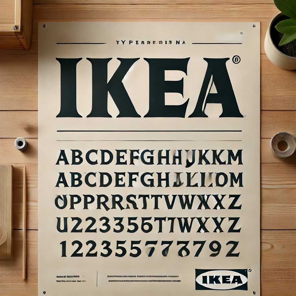
IKEA Logo Font
The IKEA logo font is a bold and geometric sans-serif typeface, which echoes the Scandinavian simplicity and modern design philosophy of the brand. Its straight edges, solid composition, and clear readability make it recognizable instantly on a global scale. The font runs alongside the blue-and-yellow iconic color scheme of IKEA, which supports the idea of trust, accessibility, and enduring functionality, which are the core values of the company.
Features of the IKEA Font
The IKEA font has evolved, but its defining characteristics remain consistent. Here are some key features:
- Clean and Minimalist Design: Each font IKEA has used embraces a simple, no-frills aesthetic that aligns with the company’s Scandinavian roots.
- High Readability: Whether on product labels, catalogues, or digital screens, IKEA’s fonts prioritize legibility.
- Bold and Geometric Lettering: The fonts utilize strong, well-defined shapes that enhance visibility and recognition.
- Functionality Over Ornamentation: Unlike decorative typefaces, IKEA’s fonts focus on clarity and practicality, ensuring easy comprehension.
- Modern Yet Timeless Appeal: IKEA balances modern design with long-lasting relevance, allowing its typography to remain fresh and compelling over the years.
IKEA Font Free Download
You can download this font by clicking the link given below.
Applications of the IKEA Font
IKEA’s fonts serve various branding and communication purposes. Here are the most common applications:
- Branding and Logo Design
IKEA’s wordmark, written in bold capital letters, makes an immediate impact. The firm, straightforward typography ensures the brand name remains legible and memorable across all platforms. The switch to IKEA Noto has reinforced IKEA’s consistency in brand identity worldwide.
- Product Packaging
From flat-pack boxes to instruction manuals, IKEA’s font ensures clarity in labelling. The bold, easily readable text helps customers quickly find product names, dimensions, and assembly details.
- Advertising and Marketing Materials
IKEA incorporates its fonts into catalogues, billboards, flyers, and digital ads. The legibility and simplicity of the font help maintain a professional yet inviting tone, making it easier for customers to absorb information.
- Website and Digital Content
In modern retail, IKEA’s website and mobile apps serve as crucial touchpoints for customers. The transition to a more digital-friendly font, like Verdana and now IKEA Noto, ensures that content remains easily read across different devices and screen sizes.
- In-Store Signage
IKEA stores are massive, and effective signage is essential for smooth navigation. The bold typography used in wayfinding signs, price tags, and promotional banners helps customers find what they need quickly and efficiently.
Read more: Scandia Font: Free Download
Alternatives to the IKEA Font
Conclusion
IKEA Font demonstrates the influence that typography has on brand identity. Since Futura and Verdana, through to the current IKEA Noto, the brand has been focused on clarity and readability to a multinational audience. This development highlights the fact that using an appropriate font is important because it increases recognition and creates the consistency of the design throughout logos, websites, and promotional materials.