Wendy’s font is part of the brand, which builds the image as much as its well-known square burgers. The typeface in the logo is not simply a visual advert, but it expresses the values of the company, which are warm, friendly, and authentic. This purposeful writing style not only differentiates Wendy among its rivals, but it also makes its branding more powerful since it is easily recognisable both in menus, packaging, and advertising.
Overview of Wendy's Font
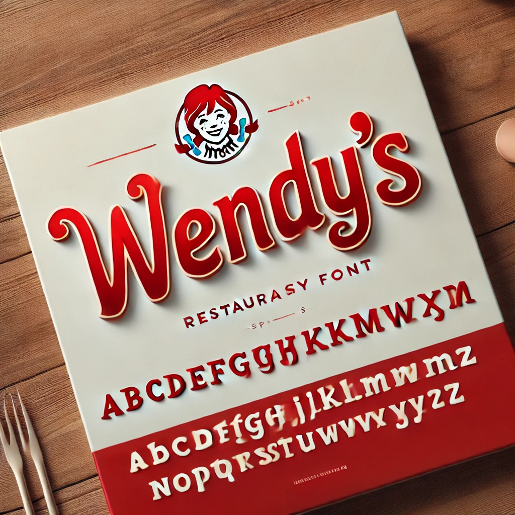
The Wendy’s logo shows its friendly identity through a script design that the company created specifically for branding purposes. The exclusive Wendy’s branded font exists solely for their branding purposes because it remains unavailable to purchase from the market. The Cursive writing style of the logo creates flowing curves that connect letters which ties into Wendy’s dedication to high-quality service with customer satisfaction.
History of Wendy's Logo and Font
- The Western-style serif typography of Wendy’s original brand appearance emerged in 1969 to symbolize traditional authenticity for the brand.
- The company redesigned its logo in 1983 while keeping the fundamental design elements for a more modern typographic appearance.
- A major Wendy’s logo redesign launched during 2013 after the company spent 29 years without major changes. A contemporary script design replaced the ones from before which used square letters and brought a fresh more flowing appearance. The rebranding objective was to develop an inviting personal brand presentation which followed modern design patterns.
Features of Wendy's Custom Font
The custom font used in Wendy’s logo possesses several distinctive features:
- Cursive Style: A written effect emerges from the slanted and interconnected letters, which creates a personalized style for the brand identity.
- Unique Characteristics: Two decorative elements above letters – a heart-shaped dot of the ‘i’ and the apostrophe in a smile shape form part of the font’s welcoming persona.
- Exclusivity: The custom-designed typeface serves Wendy’s exclusively for branding purposes, both to build recognition among customers and stand out among competitors within the fast-food sector.
Applications of Wendy's Font
Wendy’s custom font is utilized across various brand touchpoints to ensure a cohesive visual identity:
- Logo: Wendy’s employs its brand logo as the foundation to display its visual appearance to the public.
- Signage: The custom font of Wendy’s appears on exterior and indoor signage throughout all their stores to maintain unified branding.
- Packaging: On-site customers experience enhanced brand visibility because this font appears prominently on the packaging which includes wrappers and cups together with bags.
- Advertising: The brand makes strategic use of the selected font in marketing materials to help consumers recognize the brand as well as present consistent messages through both printed and digital content.
Alternatives and Similar Fonts
While Wendy’s custom font is not publicly available, designers seeking similar typefaces for personal projects can download the following alternatives:
- Wendy’s Script: Created by a fan of the brand, this free font emulates the cursive style of Wendy’s logo. It’s available for personal use and captures the essence of the original design.
- Lobster: A popular free font known for its bold and flowing cursive design, reminiscent of Wendy’s script.
- Pacifico: This free, hand-drawn font offers a casual and friendly cursive style, making it a suitable alternative for projects aiming for a similar aesthetic.
Conclusion
The Wendy’s font is most crucial in developing the identity of the brand, whereby it creates a distinct and memorable appearance. The company is using its own typeface to strike the right balance between being modern and retaining its fundamental brand values. The distinctive typeface, which was created in a friendly and charming fashion, assists Wendy in its packaging, advertising, and online representation.
Analyzing the typography in the strategy used by Wendy, it is evident that the careful design decisions can improve a brand and present a memorable impact on the listeners.