Ever wondered why some fonts just feel right, even before you read the text? That’s the power of typography. It’s not just about making words look pretty. It’s about shaping how your message is felt and understood at first glance.
Alphabet font design goes even deeper. Each letter, A to Z, plays a role in the visual harmony of a font. Whether you’re cooking up a logo, designing a poster, or building a brand identity, focusing on letter-by-letter design helps you create something truly original and impactful.
In this blog, we’ll break down alphabet font design in a practical and inspiring way. If you’re a designer, typographer, or just curious about fonts, this guide is for you.
Understanding Font Design Basics
Let’s start with the fun stuff: what makes a font a font? If you want to design your own alphabet style, you need to know the building blocks first. Think of fonts like Lego pieces, each has its own shape, purpose, and way of fitting in.
Eventually, if you’ve ever explored a top UI/UX design service, you’ll notice how much attention they give to typography, it’s not just about looks, but also how it improves user experience.
Anatomy of a Letter
Every letter has small parts that give it character and personality. Strokes are the lines that shape the letter, while terminals are the ends of those strokes, rounded, sharp, or flat.
Serifs are tiny lines or “feet” at the ends of strokes. Some fonts have loops, curves, or sharp edges, these little touches change how a letter looks and feels.
Serif vs Sans-Serif vs Display Fonts
Serif fonts have small lines at the ends of letters, and that makes them feel classic and formal, like the ones you see in printed books or newspapers.
Sans-serif fonts skip the extra lines, so they look clean, modern, and easy to read on screens. Display fonts are bold, fun, or fancy, perfect for headlines, not long reading.
Font Families and Styles
Fonts come in groups called font families. A font family includes all the different styles of one typeface, like bold, italic, light, or regular. It’s like a family photo where everyone looks similar, but each person has their own look.
For example, the font family “Roboto” has Roboto Bold, Roboto Italic, Roboto Light, and more. These different styles help designers create contrast and emphasis while keeping the overall look consistent.
Basic Fonts Principles
Great fonts feel right because they’re:
- Balanced (not too heavy or too light)
- Evenly spaced (so it’s easy to read)
- High contrast (clear difference between letters)
- Consistent in style (each letter belongs to the same “family”)
- Legible at all sizes (still easy to read when small or big)
- Friendly to the eye (no weird shapes that confuse readers)
Best Alphabet Font Design Guide: 7 Effective Tips
When it comes to creating memorable alphabet font designs, following a structured process is mandatory. Here are 7 effective tips to guide you through the journey of designing fonts that not only look good but also serve their purpose:
Know Your Audience Before You Draw
Fonts speak louder than words, so make sure yours is saying the right thing. Before starting your design, ask yourself: Who’s going to use this?
A smooth & modern tech brand needs a different vibe than a retro café logo. So, it’s essential to understand your audience so that your font resonates emotionally and functionally.
Sketch, Then Vector; Always
Pencil and paper are your best friends at the start. Sketching lets you play with shapes freely and refine ideas before committing to digital. Once you’ve nailed the rough draft, vectorize it for crisp, scalable perfection.
Trust me, skipping this step leads to messy, unpolished results.
Don’t Ignore Spacing and Kerning
Ever seen a font that just feels “off”? Chances are, the spacing is to blame. Kerning (space between letters) and overall spacing are crucial for readability. A well-balanced font looks professional, while poor spacing screams amateur, don’t let that be you.
Use Consistency, But Break Rules When It Works
Consistency keeps your font cohesive, but a little rebellion adds personality. Maybe your “Q” has a quirky tail, or your “G” takes a unique turn. Just ensure it doesn’t sacrifice clarity. After all, rules are meant to be bent, not broken beyond recognition.
Think in Black and White First
Color can distract from the bones of your design. Start in monochrome to focus on shape, balance, and proportion. Once the foundation is solid, you can splash on color to elevate the final look.
Design Letters in Groups
Tackling the alphabet one letter at a time is exhausting and inconsistent. Group similar shapes (like “a,” “d,” and “g”) to maintain harmony. This approach saves time and ensures your font feels unified.
Test Your Font in Real Use Cases
A font might look great in your design software but fall flat in real life. Test it on mockups, like posters, websites, packaging. This practice will help you spot issues like poor readability or awkward scaling. Real-world feedback is priceless.
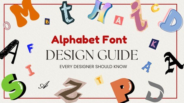
Alphabet Font Design: A Letter-by-Letter Breakdown
Designing a font is like telling a story through shapes. Each character has its own rhythm, weight, and voice. And when you design fonts letter by letter, you get to shape how your message feels, playful, bold, classic, or futuristic.
Let’s learn about the alphabet and see how each group of letters plays a special role in the overall vibe of a typeface:
-
- A: Symmetrical legs for strength.
- B: Smooth curves, clean lines.
- C & E: Keep spaces open for legibility.
- D: Balance curves and straight edges.
- F & G: Simple, balanced lines.
- H: Symmetrical strokes.
- I: Straight and clear.
- J: Soft curves with a defined base.
- K: Sharp angles for structure.
- L, M & N: Focus on geometric alignment.
- O: Balanced, smooth curves.
- P: Clear bowl without excess.
- Q & R: A unique tail or flourish
- S: Smooth curves with balance.
- T: Personality Injection
- U, V & W: Angular, dynamic designs.
- X, Y, & Z: Play with angles for flair.
Start Your Typography Journey Now!
Mastering alphabet font design is mandatory for creating standout designs. With practice and experimentation, you can easily develop unique, custom fonts that set your work apart. Keep exploring and refining your skills.
Remember, typography is both an art and a science! So, don’t be afraid to get creative and explore different styles. Just design it, refine it, and use it.