Mont Font might just be the design partner you’ve been searching for.
Ever spent hours scrolling through fonts, only to end up with one that’s just… “meh”? You’re not alone. Whether you’re designing a logo for a sleek tech startup, prototyping a minimalist app interface, or crafting an editorial layout, the right typeface can make or break your design.
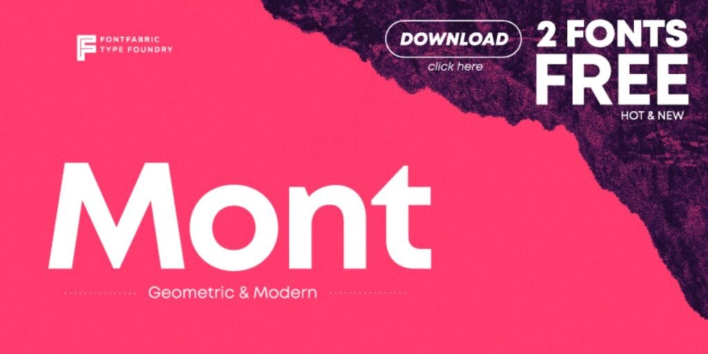
Mont Font is a modern geometric sans serif that’s clean, confident, and incredibly flexible. It’s not just another pretty font—it’s a workhorse for creatives who value precision, clarity, and style. From branding to UI design, Mont adapts seamlessly to your vision.
Let’s dive into why this font deserves a top spot in your type library.
What Is Mont Font?
So, what is Mont Font, and why does it keep popping up in professional design portfolios?
Mont is a geometric sans serif typeface designed by Milen Radakov and Mirela Belova, and published by Fontfabric, a renowned type foundry. It draws heavy inspiration from the principles of modernist design—think Bauhaus simplicity meets digital clarity.
Key Highlights:
- Geometric design: Perfectly symmetrical and highly legible
- Font family: 10 weights + matching italics (from Hairline to Black)
- Multilingual: Supports Latin and Cyrillic alphabets
- Versatile style: Feels just at home in a luxury brand logo as it does in a minimalist UI.
Key Features of Mont Font
Let’s break down what makes the Mont font family such a favorite in the design world:
Clean, Geometric Letterforms
Mont’s design is mathematically balanced—letterforms are crafted with circles and straight lines that make your typography look clean, consistent, and professional.
Screen-Ready Readability
Thanks to its perfect x-height and optically adjusted spacing, Mont delivers excellent legibility even on small screens. It’s a win for UI/UX designers.
Multilingual Superpowers
Need to work with Cyrillic or Latin characters? Mont’s got you covered with broad language support, making it ideal for global brands.
Weight Options Galore
From ultra-light “Hairline” to bold “Black,” you get 10 weights with matching italics—giving you full control over tone and hierarchy.
Optical Precision
Mont is crafted with optical harmony in mind. The kerning, spacing, and shape proportions feel natural and refined.
Where to Use Mont Font?
The beauty of Mont is in its flexibility. It adapts to your creative vision, whether you’re going for corporate polish or edgy minimalism.
Perfect for:
- Corporate branding & high-end logos
- Web and mobile UIs (clean, scalable type)
- Editorial layouts & infographics
- Tech startups, fintechs, or SaaS websites
- Signage, posters, and packaging design
Mont’s wide range of weights makes it ideal for combining headers and body text in a cohesive system—no need to jump between typefaces.
Mont Font Free Download
Want to try Mont Font for yourself? Here’s how to free download it:
Is Mont Font Free to Use?
Here’s the scoop on Mont’s licensing:
Free for personal use (some weights)
Commercial use requires a license
Final Thoughts on Mont Font
If fonts were personalities, Mont Font would be the cool, calm, and collected minimalist—always on point, never overbearing.
Whether you’re:
Building a sleek fintech dashboard,
Crafting a luxury brand identity,
Designing accessible UI interfaces,
Or making a print-ready editorial layout…
Mont delivers. With its geometric charm, versatility, and attention to detail, it’s one of the best modern sans serif fonts out there.
And if you’re exploring stylish font pairings or experimenting with retro-futuristic themes, Mont Font works surprisingly well alongside bold, expressive typefaces featured on y2kfonts, a blog dedicated to curating nostalgic, standout fonts that echo early 2000s design trends—striking a perfect balance between modern minimalism and nostalgic flair.
Try Mont Font today—and give your typography the geometric edge it deserves.