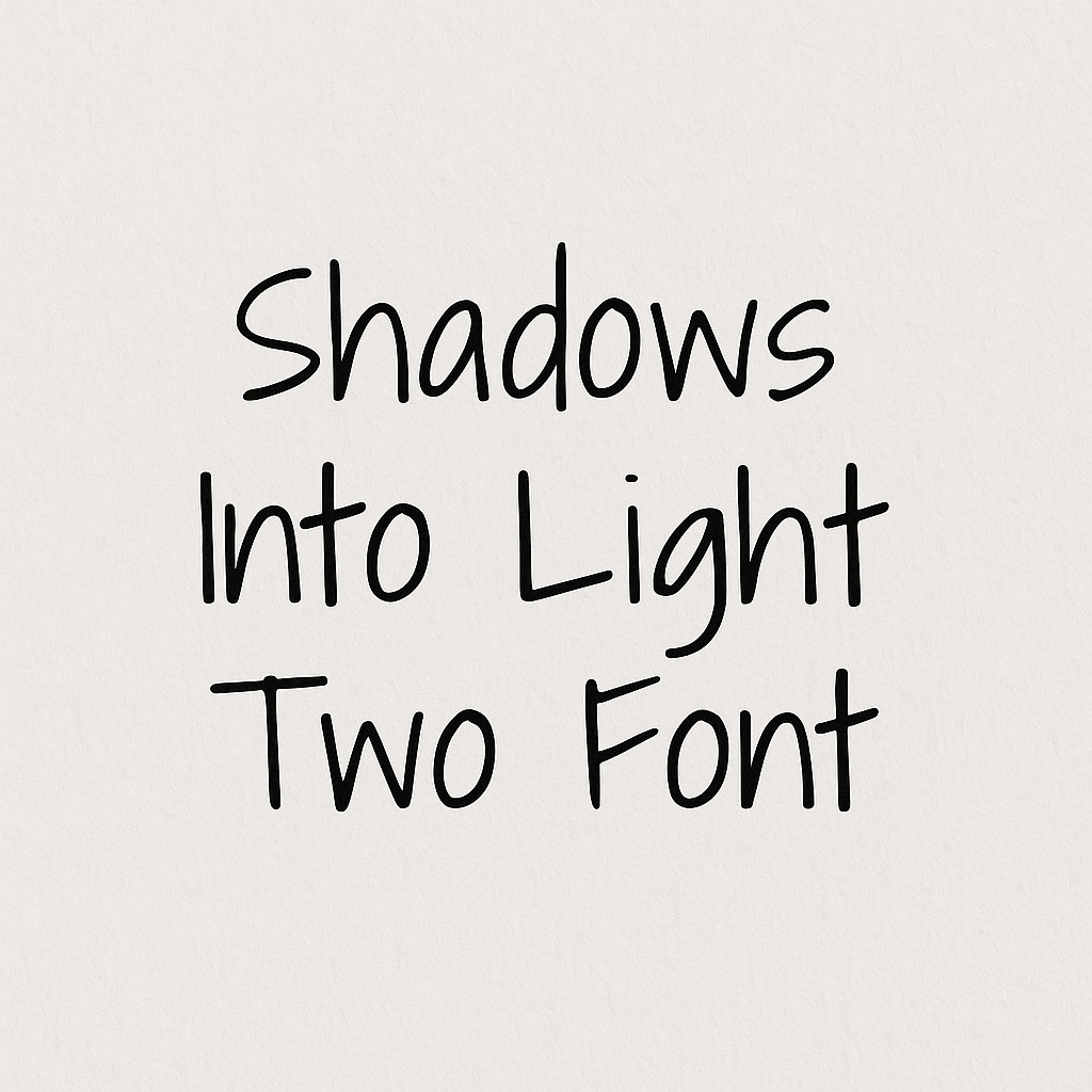
Shadows Into Light Two Font: Introduction
Typography does not have many such fonts that could strike a balance between informal aesthetics and formal functionality as Shadows Into Light Two does. This joyful handwritten typeface is based on the popular Shadows Into Light font which has been cleaned up to provide a sense of coziness, approachability, and authenticity, but is still very readable.
Shadows Into Light Two is a quirky font designed by Kimberly Geswein, a font design celebrity and it has superior spacing and kerning than the original. You want to create an online article, a party invitation or a lifestyle blog logo? Such a font will provide it the additional human touch which is extremely hard to provide when using more robotic fonts.
History and Development: From Shadows Into Light to Version Two
The first Shadows Into Light font was released in 2011. It is created by Kimberly Geswein whose typeface collection consists of playful and professional typeface designs. Due to its handwritten style, smooth lines and harmony, Shadows Into Light was an immediate success on Google Fonts. It remains very much in use in personal and semi-formal situations, handouts by teachers, blog headers, etc.
But, the initial one possessed certain technical shortcomings. Character spacing (kerning) and line height could cause inconsistencies at times, particularly with paragraph text or professional layouts. This prompted the publication of Shadows Into Light Two which was an updated version meant to solve these problems.
Launched shortly after the original, Shadows Into Light Two maintains the essence of its predecessor but improves upon it in key areas:
- Enhanced kerning
- More balanced baseline alignment
- Better character proportions for digital environments
This update solidified its place as one of the most reliable handwritten fonts available in the open-source font world.
Features and Characteristics of Shadows Into Light Two Font
Shadows Into Light Two stands out because of its thoughtful blend of personality and polish. Let’s explore its defining features:
1. Handwritten Aesthetic
The font mimics natural handwriting, giving designs a more personal, friendly touch. The letterforms are clean yet irregular enough to feel authentic.
2. All Lowercase and Uppercase Support
Shadows Into Light Two also has a full range of uppercase characters, unlike some other handwriting fonts which are restricted to lowercase only. This renders it appropriate in titles, headlines and stressed text.
3. Improved Kerning and Spacing
Among the many improvements in the Shadows Into Light Two is improved space rendering between characters to make the text more readable and visually balance, particularly in longer pieces of text.
4. Extensive Language Support
It includes Latin-extended characters, allowing for usage in many European languages. This global usability makes it ideal for international content creators.
5. Lightweight
The font features a single, lightweight stroke, giving it a delicate and airy appearance, perfect for informal content or soft, inviting visuals.
6. Free for Commercial Use
Shadows Into Light Two is free and can be used for personal and commercial purposes; it is available on Google Fonts, so students, teachers, bloggers, marketers, and businesses can use it without any fee.
Shadows Into Light Two Font Free Download
You can download this font for free via the link given below.
Practical Applications of Shadows Into Light Two
Thanks to its versatility, Shadows Into Light Two finds use in various creative and professional settings. Here are some of the most popular applications:
1. Education and Teaching Materials
Educators often download Shadows Into Light Two as a classroom worksheet, bulletin board, and PowerPoint slideshow. The handwritten nature of the font establishes a good connection with young learners and gives a cordial mood to instructional texts.
2. Lifestyle Blogs and Websites
This font is favoured by many lifestyle bloggers and is used in headings, image captions, and quotes. It has a handwritten effect that makes the contents more personal and connecting, which is best suited in the blog section on parenting, cookery, travel, or journals.
3. Greeting Cards and Invitations
Shadows Into Light Two is beautiful on printed papers, whether you want wedding invitations or thank-you cards. It makes it personal, hand-made, which is hard to accomplish with ordinary serif or sans-serif fonts.
4. Branding and Packaging
Small businesses and Etsy sellers use this font in logos, packaging and signage, especially in the handmade, craft or boutique niche. It evokes a feeling of comfort and authenticity that are the key characteristics of the modern brand image.
5. Social Media Graphics
Whether you’re designing quote graphics for Instagram or promotional posts for Pinterest, Shadows Into Light Two helps convey emotion in a visually pleasing way.
6. Digital Journaling and Planners
With the rise of digital planning, handwriting fonts like Shadows Into Light Two are increasingly featured in GoodNotes, Notability, and other note-taking apps.
Shadows Into Light Two vs. Other Fonts: Alternatives and Comparisons
While Shadows Into Light Two offers a unique balance of charm and clarity, knowing what other fonts offer similar appeal is helpful. Below are some popular alternatives that can work in similar contexts:
1. Patrick Hand
Another Google Font with a handwritten style, Patrick Hand, is slightly more playful and rounded. It’s ideal for casual or youthful design themes.
2. Amatic SC
Amatic SC is a condensed, handwritten font with tall, narrow characters. It’s often used in modern, artsy projects but lacks the softness of Shadows Into Light Two.
3. Dancing Script
For a more cursive option, Dancing Script brings a flowing, elegant handwriting style that’s still easy to read. It’s great for formal invitations or fashion/lifestyle branding.
4. Kalam
Developed by Indian Type Foundry, Kalam offers a bolder, more structured handwriting style. It’s particularly well-suited for body text in informal documents.
5. Satisfy
Satisfy is a brush script with strong strokes and an energetic flow. While more stylized than Shadows Into Light Two, it’s perfect for eye-catching headers or expressive text.
Conclusion
Shadows Into Light Two is a welcome alternative to the cool, technical faces. It is relaxed and at the same time logical, poetic, and functional. Need to find the right tone of voice in a warm lifestyle blog you are writing, an educational text, or an invitation that will melt hearts? This font may be your secret weapon.
Shadows Into Light Two has better kerning and extended character support, making it an improvement over the original in addition to addressing the weaknesses of the original. It is human enough to be a default choice when one needs a certain coziness, genuineness, and beauty to their works, yet readability is not going to be an issue.