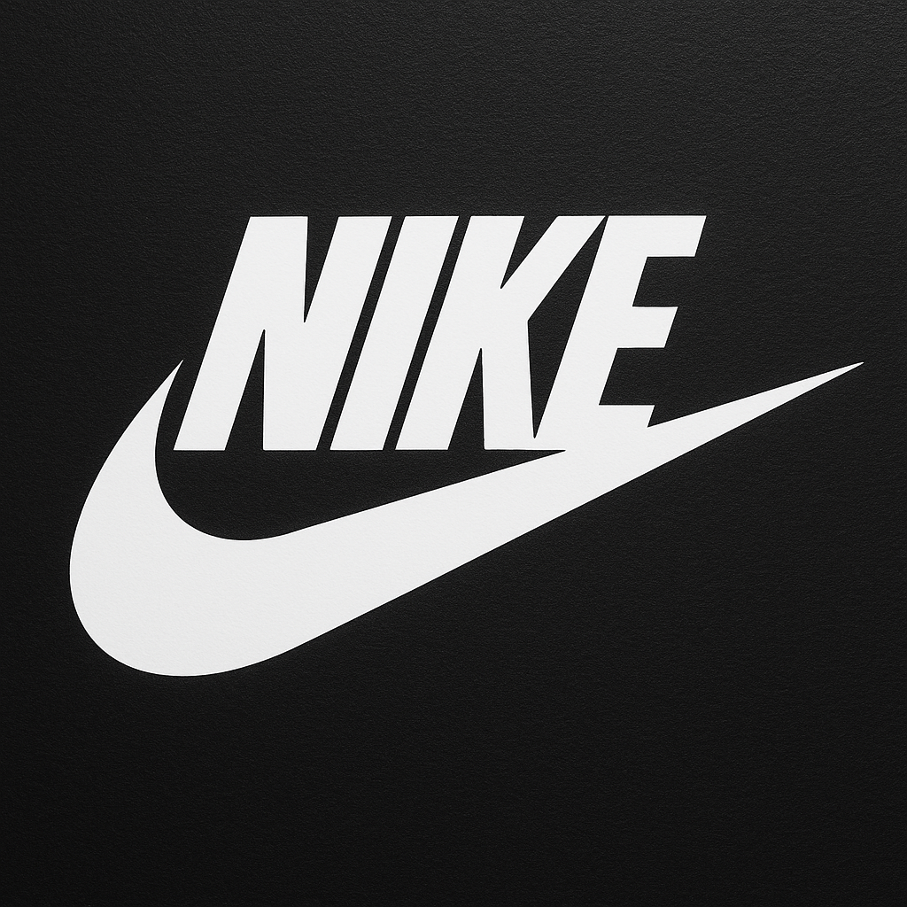
Nike Font: Introduction
Lettering forms a vital component in branding. A selection of fonts is of great significance to a company like Nike, where font is iconic, like its set of words, “Just Do It.”
The Nike typeface applied by the brand in its logo is a bespoke typeface referring to the Futura Condensed Extra Black, a heavy, geometric, and sans-serif typeface created by Paul Renner in 1927. And as much as the Nike wordmark has slightly changed, the large and condensed letterforms appear strong, contemporary, and minimalistic.
Futura Condensed Extra Black is the base, but Nike has altered its branding so that we can distinguish the typeface in the face of exceptionality.
Features of the Nike Font
Although the Nike font is based on the Futura Condensed Extra Black font, its features make it unique. These are the characteristics of it, explained brief:
1. Bold and Condensed Letterforms
The compact structure will give the font less horizontal space but the visual weight still. This attributed to it being very versatile in terms of branding particularly to sportswear and other constrained brand response space such as the shoe brands.
2. Geometric Design
As per the Bauhaus history of Futura, the font contains clean geometrical lines and shapes, such as in the “O” and the “C,” which are almost close to being circles. This gives it an impression of modernity and accuracy.
3. All Caps Usage
Nike uses the font almost exclusively in uppercase, conveying a tone of urgency, strength, and confidence.
4. Custom Kerning
The tight letter spacing enhances cohesion, giving the logo a more compact and assertive appearance.
5. Minimalist Aesthetic
There are no embellishments or serifs, making the design timeless and adaptable across media and merchandise.
Nike Font Free Download
You can download the font using the link given below.
Applications of the Nike Font in Branding
Nike has applied its custom font strategy across various touchpoints in its brand ecosystem, reinforcing consistency and identity.
1. Logo and Packaging
The primary application is in the Nike wordmark, often paired with or isolated from the Swoosh. It appears on:
- Shoe boxes
- Tags and labels
- Apparel
- Product packaging
2. Advertising Campaigns
The types of Nike are bold and powerful in Just do it campaigns. The type style helps create emotional value in the taglines and call-to-actions.
3. Retail and Online Storefronts
Nike stores and websites items, as well as smartphone applications, have slight alterations of the bold condensed sans-serif appearance, to uniform the brand and make it easy to read.
4. Sports Sponsorships
Nike sponsors athletes and sports teams worldwide. The font is often seen in:
- Jerseys
- Training gear
- Event signage
The font’s aggressive and sleek look complements the dynamic world of sports.
5. Social Media and Digital Ads
Across platforms like Instagram, YouTube, and X (formerly Twitter), Nike leverages the bold, condensed type style to maintain a strong visual brand identity.
Alternatives to the Nike Font
Assuming that you desire to replicate the appearance and style of the Nike font to either personal or commercial endeavors, the following constitutes some substitutes that can replicate the typographical appearance of the brand:
1. Futura Condensed Extra Black
The closest publicly available match to Nike’s wordmark. Designed by Paul Renner, it’s a geometric sans-serif font with a rich design heritage.
- Use case: Logos, branding, posters
2. Bebas Neue
A popular free font that features tall, condensed uppercase characters. Though not a direct match, it shares the same visual strength and clarity.
- Use case: Headlines, social media graphics, marketing material
3. League Spartan
An open-source geometric sans-serif inspired by Futura but with modern tweaks. It offers a bold, clean aesthetic suitable for bold statements.
- Use case: Web design, apparel mockups, display type
4. Anton
A high-impact sans-serif typeface designed specifically for headlines and display. While more square than Futura, its commanding presence is Nike-esque.
- Use case: Posters, ads, digital banners
5. Impact
While not as sleek as Futura, Impact shares the bold, condensed DNA that gives off a strong, athletic vibe. Great for quick projects or internal branding.
- Use case: Sports graphics, memes, banners
Why Nike’s Typography Strategy Works
Nike’s typography doesn’t just identify the brand—it amplifies its core message. Here’s why their approach is so effective:
1. Brand Consistency
Using a single style of typeface across multiple platforms and products creates instant recognition and brand integrity.
2. Emotional Connection
The font style complements Nike’s messaging—dynamic, empowering, and no-nonsense. It feels like a battle cry: strong, energetic, and focused.
3. Versatility
Despite being bold and distinctive, the Nike font adapts well across various platforms—from digital to print to apparel.
4. Cultural Relevance
Typography trends evolve, but Nike’s geometric, sans-serif design remains relevant because of its clean, timeless design.
Conclusion
Nike font is more than font, it is an extension of the brand DNA. It originates in Futura Condensed Extra Black, but due to its custom nature, this face is power and energy, innovative. Through uniformity in bold and geometric typeface in branding and advertising, Nike has fashioned a unique identity, in which there can be no confusion over.
Regardless of what your niche might be, whether you are a designer who might need to get inspired, or a brand builder who wants to learn the strategy of Nike, or a typography lover who might want to see how powerful fonts are used, it is often said that you can learn several things about visual storytelling, consistency and even brand power by looking at the Nike font.
Your message might be undoubtedly inescapable with the correct font. Just Do It.
