
Sonic Font: Introduction
Sonic Font is not only a typeface but nostalgia, speed, and creativity. Italic, bold, and slightly futuristic, it was iconified in the Sonic the Hedgehog series with Sega. Outside of gaming, the font has commonly been used in fan art, retro-evoking designs, and creative projects in which the designer aims to depict a sense of movement and excitement. It is still popular today, decades later, as something that reminds us of the energy and jovial spirit of the 1990s.
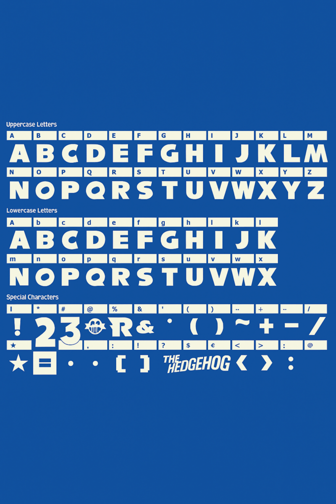
Key Features of the Sonic Font
The Sonic font is known for more than just its association with a beloved video game series. Its distinct visual identity is made up of several typographic features:
1. Bold Weight
The thick strokes give it a strong presence, ideal for logos and headlines. This reflects Sonic’s bold, high-energy persona.
2. Italicized Form
Most iterations lean slightly forward, suggesting motion — a visual nod to Sonic’s unparalleled speed.
3. Geometric Shapes
The letterforms often have rounded counters and consistent stroke widths, giving the font a clean, modernist appeal.
4. Custom Lettering
Several Sonic logos feature hand-modified characters, like the exaggerated ‘S’ or slanted ‘O’ adding uniqueness and preventing exact replication via standard fonts.
5. High Contrast Colors
There is also a tendency to use the typeface with strong colors (blue, yellow, red) and metallic or 3D surfaces that increase the visual effect in graphic use.
Sonic the Hedgehog Font Free Download
You can download it by using the link given below.
Practical Applications of the Sonic Font
Fonts like Sonic may be helpful for various creative projects, particularly when a retro, arcade, or dynamic design is needed.
1. Video Game Design
Perfect for fan-made games, retro arcade designs, or platforms aiming for a nostalgic yet modern look.
2. Posters and Branding
Ideal for music events, comic book conventions, or youth-oriented campaigns that need a fast-paced, fun vibe.
3. Merchandise and Apparel
Commercialized under fan art, T-shirts, stickers, and ephemera, particularly when targeting gamers and followers of pop culture.
4. YouTube Thumbnails and Twitch Overlays
It is a common font that is used in gaming channels to attract attention and highlight dynamic content.
Replicas and Alternatives of the Sonic Font
Created by Nise Mono, this is perhaps the most faithful fan reproduction of the original Sonic logo font. It’s often used in fan art and projects emulating the Sega Genesis style.
- License: Free for personal use
- Pros: Very close to the original
- Cons: Limited character set and commercial restrictions
2. Sega-Logo
Another replica that mimics the stylized Sega lettering, often paired with Sonic branding.
- Best For: Logos, posters, or anything evoking early ’90s game aesthetics
3. SF Sonic Font
A stylized typeface with more futuristic edges, designed to reflect the more modern Sonic branding.
4. Alternatives for Versatility
If you’re looking for fonts that aren’t exact replicas but carry a similar vibe:
- Pricedown – Famous from the GTA series, but offers a playful, bold style
- Orbitron – A clean, futuristic sans-serif typeface great for digital and tech themes
- Bungee – Offers fun, bold lettering in a geometric style with a modern touch.
- Exo 2 – Sleek and angular, suitable for sci-fi or speed-based themes
Final Thoughts
Sonic Font is an energy-filled and excitement-inducing representation of the legendary video game series, and how font types can create the atmosphere and make the design come alive. Let the Sonic Font (or a similar style) make your ideas come to life if you want to create a feeling of nostalgia of the classic games or emphasize the feeling of speed and movement.