The Shadow Into Light Font is a one-of-a-kind typeface that feels like a note from a companion—inviting, distinct, and full of character. Given that 2025 is on the horizon, it is clear that this typeface shall become ever more popular with the rise of digital and print hand-written aesthetics. Its usage spans from structural and arch design to journaling layout, wedding invitations, branded kits, and even app interfaces.
Due to the casual charm that the typeface exudes, Shadow Into Light brings authenticity to the project. Aesthetically, it brings a lot to the table and is perfect whether one is designing for a boutique store, a teacher’s worksheet, or even a journaling application. This typeface brings the perfect mixture of style and elegance, while remaining very easy to read.
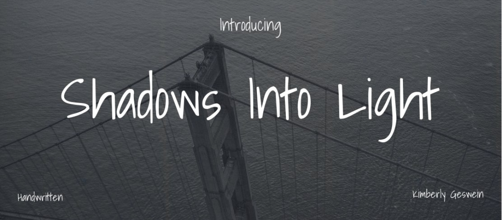
What Is Shadow Into Light Font?
Developed by type designer Kimberly Geswein, Shadow Into Light Font is a typeface reminiscent of handwriting, striking a delicate balance between neatness and a personal touch. With its simplistic, softly emphasized brush strokes, it renders a legible, warm, and inviting script style.
It’s primary source of distribution, Google Fonts, makes it accessible for personal and professional use without cost restrictions due to the SIL Open Font License. Because of the font’s availability and the ease of accessing it, Shadow Into Light Font gained immense popularity among creatives in the year 2025.
Key Features of Shadow Into Light Font
- Smooth sans-serif script with natural, consistent stroke width
- Very readable when written small, perfect for notes and UI design
Accommodates letters, numbers, punctuation symbols, and a few decorative variations.
Accessible in .TTF and .OTF formats and prepared for web deployment.
Designed for effortless use in Canva, Google Docs, Figma, as well as on mobile apps Goodnotes and Notability.
Applications of Shadow Into Light Font
Personal Branding & Logo Design
Shadow Into Light is an excellent pick for small business logos, boutique brand visuals, or YouTube and Instagram headers. It brings a personal touch that says, “Hey, I’m approachable.”
Event Design & Invitations
Planning a rustic wedding or hosting a baby shower? This handwritten font is made for stylish invitations, signage, menu cards, and DIY banners.
Digital Journals & Note Apps
In an age where digital journaling is on the rise, many apps are using Shadow Into Light to give users a handwriting-like feel. Think of apps like Notion, Goodnotes, and mobile journaling tools.
Educational & Craft Projects
Teachers love it for worksheets, student labels, and classroom materials. It’s also popular in the crafting community for Cricut projects and DIY printables.
Shadow Into Light Font Free Download
You can grab the Shadow Into Light Font free download from the below button:
Tips for Using Shadow Into Light Font in 2025 Designs
- Use it Sparingly: Works best as an accent or headline font rather than for body text.
- Pair it Well: Combines best with sans serifs Montserrat, Open Sans, and Lato.
- Mind the Spacing: Its characteristically loose, handwritten quality benefits from generous letter spacing.
- Match the Vibe: For a warm and personal impression, use soft, pastel or neutral color schemes.
Conclusion – Why Shadow Into Light Font Still Wins in 2025
Shadow Into Light Font isn’t just another handwritten typeface—it’s a warm invitation into your design. It offers casual elegance, emotional warmth, and crystal-clear readability, making it a standout choice across both physical and digital mediums.
From a DIY wedding invite to a journaling app UI, its versatility continues to shine in 2025. If you’re looking for a way to make your designs feel personal, polished, and modern, this font is a great place to start.
At Y2K Fonts, we love fonts like Shadow Into Light that bring a handwritten, heartfelt touch into design—balancing creativity with simplicity.
Want something that feels personal and polished? Shadow Into Light Font is your go-to for heartfelt, creative design.