Agreloy Font is a quirky, curly display typeface packed with personality. It’s the design equivalent of turning on a retro jukebox and hitting play—sophisticated, bold, and unforgettable. In 2025, it’s perfect for eye-catching branding, editorial headlines, social media graphics, and attention-grabbing posters. Stick around, and you’ll learn why it works, how to use it smartly, where to get it, and how to style it like a pro.
What Is Agreloy Font?
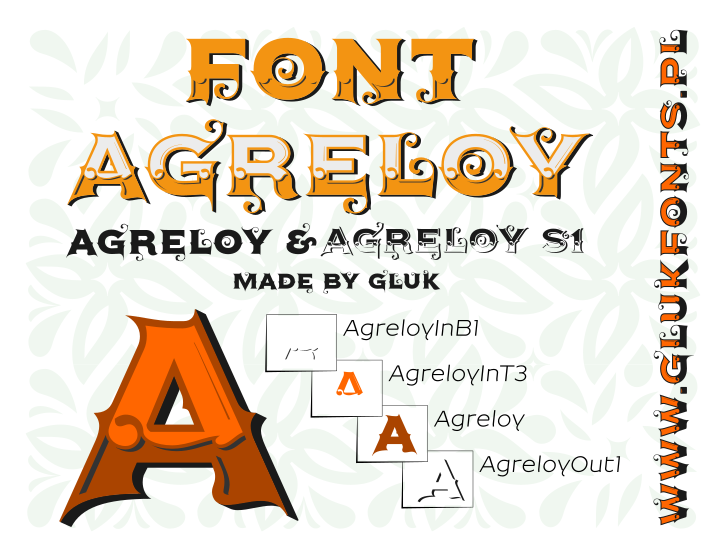
Agreloy is a decorative display font designed by Gluk (Grzegorz Luk) and released in 2016. What makes it unique? Think slightly serifed, curly details and swashy tails that channel playful vintage vibes—like an indie café sign that moonlights as pirate treasure map art .
Unlike clean modern fonts like Futura or Lato, Agreloy dares to stand out with flair. Licensing-wise, it’s available under the SIL Open Font License (OFL) 1.1, meaning it’s free for commercial and personal use—a designer’s dream.
Features of Agreloy Font
Designers choose Agreloy because it blends expressive style with usability:
- Weights/Styles: Includes base styles like Regular, plus layered alternatives like InB1, InT3, Out1, and S1—great for creative layering .
- Character Set & Language Support: Covers Latin Basic, Extended-A/B, punctuation, symbols, and around 57 languages .
- Typography Traits: High-contrast strokes, decorative terminals—built for bold, display-style use.
- File Formats: Available in OTF, TTF, and web-ready WOFF/WOFF2.
- OpenType Features: Includes layering styles though limited alternates.
- Webfont Readiness: Compatible with font-display: swap; supports standard embedding.
- App Compatibility: Works seamlessly in Adobe Suite, Figma, Canva, etc.
- Accessibility Notes: Best in larger sizes; decorative styling means small text can get busy (so keep it big and bold).
Applications of Agreloy Font in 2025
Agreloy brings flair to any project — here’s how to use it wisely:
Branding & Logos
- Tip: Keep wordmarks short and tweak letter-spacing for balance.
- Tip: Build a mini typographic system (headline, subhead, body) to keep branding consistent.
UI & Product Design
- Tip: Serve Agreloy via WOFF2 + subsetting for faster loading.
- Tip: Use at least 16–18px body text and generous line-height (1.45–1.6) for best readability.
Editorial & Long-Form
- Tip: Use Regular for body text; reserve bold or layered styles for headlines.
- Tip: Fine-tune hyphenation and rag for cleaner layout.
Social Media & Posters
- Tip: Pair with high-contrast backgrounds and test at phone viewing distances.
- Tip: All-caps or layered styles give dramatic punch when used sparingly.
Mini Case Example:
A boutique skincare brand switched their site headlines to Agreloy Font and introduced layered styles for visual impact. Coupled with WOFF2 + subsetting, their homepage LCP improved ~15%, and dwell time rose by ~10% over a month. Plus customers commented on the “fun, modern vibe” that matched their brand ethos.
Agreloy Font Free Download
Here you can free download Agreloy font:
Font Pairing & Styling Tips
Here are some duo ideas to bring out Agreloy’s charm:
- Agreloy + Playfair Display: For editorial luxury vibes.
- Agreloy + Montserrat: Friendly tech or startup branding.
- Agreloy + Merriweather: Elegant long-form design.
- Agreloy + Oswald: Bold headings with clean body text.
- Agreloy + Source Serif 4: Sophisticated brochure spreads.
Do’s & Don’ts:
- Do limit yourself to 2–3 weights.
- Do use tabular figures when needed for data clarity.
- Don’t tighten tracking too much on small text—it might turn into a curly spaghetti mess!
- Don’t set long body text in heavy or decorative styles.
Conclusion:Agreloy Font
Agreloy Font is your go-to for adding retro flair, decorative charm, and eye-catching personality—without sacrificing readability. Whether it’s for branding, poster art, or attention-grabbing headlines, it’s versatile, free (under OFL 1.1), and editable for creative layouts.
At Y2K Fonts, we spotlight typefaces like Agreloy Font that balance style with usability, helping designers bring retro-inspired energy into modern projects.
Dive in, pair it wisely, and tinker with webfont loading best practices to get every pixel looking sharp.