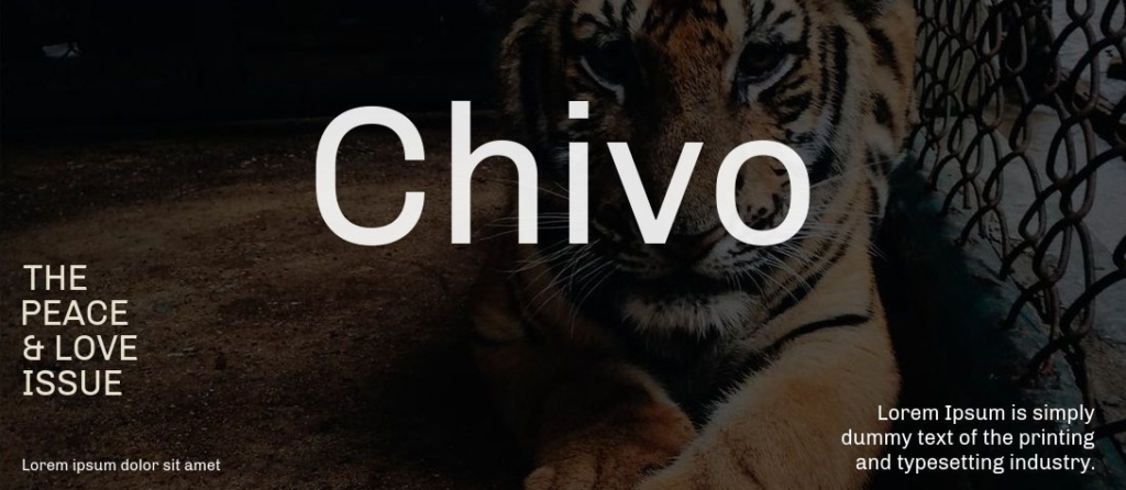
Chivo font family is your efficient best friend in design — a strong, slab-like sans serif with clean shapes and bold presence. It blends slab-inspired weight with grotesque clarity, making it a go-to for brands, editorial layouts, and user interfaces.
Today, Chivo matters more than ever—thanks to its web readiness, versatile weights, and modern feel, it’s popular across websites, apps, and printed materials throughout 2025.
In this article, you’ll get the lowdown on features, where to use Chivo, how to grab and license it safely, pairing ideas, and real-world pro tips.
What Is the Chivo Font Family?
Chivo is a neo-grotesque sans-serif with slab-like terminals that deliver subtle contrast and structure. Designed by Héctor Gatti and released by Omnibus-Type, it first appeared around 2011.
This font lives in the sweet spot between slab and grotesque styles, offering both strength and readability—a rare combo that makes it incredibly versatile for multiple design purposes.
In terms of styles, Chivo includes a robust range: Light, Regular, Medium, Bold, Black, plus matching italics. A variable font version appeared in late 2022 to add flexibility.
Key Features of Chivo Font Family
Designers love Chivo for its sturdy yet versatile nature:
- Weights & Styles: From Light to Black, with italics and a variable version.
- Design Traits: Subtle slab terminals, open counters, and a sturdy structure for presence with clarity.
- Character Set: Broad Latin coverage with diacritics (check vendor for specifics).
- OpenType Features: Supports lining figures, small caps, and more (depending on source).
- Formats & Web-Ready: Available in OTF/TTF; web use via WOFF/WOFF2 offers faster loading.
- App Compatibility: Works in Adobe apps, Figma, Canva, Sketch, even Cricut for crafting.
Performance & Accessibility: Easily subset for fast web loads, font-display: swap improves rendering. Legibility starts around 16px for body, 24px+ for headings.
Applications: Where to Use Chivo in 2025
Branding & Logos
Tip: Use Medium or Semi-Bold for logos; test on both light and dark backgrounds.
UI & Product Design
Tip: Serve Chivo as subsetted WOFF2 for faster page loads. Use it at ~16px with comfortable line-height (~1.5).
Editorial & Long-Form
Tip: Use Chivo for headings; combine with a serif or neutral sans for body text. Enable tabular figures for clean price tables or stats.
Posters & Motion Graphics
Tip: Bold weights shine in motion scenes. Outline or stroke Chivo for layered text effects.
Packaging & Labels
Tip: Print test at final size — the slab terminals can ink-blur on inexpensive paper, so adjust if needed.
Mini Case Study
A digital magazine switched its site headers to Chivo Bold and served subsetted WOFF2. Result? LCP dropped ~15% and reader engagement increased in hero areas. The bold weight’s clarity sharpened their visual hierarchy and consistency. (Other optimizations were active too—this is a correlated result.)
Chivo Font Family Free Download
Here is how you can free download Chivo Font Family:
Chivo Font Pairing & Styling Tips
Pairing Ideas:
- Chivo + Merriweather — editorial elegance and contrast
- Chivo + Inter — clean, neutral mix for apps/UI
- Chivo + Playfair Display — high-end brand look
- Chivo + Lora — warm serif balance for editorial feel
Do’s & Don’ts:
- Do give Chivo breathing room—tight spacing reduces clarity.
- Don’t set long blocks of text in Chivo—it’s best as display face.
- Do test prints for packaging; outline text if boosting visibility.
- Don’t over-stretch it—maintain font proportions.
Conclusion: Chivo Font Family
The Chivo Font Family is a robust, stylish sans serif with slab-inspired flair — ideal for impactful branding, editorial layouts, UI, and more in 2025. It’s easy to use, performance-optimized, and free to license. Want clarity and modern strength? Chivo delivers.
At y2k fonts, we recommend Chivo for designers who want versatility without losing personality. Whether it’s for bold headlines, clean app interfaces, or polished editorial spreads, this font family adapts beautifully to digital and print.
👉 CTA: Put it in your next mockup, serve as subsetted WOFF2 on the web, pair it wisely, and always check your license. Design stronger today!