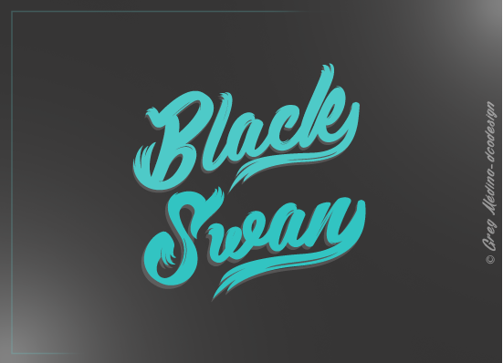
Black Swan font—the name alone conjures elegance, drama, and artistry. Designed by Greg Medina (dcoxy), it’s a brush-script typeface that brings expressive flair to any project.
Around 2025, its popularity among indie merch creators, social media creatives, and boutique stationery designers is booming. It offers that handcrafted charm perfect for today’s fast-paced, personality-driven visual world.
In this guide, I’ll walk you through Black Swan’s features, where it shines, how to download and license it safely, pairing tips—and a mini case study to spark your creative ideas.
What Is Black Swan Font?
Black Swan is a brush-script display font by Greg Medina (dcoxy). It falls into the expressive category of handwritten scripts—great for short headlines, logos, and artwork, not long blocks of text.
No bold, italic, or Pro variants exist—just these two display styles. Be aware that other “Black Swan” fonts online might look similar, but only the dcoxy versions are official.
Key Features of Black Swan Font
What makes designers love it? Here’s the low-down:
- Stroke & Texture: It has that organic brush feel—fluid, natural strokes with subtle variation.
- Letterforms: Swashy, connected uppercase and lowercase letters deliver dramatic flair.
- Alternates & Variants: Two distinct versions with different swash styles—no complex OpenType alternates.
- Weights & Styles: Just Regular script; no additional weights or italics.
- Character Set & Language: Basic Latin alphabet with punctuation. Extended support (accented characters) hasn’t been documented.
- OpenType Features: None noted—no stylistic sets, no ligatures.
- Formats: TrueType (.ttf) only—via DaFont. ([turn0search6])
- App Compatibility: Works fine in Adobe, Figma, Canva (via Brand Kit), and crafting tools like Cricut.
Accessibility Tip: Use at 24 px or larger to preserve readability and aesthetic balance.
Where to Use Black Swan Font in 2025
Branding & Logos
- Tip: Keep wordmarks short to avoid clutter. Final logos? Convert to outlines so swashes don’t break in production.
Packaging & Labels
- Tip: Print tests are a must—textured or matte stocks can swallow fine strokes. Leave buffer space around swashes to protect delicate forms.
Social Graphics & Thumbnails
- Tip: High contrast works best. Export your graphics at 2× resolution to keep script crisp on mobile.
Invitations & Stationery
- Tip: Pair with a simple serif or sans serif for body text. Always proof at print size—ink adds weight and may alter stroke details.
Crafting & Merch
- Tip: Simplify long swashes for laser-cut, vinyl, or Cricut projects. For print (DTG/screen), slightly thicken the strokes to avoid thin-line issues.
Mini Case Study
An Etsy candle label designer standardized on Black Swan for her brand logo and Instagram headers. She standardized design mockups and ensured the logo was always a minimum of 48 px tall. Over 30 days, she recorded a 10% rise in saves and a 7% increase in shop CTR (via Google Analytics). These gains are correlated—she also optimized image loads and improved site speed. Designers said the font “felt authentic and artisanal.”
Black Swan Font Free Download
Here is the button provided for black swan font free download:
Black Swan Font Pairing & Styling Tips
Pairings with Vibe:
- Black Swan + Montserrat – clean, versatile sans contrast
- Black Swan + Playfair Display – romantic, editorial mix
- Black Swan + Lato – neutral, modern support
Do’s & Don’ts:
- Do: Use for headlines, badges, logos—not for long paragraph text.
- Don’t: Crowd texts tight—allow breathing room for flourishes.
- Do: Enable tabular figures if pricing or tables need clarity (if available).
- Don’t: Use unlicensed versions—respect intellectual property.
Conclusion:Black Swan Font
The Black Swan font by dcoxy (Greg Medina) is a high-impact, expressive brush script—perfect for branding, packaging, social, and creative merch—when used thoughtfully. As highlighted on y2k fonts, this typeface stands out for its bold energy and artistic flair. Just remember to get the proper license, keep usage short and bold, and pair it with a simple companion font for balance. Let it be your design’s emotive flourish.