Introduction
The early 2000s were a vibrant era for design, a time when technology, pop culture, and fashion collided to create a distinct visual style. This period, often referred to as Y2K, brought with it a futuristic, experimental, and sometimes playful approach to typography that mirrored the optimism and digital fascination of the era. Y2K fonts are instantly recognizable for their bold shapes, quirky curves, and futuristic flair, often blending technology-inspired aesthetics with a sense of nostalgia.
Today, these fonts are experiencing a major comeback, influencing everything from graphic design and branding to social media visuals and digital art. Whether you’re a designer looking to evoke nostalgia, a brand seeking a bold statement, or simply curious about typography trends, understanding Y2K fonts can elevate your creative projects. This article explores the origins, characteristics, popular options, and practical applications of Y2K fonts in modern design.
What Are Y2K Fonts?
Y2K fonts are typographic styles that gained popularity around the turn of the millennium. They were heavily influenced by the digital revolution, futuristic visions, and pop culture of the late 1990s and early 2000s.
Key Characteristics:
-
Bold and Geometric Shapes: Y2K fonts often feature strong lines, exaggerated angles, and wide letterforms that command attention.
-
Futuristic Influence: Many designs incorporate sci-fi aesthetics or digital-inspired motifs, reflecting the optimism of a tech-driven era.
-
Playful and Experimental: Unlike traditional typography, Y2K fonts embrace creative distortions, unexpected shapes, and asymmetry.
-
Versatility: They work well in digital media, advertising, music visuals, video games, and even fashion branding.
These fonts are not just decorative—they convey a mood, a cultural moment, and a sense of technological optimism that resonates even today.
Why Y2K Fonts Are Making a Comeback
Nostalgia is a powerful driver of trends, and the 2000s are no exception. Designers and creatives are increasingly looking back at Y2K aesthetics for inspiration. Several factors contribute to this resurgence:
-
Digital Nostalgia: Millennials and Gen Z are revisiting early digital designs, including websites, video games, and music visuals from the Y2K era.
-
Pop Culture Influence: Music videos, movies, and social media trends often adopt retro-futuristic styles, making Y2K fonts highly relevant.
-
Brand Differentiation: Bold, experimental fonts help brands stand out in a crowded digital marketplace.
-
Versatility Across Mediums: Y2K fonts work on screens, print, and motion graphics, offering designers a flexible toolset.
By embracing these fonts, creatives can tap into nostalgia while also making a modern design statement.
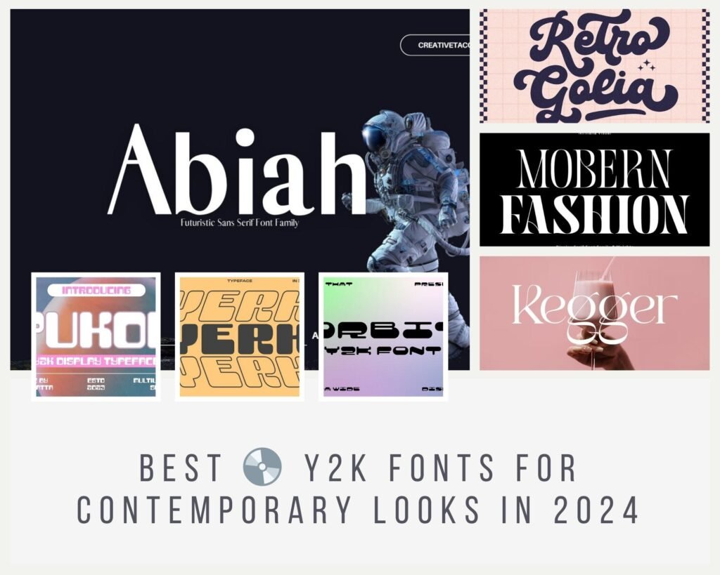
Popular Y2K Fonts
While countless fonts fall under the Y2K umbrella, some have become iconic for their bold, futuristic, or quirky style:
-
Orbit – Wide, rounded letterforms with strong contrasts, ideal for headlines.
-
Vercetti Regular – A geometric sans-serif font that combines minimalism with a futuristic edge.
-
Template Gothic – An experimental sans-serif font with organic shapes, reflecting the grunge and early digital era.
-
Espy Sans – Originally designed for Apple interfaces, blending readability with a tech-forward aesthetic.
-
Freestyle Script – A playful, informal script font reminiscent of casual 90s and early 2000s graphics.
These fonts can be creatively paired with simpler typefaces to maintain readability while highlighting the bold, retro-futuristic vibe.
How to Use Y2K Fonts in Modern Design
To make the most of Y2K fonts, it’s important to understand how to incorporate them effectively.
1. Establish Hierarchy
Use Y2K fonts for headings or focal points, pairing them with simpler, clean fonts for body text. This ensures your designs are eye-catching yet readable.
2. Color Matters
Vibrant neon colors, metallics, and gradients complement Y2K fonts. They enhance the retro-futuristic aesthetic and make your designs pop.
3. Balance Experimentation
While Y2K fonts encourage creativity, maintaining a balance is key. Avoid overloading designs with multiple experimental fonts, which can create visual chaos.
4. Consider the Medium
Test your fonts on different platforms, including screens of various sizes. Some Y2K fonts may appear distorted if scaled improperly, so always adjust kerning and spacing.
5. Incorporate Modern Elements
Blend Y2K typography with contemporary layouts, animation, or motion graphics. This approach bridges nostalgia with modern design sensibilities, making your work feel fresh and relevant.
Y2K Fonts in Branding and Marketing
Brands can use Y2K fonts to evoke nostalgia, establish uniqueness, and create memorable experiences.
-
Fashion: Clothing brands use bold Y2K fonts for logos, product labels, and promotional materials.
-
Music and Entertainment: Album covers, concert posters, and music videos frequently adopt these fonts for their edgy and futuristic look.
-
Digital Media: Social media campaigns, website headers, and app designs leverage Y2K typography to attract younger audiences.
By integrating Y2K fonts into marketing materials, businesses can convey energy, optimism, and creativity.
Tips for Choosing the Right Y2K Font
-
Know Your Audience: Younger audiences may respond better to playful or bold fonts, while older demographics may prefer cleaner, retro-futuristic styles.
-
Test Readability: Even the most visually striking Y2K fonts must remain legible across different sizes and screens.
-
Stick to One or Two: Avoid using too many experimental fonts in a single design to maintain cohesion.
-
Pair Strategically: Combine a Y2K font with a modern sans-serif or serif font for contrast and readability.
-
Stay True to Your Brand: Ensure the font aligns with your brand identity and the message you want to convey.
Read More: Helvetica Font: History, Usage, and Licensing Explained
Conclusion
Y2K fonts are more than just a nostalgic trend—they are a creative tool that bridges the past and the present. Their bold shapes, futuristic elements, and playful designs capture the spirit of an era when technology and style were merging in exciting ways. Today, they offer designers a chance to evoke nostalgia while staying relevant in modern design contexts.
By understanding the history, characteristics, and practical applications of Y2K fonts, creatives can make informed choices that enhance branding, digital content, and visual storytelling. Whether you’re designing for a fashion label, a music project, or social media content, Y2K fonts provide a versatile and engaging way to stand out. Embrace their retro-futuristic charm, experiment thoughtfully, and let your designs reflect the dynamic energy of the Y2K era in a way that resonates with contemporary audiences.
FAQs
-
What are Y2K fonts?
Y2K fonts are typographic styles popular around the year 2000, known for bold, futuristic, and experimental designs inspired by digital culture. -
How do I use Y2K fonts in my designs?
Use them for headings, pair them with simpler fonts, and complement them with vibrant colors or gradients for maximum visual impact. -
Are Y2K fonts suitable for branding?
Absolutely. They can convey energy, nostalgia, and creativity, making them ideal for fashion, entertainment, and digital brands. -
Can Y2K fonts be used for commercial projects?
Yes, but it’s essential to check the licensing of each font to ensure compliance with commercial use. -
Which Y2K fonts are most popular today?
Popular options include Orbit, Vercetti Regular, Template Gothic, Espy Sans, and Freestyle Script, each offering unique retro-futuristic styles.