Yard signs are one of the simplest and most effective communication tools. They work because they live in motion-heavy environments such as busy streets, sidewalks, storefronts, and neighbourhood lawns where people only have a second or two to absorb information. The font you choose determines whether that second becomes useful or wasted. A good font pulls the eye. A bad one gets lost in visual noise.
Designers know this, but many DIY sign creators underestimate how technical the typography decisions really are. Font families behave differently at scale. Stroke width affects visibility. Letter spacing alters perception. Weight influences legibility from a distance. The wrong combination reduces impact even if the message is strong.
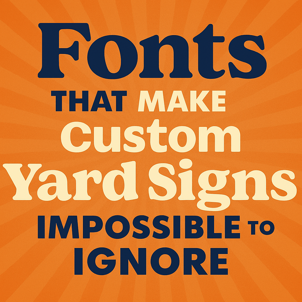
Below is a look at the fonts that work and the ones that fail when designing custom yard signs that actually get noticed.
Start With Legibility, Not Style
Legibility should always come before personality. The typeface must remain readable when someone drives past at 25–40 mph. Decorative fonts collapse under speed. Script fonts blur. Thin fonts fade under bright sunlight or low-contrast environments.
Sans-serif fonts outperform most alternatives because their shapes are cleaner. They also scale better across different materials like coroplast, metal, PVC, or assembled print panels. Their geometry resists distortion when placed outdoors.
Companies like Yard Sign Plus emphasise these basics because the industry understands a simple truth: the first job of a font is to be recognized instantly. Decorative choices come second.
Why Stroke Weight Determines Visibility
Stroke weight might be the most overlooked factor in sign design. Thin fonts disappear at distance. Ultra-bold fonts become unreadable when letters merge together visually. The goal is balance—thick enough to hold contrast, thin enough to preserve internal shapes.
Designers often use mid-weight or bold-weight variations of fonts like:
- Helvetica
- Futura
- Impact
- Franklin Gothic
- Gotham
- Montserrat
Each offers strong line weight without collapsing at long range. Impact is the most aggressive, but its compressed structure limits longer messages. Helvetica and Montserrat remain the most adaptable for varied sign sizes.
Stroke consistency also supports clarity. Avoid fonts with irregular thickness or ornamental endings. Those features create noise, not recognition.
Colour Contrast Makes or Breaks Font Performance
Contrast determines whether a font succeeds. The sign material, ambient light, and colour choices all matter. Designers follow a general rule: maximum contrast equals maximum speed of recognition.
High-performing colour combinations include:
- Black text on yellow
- White text on navy
- Black text on white
- Red text on white
- Yellow text on black
These combinations take advantage of strong luminance contrast, not just colour. Low-contrast combinations such as light grey on white, blue on green, red on black perform poorly because the letters visually blend.
Strong colour contrast increases legibility by reducing the brain’s decoding time. When people pass quickly, every millisecond counts.
Use Font Spacing to Protect Clarity
Spacing is not decorative. It is structural. Tight kerning makes letters blur together at distance. Excessive spacing breaks rhythm and slows reading. The goal is optical balance. Letters should feel unified but not touching.
Outdoor sign designers follow two key spacing principles:
- Increase tracking slightly for long-distance readability.
This prevents letters from merging visually. - Avoid ultra-tight letter spacing in condensed fonts.
Condensed fonts already compress shapes. Tight spacing makes them fail instantly outdoors.
A simple rule: if the sign must be readable from a moving car, loosen spacing.
Scale Based on Viewing Distance
The science of visibility is surprisingly exact. Designers rely on measurement formulas to determine ideal font height. A widely used rule from the United States Sign Council says one inch of letter height provides approximately 10 feet of readable distance.
So a 6-inch letter is readable from roughly 60 feet. A 10-inch letter reaches 100 feet. Smaller text is fine for sub-messages but not for primary messaging.
Yard signs often fail because the main message is too small. Prioritise hierarchy. The primary phrase like “For Sale,” “Vote,” “Now Hiring” should dominate the layout. Supporting text should remain secondary.
Choose Fonts That Hold Shape in Harsh Conditions
Outdoor environments distort typography. Sun glare, dust, shadows, and distance all work against clarity. Fonts must maintain distinct letterforms even when partially obscured.
Bold sans-serif fonts with predictable geometry perform best. Avoid thin scripts, distressed styles, or novelty fonts. They break apart in weather, blur at distance, and lose structure under glare.
Material choice also matters. Coroplast signs flex in wind. Metal signs reflect more light. PVC signs handle scale better. The font must survive these conditions without losing shape.
Why Simplicity Wins Every Time
When signs compete for attention on lawns, fences, intersections, or storefronts, simplicity wins. Viewers make split-second decisions. They won’t decipher complicated text or layered fonts.
A winning yard sign uses:
- One font family
- Two weights maximum
- Strong colour contrast
- Clean spacing
- A clear hierarchy
- Enough negative space for effortless scanning
Complexity slows recognition. Recognition is the whole point.
Conclusion
Typography is not decoration in yard sign design, it’s the core functional element. Fonts influence visibility, comprehension, and speed of recognition. High-performing signs use simple, bold, geometric fonts. They use structured weight and spacing. They maximize contrast. They scale appropriately for distance. And they treat legibility as a technical requirement, not a stylistic one.
When chosen correctly, the font becomes the engine of communication. When chosen poorly, even the smartest message disappears.