Bitter Font is one of those rare typefaces that quietly gets the job done—without demanding the spotlight.
In 2025, when good typography balances personality with performance, Bitter is leading the pack. You’ll find it everywhere: blogs, editorial sites, eBooks, academic platforms, and even clean mobile UI designs.
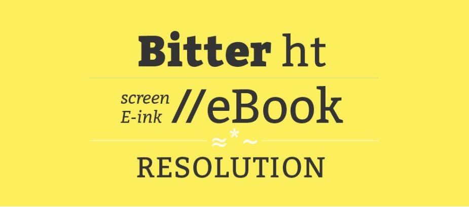
Why? Due to the purpose of this slab serif font, it was designed for optimal digital readability. Attention to detail in the intricacies of the font makes Bitter perfect for any long-form articles as well as structuring a brand in a minimalist manner. Above all, it brings style, structure and clarity, which are very important for any flawless design. It’s also incredible that it is open-source, free, and downloadable on Google Fonts.No fuss. Just solid design.
What is Bitter Font?
Sol Matas designed Bitter Font for Huerta Tipografica, an Argentine independent type foundry. Because Huerta Tipografica Fonts expected users would read them digitally, Bitter Font’s each character, serif, and curve were purposefully crafted.
Bitter is a slab serif typeface. Though it remains true to the category’s heritage, it is much more approachable and less formal than other slab serifs. It is a hybrid digital-age and a classic font.
Quick facts:
- Available as a Google Font
- Styles: Regular, Bold, Italic + Variable Font
- Constantly updated for performance and readability
Key Features of Bitter Font
Slab Serif Design: With its powerful affine vertical strokes and solid serifs, Bitter bestows text with a balanced and stable appearance.
Humanist Touch: It is more approachable than other slab serifs due to a gentle softness found in its curves and letterforms.
Readability First: Spacing and weight are optimized for clarity, whether on a smartphone or a large monitor.
Variable Font Ready: With Bitter variable font, responsive typography is possible, adapting text seamlessly across devices.
Multi-language Support: Perfect for projects worldwide with varying linguistic requirements.
OpenType Features: Supports ligatures, stylistic alternates and more.
Applications of Bitter Font in 2025
If you’re wondering where you can use Bitter Google Font, the answer is: almost everywhere.
- Blogs and News Websites: Its clean lines and high legibility make it perfect for long-form content.
- eBooks and Educational Platforms: Designed for reading on screens, Bitter is a go-to font for academic and instructional design.
- UI/UX and Mobile Design: The variable font version makes it ideal for responsive apps and websites.
- Branding and Identity: Pair it with a clean sans-serif (like Montserrat or Lato), and you’ve got a modern, trustworthy look.
- Creative Tools: Works smoothly in Figma, Adobe XD, Canva, and WordPress.
Fun fact: According to a 2024 UX survey by Smashing Magazine, 61% of designers said they prefer slab serif fonts like Bitter for digital body text due to improved scan-ability.
Bitter Font Free Download
Getting your hands on Bitter Font is as easy as making coffee.Here is how you can download bitter font for free.
Font Pairing Suggestions
Pairing Bitter Font with the right counterpart can create stunning results. Here are some winning combos:
- Bitter + Open Sans: A clean, modern serif/sans pairing for blogs.
- Bitter + Montserrat: Perfect for tech brands and editorial sites.
- Bitter + Roboto: A balanced design for apps and user interfaces.
Pro Tip: Use Bitter for body text and the sans-serif for headers to guide reader flow naturally.
Conclusion: Why Bitter Font Works So Well in 2025
In a design world where flashy often overshadows functional, Bitter Font proves that clarity never goes out of style.
It’s dependable, readable, and versatile—a true workhorse of modern typography.
If you’re a designer, developer, or content creator who wants to build trust, communicate clearly, and look good doing it, Bitter Font should be in your go-to type stack.
At y2kfonts, we often recommend Bitter Font to creatives who value function as much as aesthetics. So go ahead—give it a shot. Whether you’re crafting your next UX case study, building an online course, or launching a design portfolio, Bitter might just be the friendly serif your work has been missing.