Chick-fil-A Font: Introduction
Chick-fil-A font captures more than just words. It showcases the brand’s personality. The famous red cursive writing and the funny “Eat Mor Chikin” cow writing are just part of what makes the design feel friendly and southern. This friendly southern design quickly connects with customers and makes the brand unforgettable.
However, what font does Chick-fil-A truly use? The answer requires some more context than you might expect. In this article, we shall diagnose the font style used at Chick-fil-A, as well as, the font style used for the Eat Mor Chikin Campaign.
What font does Chick-fil-A use?
Chick-fil-A Logo Font
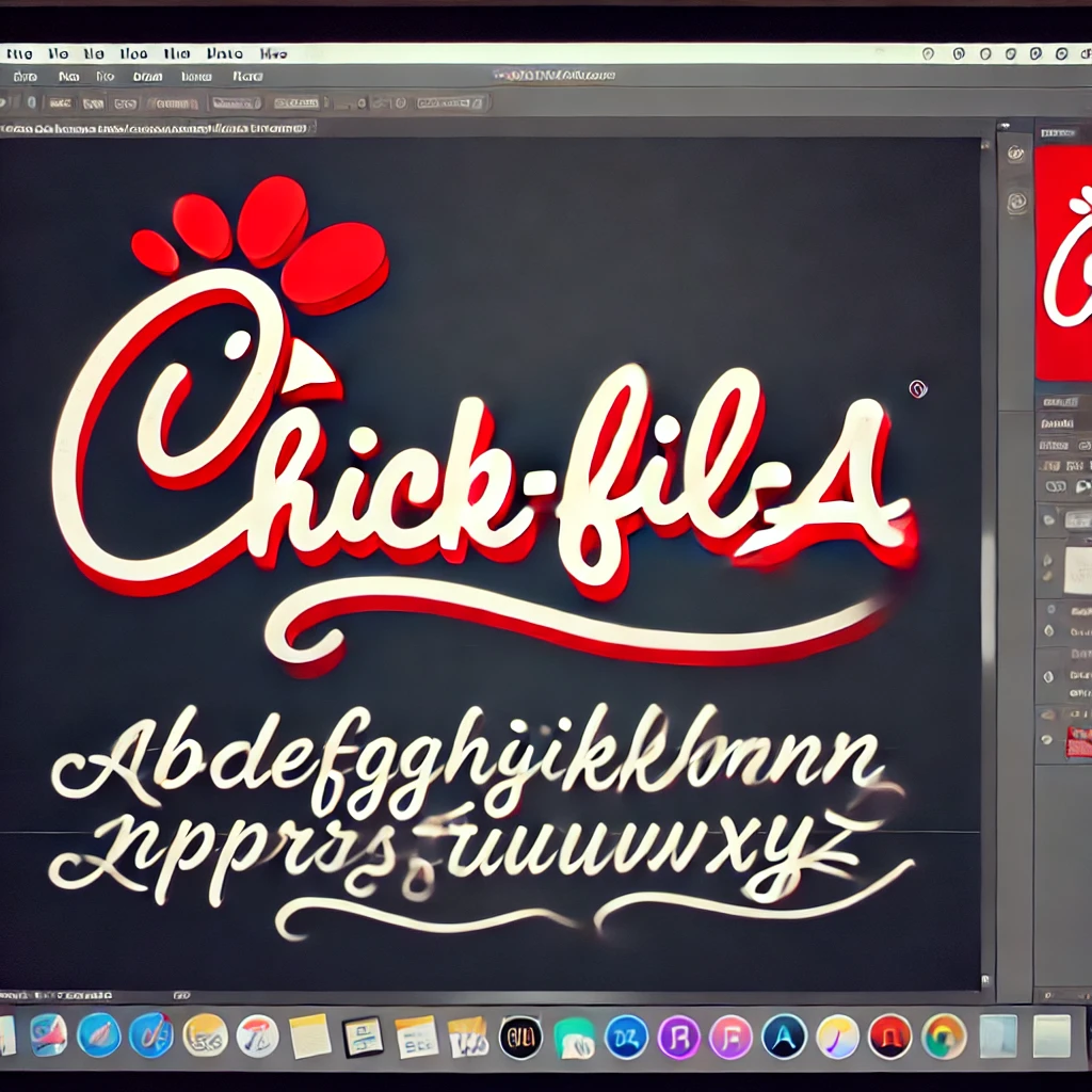
The Chick-fil-A logo is not made up of any commercial font. Rather, it is a fully fledged custom script logo — a wordmark drawn by hand exclusively for Chick-fil-A. Its signature chicken “C,” paired with the flowing, calligraphic style with smooth curves, captures the essence of its ever recognizable mark.
Chicken Hut font closely looks like the Chick-fil-A logo.
The “Eat Mor Chikin” Font
Besides their main logo, Chick-fil-A is also well known for the 1995 advertisement slogan, “Eat Mor Chikin.” Advertised by The Richards Group, the slogan became popularized through the commercials depicting cows with signs. The campaign became one of the most memorable ads in fast-food history.
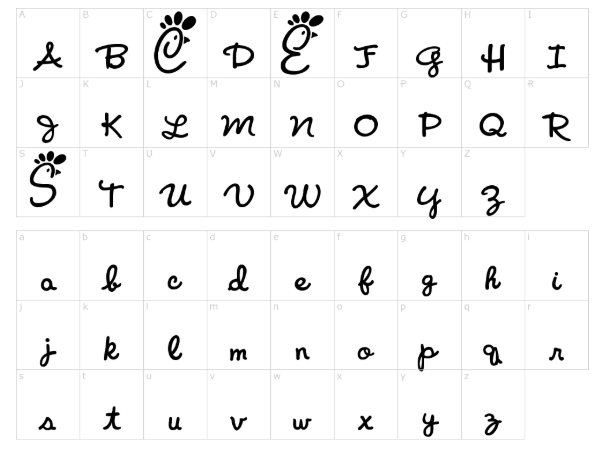
Font-Fli-A font created by FontGrill is very similar to the slogan lettering.
Features of the Chick-fil-A Font
- Handwritten Calligraphy Style
The font is a cursive script typeface that copies hand-drawn lettering. This gives it a personal, friendly, and approachable feel, reinforcing the brand’s emphasis on customer service and hospitality.
- Bold and Flowing Strokes
Each letter is crafted with smooth curves and connected strokes, creating a natural and flowy appearance. The bold strokes enhance visibility and readability, making the logo stand out on signage, packaging, and advertisements.
- Playful and Whimsical Design
Not likely to be formal cursive fonts, Chick-fil-A’s typography has a playful and slightly irregular design. The letterforms are designed to evoke warmth and familiarity, aligning with the brand’s Southern origin.
- Distinctive Chicken Outline in the ‘C’
A signature element of the Chick-fil-A logo is the stylized chicken head incorporated into the letter ‘C’. This creative design choice reinforces the company’s focus on quality chicken-based products.
- Red and White Color Scheme
Although not a feature of the typeface itself, the Chick-fil-A brand pairs its typography with a red and white color scheme, symbolizing energy, passion, and cleanliness.
Applications of the Chick-fil-A Font
- Company Logo
The most famous logo font striking on restaurant signage, packaging and advertising materials is the Chick-fil-A logo.
- Restaurant Signage and Menu Boards
The font appears on storefronts, menu boards, and in-store promotional materials, reinforcing brand consistency across all locations.
- Marketing and Advertising Campaigns
From TV commercials to print ads Chick-fil-A’s font plays a significant role in branding work making marketing messages more engaging and memorable.
- Product Packaging
The company uses its signature font on bags, cups, and wrappers to create a unified branding experience for customers.
- Social Media and Digital Presence
On platforms like Instagram, Twitter, and Facebook, Chick-fil-A embody its typography into digital graphics and promotional banners and social media posts.
Alternatives to the Chick-fil-A Font
How to Use Chick-fil-A-Inspired Fonts
If you want to incorporate a font similar to Chick-fil-A’s in your designs, consider these best practices:
- Use It for Branding and Logos
Script fonts work well for logos, especially in food, hospitality, and entertainment industries. Pair them with complementary sans-serif fonts to maintain balance.
- Pair with Simple Fonts
Pairing script fonts with sans-serif fonts like Lato, Open Sans, or Montserrat is the best combination for body text.
- Maintain Readability
Avoid using script fonts in long paragraphs or small font sizes, as they can reduce readability. Instead, use them for headlines, logos, and short branding messages.
- Stick to a Limited Color Palette
Chick-fil-A successfully pairs its typography with a red and white color scheme. When using similar fonts, ensure your color choices complement the design rather than overwhelm it.
- Consider Customization
If you’re creating a unique brand identity, consider customizing script fonts to add distinctive elements, much like Chick-fil-A’s signature chicken head incorporated into the “C.”
Conclusion
The Chick-fil-A font both establishes brand recognition along with delivering a nurturing brand identity to customers. The written calligraphy design linked with forceful brushstrokes and whimsical brand representation, establishes a welcoming environment that captures authentic Southern hospitality. The exact proprietary font used by Chick-fil-A remains unavailable but designers can use substitute fonts to match its visual style.
Project design work at restaurants or marketing materials and brand assets benefit from script fonts that share characteristics with Chick-fil-A branding. Following the best typography principles enables you to design attractive visual content that will engage your target audience.
Explore our BD Fazer Font Free Download