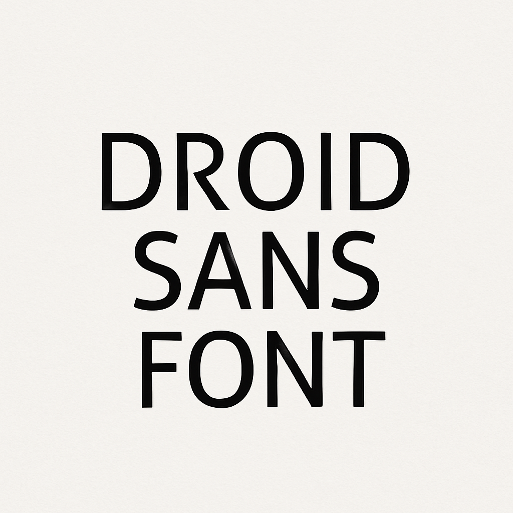
Droid Sans Font: Introduction
Whether it is the digital era, and screen real estate and performance are paramount, few fonts have endured the way Droid Sans has. Mobile first, Droid Sans contributed to defining our screen reading behavior, particularly within the Android environment.
Droid Sans is a humanist sans-serif typeface face designed by Steve Matteson in 2007 as a part of the Android platform of Google. It is a part of Droid font family that also has Droid Serif and Droid Sans Mono. Droid Sans is a font specifically designed as a mobile user interface and is readable, legible, and technically accurate.
The History of Droid Sans Font
Unlike Apple’s iOS, which relied considerably on Helvetica, Google desired a typeface that was optimized for use on small screens and highly readable, with open counters and warm but professional characters.
To address this requirement, Google Contracted Steve Matteson, an eminent type designer who is also the Director of Type Design at Ascender Corporation. Matteson had earlier created fonts used by Microsoft (such as the Segoe UI used in Windows Vista) and was highly knowledgeable about screen-optimized types.
Google published Droid Sans under the Apache License, and it is free and open-source.
Key Features of Droid Sans Font
Droid Sans was designed with intentional precision to work in digital contexts. Here’s a breakdown of its defining characteristics:
1. Humanist Design
The typeface is inspired by humanist sans serif such as Frutiger and Myriad. This makes it approachable, friendly, not as mechanical as geometric sans serifs such as Futura.
2. Open Apertures
Droid Sans has wide openings in letters such as e, c, and s, which improves legibility, especially on low-resolution or small screens.
3. Tall x-Height
A generous x-height ensures better readability at small sizes by making lowercase letters more distinguishable.
4. Minimalist Detailing
Strokes are even and smooth, with little contrast, helping the font render clearly across different resolutions and pixel densities.
5. Optimized for Screens
Every aspect—from stroke width to spacing—was tuned for digital environments, ensuring clarity in UI elements, app interfaces, and web typography.
Droid Sans Font Free Download
You can download this font via the link given below.
Applications of Droid Sans Font
While Droid Sans was created for Android, its utility has expanded across a wide range of digital and design contexts:
1. Mobile Operating Systems
Millions of smartphones worldwide displayed Droid Sans as the system font as the default font in early Android versions (1.0 to 4.0 Ice Cream Sandwich). It was instrumental in making mobile interface more legible and easy to use.
2. Web Design
With its open-source license and great legibility, Droid Sans has found its place in every website which needs clean and readable UI elements particularly in navigation menus, body text and form inputs.
3. User Interfaces and Apps
Its screen-first design makes Droid Sans ideal for:
- App interfaces
- Embedded devices
- Wearables
- Dashboards
4. Corporate Design
Brands that aim for a clean, tech-forward image use Droid Sans in product design, reports, and internal communications.
5. Print and Branding
Despite being optimized to be used on a screen, Droid Sans may be successfully applied to print (flyers, posters, brochures, etc.), particularly when the modern and accessible look is to be achieved.
Alternatives and Competitors to Droid Sans Font
Depending on your project’s design goals, several other fonts offer similar utility with subtle stylistic differences. Here are a few noteworthy alternatives:
1. Roboto
Roboto, also created by Google, became an Android 4.0 and later replacement of Droid Sans. It kept the open form of Droid Sans, but introduces more mechanical rhythm and vertical stress, allowing it to be more cross-platform-compatible.
Best for: Android apps, mobile design, modern UI/UX.
2. Open Sans
Designed by Steve Matteson as well, Open Sans is a more rounded and neutral alternative, widely used on the web due to its excellent legibility and neutrality.
Best for: Corporate websites, apps, blogs.
3. Noto Sans
The Noto Sans font was constructed to accommodate every language in the world, within the Google Noto font family. It is screen-optimized (and thus neutral) in design similar to Droid Sans, but supports a broader range of languages.
Best for: Multilingual platforms, international applications.
4. Segoe UI
Used extensively by Microsoft, Segoe UI shares similarities with Droid Sans regarding humanist inspiration and screen optimization.
Best for: Windows-based applications and corporate environments.
5. Helvetica Neue
Not free, not open-source, but for many years Helvetica Neue has been a default system font for legible and nice-looking typography, particularly in iOS interfaces.
Best for: High-end branding, print design, modern UI.
Conclusion
Android might have started with the silent font on the side, Droid Sans but its history is not in any way miniature. It paved the way to a new era of performance-conscious, readable digital typography and remains popular with designers and developers wanting clarity, performance, and the freedom of an open source license.
In the design of mobile applications, the development of accessible websites, or the interfaces that will be used by people across the globe, Droid Sans offers a good combination of humanist appeal and technical functionality. Still, it is a silent, self-confident workhorse, clean, competent, and greatly respected in a world where types come and go.