Dune Font-Introduction
In this single typeface concept design project, what if explaining mystery, power and futuristic elegance is possible with just one click? The font named Dune has been created to support texts and invites readers into the fabulous world of the well-known Dune series.
The font design of the titles ‘Dune’ in both 2021 and 2023 is not a font but a logo based on the Unified Canadian Aboriginal Syllabics with a Unicode stylization: ᑐ ᑌ ᑎ ᕮ.
However, a font referred to as “Dune Rise”, a typeface that looks conspicuously like the Dune logo, has been designed by Jesta Designs. This font was created to resemble the film’s title, its shapes borrowed from the Unicode characters of the Unified Canadian Aboriginal Syllabics at first.
Dune Rise Font Free Download
Ready to explore the world of Arrakis with the Dune Rise font? Click the button below to initiate a free download and unlock the secrets of this unique typeface.
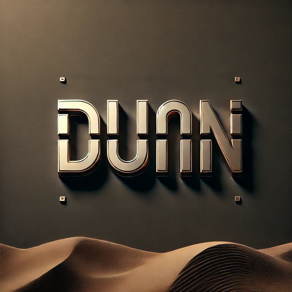
Features of the Dune Font: What Makes It Stand Out?
The Dune font is a study in balance—blending ancient mysticism with futuristic clarity. Here’s what makes it a designer’s dream:
Geometric Precision
Each letter features sharp angles and clean, symmetrical lines that reflect a futuristic, technologically advanced world.
Minimalist Aesthetic
The font embraces simplicity, stripping away unnecessary details to allow its stark beauty to shine.
Organic Flow
Despite its geometric core, the font has an almost organic rhythm, reflecting the desert landscapes of Arrakis.
Timeless Elegance
Unlike overly stylized fonts, the Dune font maintains a timeless appeal, making it adaptable to various projects.
Why the Dune Font Resonates
What makes the Dune font stand out is that it is also a narrative. They don’t care about the name or identify it as a specific brand of typeface; it is an emotional journey in this regard. If included in the frames of the film’s poster, it provided the audience with the thrill, intrigue, and scale of the plot in Dune at once.
This font resonates because it speaks to human emotions. Its minimalist approach leaves room for interpretation, while its sharp lines suggest precision and power. For designers, it’s a reminder of how typography can elevate storytelling.
Applications of the Dune Font
The Dune font has transcended its role as a branding element for the film, finding a home in diverse creative projects. Here’s where you can use it:
Movie Titles and Posters
The cinematic appeal of the font makes it perfect for film titles, posters, and promotional materials.
Book Covers
For science fiction or fantasy novels, the Dune font can instantly captivate readers and hint at an epic narrative.
Tech Branding
The font fits technology companies and start-ups to enhance its modern vision since it extends the futuristic concept.
UI/UX Design
It is somewhat rigid and ideal for flat design for applications, web-based tools, and command panels.
Event Branding
From comics to boldly going where no man has gone before with the latest sci-fi fan con to introducing new products to the market, Dune font is perfect for business letters. It makes the general tone of chosen directions Creative.
Merchandise
Everything from clothing to posters, the font makes branded products and items look much more classy.
What If You Can’t Use the Dune Font?
While the official Dune font isn’t widely available for commercial use, there are excellent alternatives that evoke a similar vibe:
Orbitron
Orbitron is a futuristic style timeless sans-serif typeface with sharp cutting angles and balanced forms.
Eurostile
This is a geometric font and appears to be quite traditional in its classification, and thus is very much in use by designers..
Neuropol
With its rounded, minimalist shapes, Neuropol captures the modern elegance of the Dune font.
Exo 2
This dynamic sans-serif font offers multiple weights, giving designers flexibility for creative projects.
Space Grotesk
Combining simplicity with a futuristic touch, Space Grotesk is ideal for branding and digital designs.
Why Graphic Designers Love the Dune Font
For graphic designers, the Dune font is more than just an aesthetic choice—it’s a tool for evoking emotion and creating immersive visuals. Here’s why it’s so beloved:
- Versatility: The font’s clean lines work across various mediums, from print to digital.
- Emotional Impact: It sets a tone of mystery, sophistication, and power, aligning perfectly with sci-fi themes.
- Timelessness: While trendy fonts may fade, the Dune font’s minimalist elegance ensures its lasting appeal.
Tips for Using the Dune Font in Your Projects
If you’re fortunate enough to use the Dune font or a similar typeface, here are some tips to maximize its impact:
- Pair It Wisely: Match it with simple sans-serif or serif fonts for a balanced look.
- Focus on Contrast: Use the Dune font for headlines and pair it with lighter fonts for body text.
- Keep It Minimal: Allow the font to shine by avoiding cluttered designs.
- Think Sci-Fi: Use futuristic imagery and colour palettes to enhance the font’s thematic appeal.
Enduring Legacy of the Dune Font
The font of the Dune series speaks volumes about the role of typography in dictating the flow of a story. Beyond being a word – it becomes a graphic symbol that delivers the reader to a realm of imagination, magic, and fantastic tales.
To the graphic designers, the font is a reinforcement of the typographic capabilities on projects to not only provide aesthetics, but emotional depth as well. Whether you are working on material for a science fiction or a tech poster, for a tech brand’s logo, or for a simple but sleek UI, the Dune font or a font very similar will do wonders.
So, next time you start a creative work, look at the fiasco of the Dune font. Typography should not just be words on a screen or on paper; typing should speak of something, elicit passion, and stir hearts.