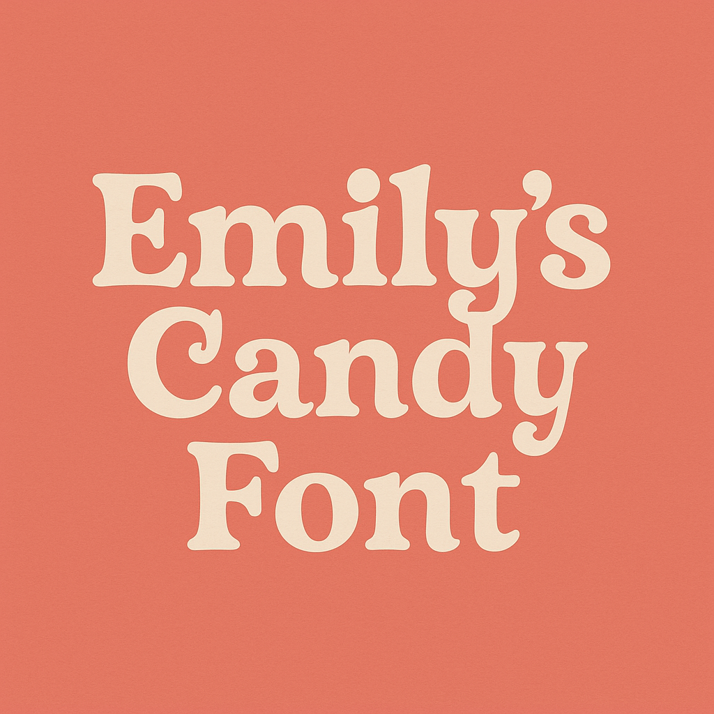
The Emily Candy font is distinctive and grabs attention with its playful nature and retro look, making it suitable for producing playful designs. Typography, nevertheless, is not a text, but it determines how the words should be displayed, how it offers a personality and a sense. A typeface may ruin or form a design, whether it is a cover of a book for children, a candy, or a Christmas invitation.
Overview of Emily’s Candy Font
The display text design of Emily’s Candy combines sophisticated elements with playful characteristics. This font stands out with its dynamic shapes and elegant swirls as well as strong reading capabilities that attract designers who need contemporary or vibrant or vintage designs. Emily’s Candy functions excellently in branding and editorial work and also serves logos as a powerful design element which combines playful charm with refined elegance.
- Font style: Display / Decorative
- Designer: Crystal Kluge
- Foundry: Neapolitan (via Google Fonts)
- Release: Made publicly available through Google Fonts
- License: Open Font License (free for personal and commercial use)
History and Origins of Emily’s Candy Font
The visual designer, Crystal Kluge, created Emily’s Candy due to her established reputation for creating beautiful, hand-lettered, and fun fonts. All the fonts in her portfolio successfully capture feelings of emotion while also conveying charm and creativity due to which Emily’s Candy perfectly fits this description.
Its creation as part of Neapolitan series later led to its addition in Google Fonts library driving substantial growth of popularity. The font found wide usage in various projects because it creates friendly visual appeal which children and adults can enjoy together.
Emily’s Candy originated from vintage sweets branding which inspired her to replicate the look of handwritten bakery signage from old-fashioned bakeries and ice cream shops.
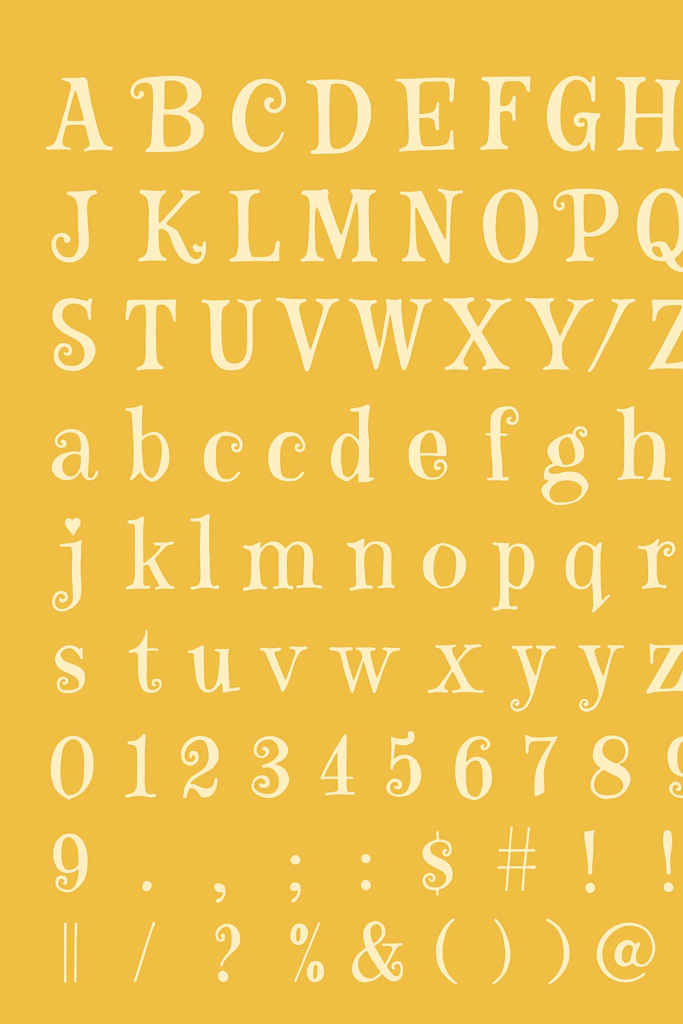
Key Features of Emily’s Candy Font
What sets Emily’s Candy apart from other display fonts? Here are some of its defining characteristics:
1. Curvaceous Letterforms
The letters have bold strokes with beautiful curves and curls giving the letters an exciting and cheerful look that yells through in the headlines and titles.
2. Distinct Uppercase Design
The capital letters are particularly fancy, not so much as to lose clarity, a kind of flourish, so to speak, that is best suited to short, forceful phrases.
3. Retro and Handwritten Feel
It directs a nostalgic quality akin to hand-drawn letters of the middle of-century advertisements that would make it ideal in vintage-inspired designs.
4. Excellent Legibility for a Display Font
Despite its decorative style, Emily’s Candy maintains good legibility even at smaller sizes — a rarity for fonts in this category.
5. Language Support
Emily’s Candy supports multiple Latin-based languages, making it a versatile choice for international projects.
6. Google Fonts Integration
Being available on Google Fonts ensures that the font is:
- Easy to embed in web projects
- Free for both commercial and personal use
- Optimized for web performance
Emily’s Candy Font Free Download
You may acquire the font using the below link without limitations for both personal and commercial needs.
Practical Applications of Emily’s Candy Font
Emily’s Candy isn’t your average workhorse typeface, but it shines brilliantly in the right contexts. Here’s where this font excels:
1. Children’s Media and Products
It has a happy and friendly appearance that suits children books, educative books, games, and toy boxes.
2. Food & Beverage Branding
Invitations to a birthday, baby shower and other festive occasions, where you desire to transfer fun and celebration can be done using Emily Candy.
3. Greeting Cards and Invitations
Use Emily’s Candy for birthday invitations, baby showers, and festive events where you want to convey celebration and fun.
4. Social Media Graphics
With its high visual appeal, Emily’s Candy is perfect for designing catchy social media posts and highlight covers, especially on platforms like Instagram and Pinterest.
5. Logos and Signage
It’s great for branding that wants to appear friendly, retro, and handcrafted — think boutique brands and creative startups.
6. Web Design
When used sparingly (e.g., headers, banners, or CTA buttons), it can make a web page pop with personality.
Read more: Wendy’s Font
Tips for Using Emily’s Candy Font Effectively
- Pair it with a simple sans-serif font (like Montserrat or Lato) to maintain readability in body text.
- Use sparingly. As a display font, Emily’s Candy is meant for emphasis, not paragraphs.
- Stick to large sizes. The ornate features shine brightest in headers, titles, and labels.
- Mind your contrast. The font’s curls can get lost on cluttered or low-contrast backgrounds.
Alternatives to Emily’s Candy Font
If you love the concept behind Emily’s Candy but want to explore similar options, here are some worthy alternatives:
1. Lobster
Designed by Pablo Impallari, Lobster is another bold, retro script font that’s widely used for food and retail branding.
2. Pacifico
With a carefree vibe, Pacifico offers a smoother, more rounded look while still channeling a playful tone.
3. Grand Hotel
A more refined and elegant script that retains vintage charm without the same level of flourish.
4. Fredoka One
A bubbly sans-serif that pairs well with playful themes and offers a cleaner, modern look.
5. Baloo 2
A rounded display font with an Indian influence, perfect for vibrant, multicultural projects.
6. Amatic SC
For a handwritten yet structured look, Amatic SC is a fun alternative, especially in headers or poster designs.
Conclusion
Font Emily’s Candy represents a refreshing change from the numerous bland, utilitarian fonts that dominate the design environment. Emily’s Candy creates an enchanting typeface that blends welcoming qualities with an explorative character, precisely what you need for your creative design needs.
The joy-filled and warm expression in this font makes it an excellent choice when selecting a typeface. This easy font design method lets you easily enhance your visual projects.