Introduction
Helvetica is one of the most recognizable and widely used typefaces in the world. From subway signage to corporate logos, its clean, balanced, and timeless appearance has made it a universal favorite among designers, brands, and everyday users. Originally designed in 1957 in Switzerland, Helvetica embodies simplicity and modernity — qualities that have helped it remain relevant for more than six decades.
This article explores everything you need to know about Helvetica: how it was created, why it became so iconic, the right way to use it, licensing essentials, and smart alternatives. Whether you are a graphic designer, brand strategist, or content creator, understanding Helvetica’s origins and best practices will help you use this classic font with confidence and professionalism.
The Origin of Helvetica Font
Helvetica began its journey in 1957 when Swiss typeface designer Max Miedinger, under the guidance of Eduard Hoffmann, developed a new sans-serif typeface for the Haas Type Foundry. The goal was to modernize and refine earlier grotesque typefaces, especially Akzidenz-Grotesk, by creating a clean, neutral, and highly legible design.
Originally called Neue Haas Grotesk, the typeface was later renamed Helvetica, derived from Helvetia, the Latin word for Switzerland. The new name gave it international appeal and positioned it as a symbol of Swiss precision and clarity. Helvetica quickly gained global attention, becoming the visual language of modern design and corporate communication.
The Rise of a Global Typeface
During the 1960s and 1970s, Helvetica’s popularity skyrocketed as it became the go-to typeface for modernist designers and major brands. Its simple geometry and balanced proportions aligned perfectly with the principles of the International Typographic Style, also known as Swiss Design.
Governments, corporations, and transportation systems embraced Helvetica for its readability and neutrality. The typeface appeared in countless logos, advertisements, posters, and even public signage. It became synonymous with trust, clarity, and efficiency — values many organizations wanted to convey.
Brands such as BMW, American Airlines, and Panasonic used Helvetica in their identities, while the New York City Subway system adopted it for its signage, proving that Helvetica worked equally well in both corporate and public environments.
Key Characteristics of Helvetica
Helvetica’s enduring success can be traced to its design features, which balance beauty and practicality.
-
Neutral Appearance
Helvetica was designed to be objective — it doesn’t express emotion or style. Its neutrality allows content to take center stage without distraction. -
Clean Geometry
The typeface features even stroke widths, tight spacing, and clean terminals, giving it a perfectly balanced structure that feels both modern and timeless. -
High Legibility
The uniform shapes and consistent letter spacing make Helvetica easy to read at almost any size. It performs well in both print and digital formats. -
Wide Family Range
Over the years, Helvetica has evolved into a large family with multiple weights and styles — from Light to Bold, Condensed to Extended. -
Visual Consistency
Its symmetrical and proportionate design ensures that text looks harmonious, even across different mediums and scales.
Why Designers Love Helvetica
Designers favor Helvetica for several compelling reasons:
-
Timeless Design: It’s modern yet classic, fitting any era or context.
-
Versatility: Works well for logos, headlines, signage, and body text.
-
Professional Look: Its clean structure conveys trust, reliability, and sophistication.
-
Cross-Platform Use: Available on most operating systems and design software.
-
Adaptability: Looks equally good in minimalist, corporate, or editorial designs.
This flexibility makes Helvetica an essential part of any designer’s toolkit.
Limitations and Criticisms
Despite its strengths, Helvetica is not without its critics.
-
Overuse: Its ubiquity has led to visual fatigue; some designers find it too predictable.
-
Limited Personality: Its neutrality can make it feel cold or impersonal in expressive designs.
-
Tight Spacing: The dense spacing can reduce readability at small sizes.
-
High Licensing Costs: Helvetica is a commercial font, and proper usage requires paid licensing, which can be expensive for individuals or small studios.
These drawbacks have encouraged the creation of modern alternatives that preserve Helvetica’s clarity but improve flexibility and accessibility.
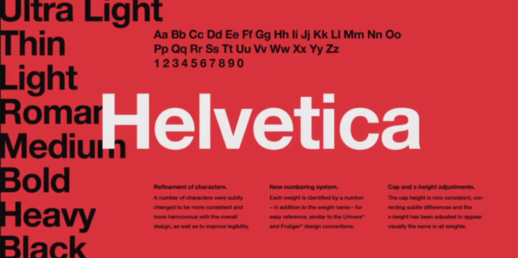
Helvetica Now: A Modern Update
In 2019, Monotype introduced Helvetica Now, a redesigned version optimized for today’s digital and print environments. This new release includes three subfamilies — Text, Display, and Micro — each fine-tuned for specific use cases.
-
Helvetica Now Text improves readability for body copy.
-
Helvetica Now Display is ideal for large titles and headlines.
-
Helvetica Now Micro is optimized for small screens and low-resolution displays.
This redesign refines spacing, kerning, and optical adjustments while preserving the original Helvetica spirit. It represents a thoughtful evolution of a timeless classic.
Best Practices for Using Helvetica
To make the most of Helvetica’s potential, consider these professional design guidelines:
-
Choose the Right Weight:
Use lighter weights for large titles and heavier weights for emphasis or small text. Avoid mixing too many weights in one layout. -
Adjust Spacing:
Helvetica often benefits from slightly increased tracking (letter spacing) and generous line height for improved readability. -
Pair Wisely:
When pairing Helvetica with another font, choose a serif typeface like Times New Roman or Georgia for contrast. Avoid pairing it with similar sans-serifs that compete visually. -
Use for Clear Communication:
Helvetica works best in contexts that demand neutrality, clarity, and professionalism — corporate materials, signage, reports, and minimalist branding. -
Don’t Overuse It:
Because Helvetica is so familiar, using it everywhere can make your design look generic. Use it intentionally and sparingly for maximum impact.
Licensing Helvetica: What You Need to Know
Helvetica is not a free font. It’s owned by Monotype and must be licensed properly for commercial use. Licensing covers different usage types, such as:
-
Desktop License: For local installation and print design.
-
Web License: For embedding Helvetica on websites.
-
App License: For including the font in mobile or desktop applications.
-
Broadcast or eBook License: For digital distribution or publishing.
Licenses are typically purchased per style (Regular, Bold, Italic, etc.) and per user or device. Using Helvetica without a valid license may violate copyright law and could lead to legal consequences.
If you only display Helvetica in rasterized images (like PNGs or PDFs), you usually don’t need a license because the text is not live or editable. However, for web or app embedding, always secure the proper license.
Free Alternatives to Helvetica
If Helvetica’s licensing cost is a barrier, several open-source fonts offer similar aesthetics:
-
Roboto: A versatile, modern sans-serif designed by Google.
-
Nimbus Sans: A close alternative inspired by Helvetica’s proportions.
-
Arial: Commonly pre-installed and visually similar to Helvetica.
-
DM Sans: Clean, friendly, and free for commercial use.
-
Inter: Designed for screens with improved readability at small sizes.
These alternatives allow designers to achieve a comparable look without worrying about licensing restrictions.
Famous Uses of Helvetica
Helvetica has appeared in countless iconic designs and systems, including:
-
New York City Subway Signage: Chosen for its clarity and easy legibility.
-
Corporate Logos: Used by brands such as BMW, Lufthansa, Panasonic, and American Airlines.
-
Government Communication: Adopted for official documents and wayfinding systems worldwide.
-
Graphic Design and Advertising: Its neutrality supports bold imagery and layouts without distraction.
Its widespread presence across industries demonstrates its universal appeal and effectiveness in conveying professionalism.
Common Mistakes When Using Helvetica
-
Ignoring Spacing Adjustments: Tight letter spacing can hurt readability, especially on screens.
-
Using Unlicensed Copies: Downloading Helvetica from unauthorized sources is illegal and risky.
-
Poor Font Pairing: Pairing Helvetica with similar sans-serifs can make designs feel flat.
-
Overreliance on Helvetica: Using it for every project can reduce brand distinction.
-
Neglecting Brand Tone: Helvetica might not fit brands seeking warmth, creativity, or vintage appeal.
Avoiding these mistakes ensures Helvetica enhances rather than diminishes your design.
Read More: AaryaEditz.org Everything You Need to Know (2025 Guide)
Conclusion
Helvetica’s timeless design, Swiss precision, and global influence have secured its place as one of the most important typefaces in history. Its clean geometry, neutrality, and versatility make it ideal for projects that demand professionalism and clarity. Yet, its very popularity requires careful, thoughtful use. Overuse can dull its impact, and ignoring licensing rules can lead to complications.
When used responsibly—with proper spacing, appropriate context, and valid licensing—Helvetica remains a reliable, elegant choice for brands and designers worldwide. And for those seeking a similar feel without the cost, free alternatives provide accessible options that maintain the spirit of clarity and modern design. Helvetica isn’t just a font; it’s a design philosophy that continues to shape visual communication across generations.
FAQs
1. What is Helvetica font?
Helvetica is a sans-serif typeface designed in 1957 by Max Miedinger and Eduard Hoffmann. Known for its clean, modern, and neutral style, it’s one of the most widely used fonts in the world.
2. Can I use Helvetica for free?
No. Helvetica is a commercial font that requires a purchased license for most uses, including web, print, and apps.
3. Why is Helvetica so popular?
Helvetica’s popularity stems from its balance, readability, and timeless design. It conveys professionalism and clarity, making it a favorite for corporate and public design.
4. What is Helvetica Now?
Helvetica Now is a modernized version of the original font, optimized for digital and print environments. It offers improved spacing and readability.
5. What are some free alternatives to Helvetica?
Free fonts such as Roboto, DM Sans, Inter, and Nimbus Sans offer similar aesthetics and are available for personal and commercial projects.