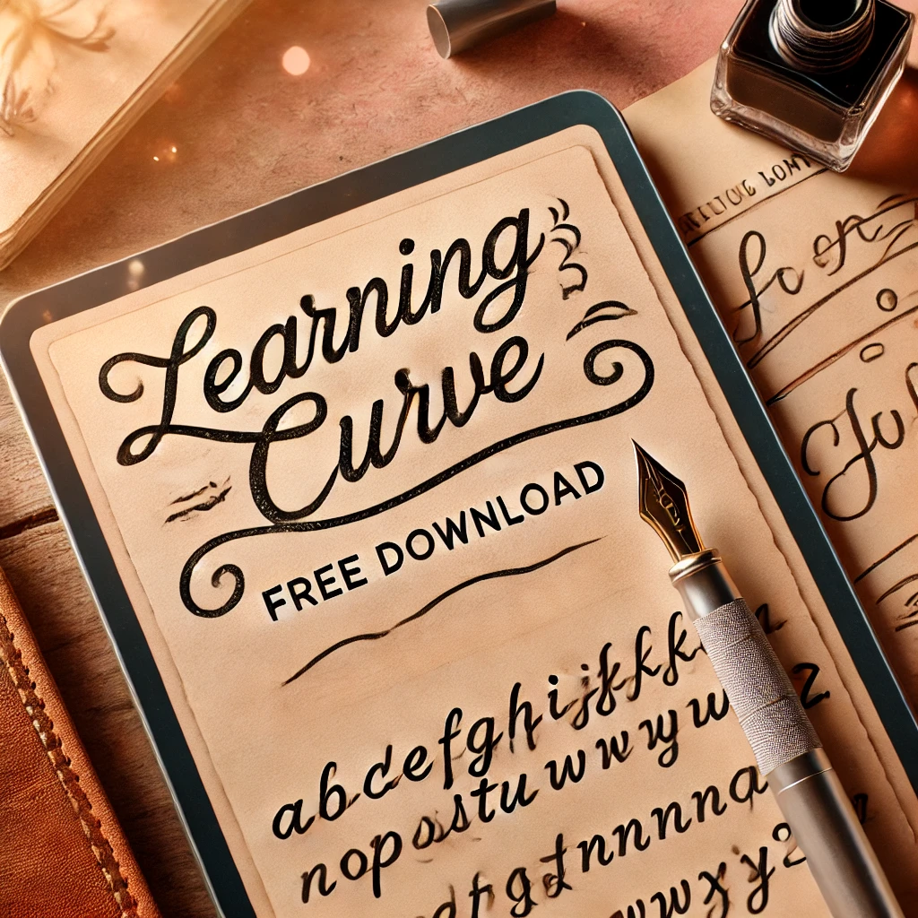
Learning Curve Font is one of numerous font options because it presents an elegant script-style handwritten appearance. It delivers both sophisticated appeal and easy readability, which suits educational creations, wedding invitations, and corporate brand development.
Overview of the Learning Curve Font
The Learning Curve Font presents itself as a casual handwritten typeface that duplicates the appearance of cursive script. Jess Latham developed this font through Blue Vinyl Fonts and it expresses a comforting aura combined with a welcoming attitude and a sentimental atmosphere. Natural handwriting elements create strokes that appear both personal and human because of their spontaneous pen and pencil movements.
History of the Learning Curve Font
Soon after the year 2000 the Learning Curve Font designers developed this handwriting-style typeface which followed the growing interest in handwritten and script fonts within the design community. Jess Latham designed the typeface with the intention to express the style of cursive writing through a readable solution for diverse design applications.
Inspiration Behind the Font
The Learning Curve Font achieved its design by trying to reproduce how students learn cursive writing. The font’s title symbolizes this concept by drawing inspiration from the mastery of a new ability. The authentic human quality of this font comes from its irregular handwriting style together with minor writing errors that humanize its appearance in a warm personal manner.
Learning Curve Font Free Download
You can download this font for free for both commercial and personal use.
Features of the Learning Curve Font
The Learning Curve Font is packed with features that make it stand out from other handwritten typefaces. Here are some of its key characteristics:
- Handwritten Aesthetic
An identifying characteristic of this font lies in its simulated hand-writings patterns. The handwriting appearance of the letters follows a natural flow between different stroke types and distances that imitate real penmanship.
- Cursive Style
The Learning Curve Font displays its letters with cursive design to establish fluid connections between each character. Because of its connected letters and smooth appearance, this font serves projects that need either an artistic or personal approach.
- Legibility
Its relaxed design does not hinder understandability although the letters maintain a clear readability. Typefaces are well spaced out in this font design which allows readers to easily understand text at various font sizes.
- Multiple Weights
Depending on where you download Learning Curve, you might find different weights and styles, including:
- Regular
- Dotted (ideal for tracing worksheets)
- Bold
These variations enhance its usability across different projects.
- Alternate Characters
Alternative characters together with ligatures present throughout the Learning Curve Font enable designers to choose unique text aesthetics. One added element in the font enhances its authenticity by reducing letter repetition.
Applications of the Learning Curve Font
The Learning Curve Font shows versatility that enables its use across different applications. These are the main scenarios where Learning Curve Font fits best:
- Educational Materials
Due to its name, the Learning Curve Font specifically suits educational materials. It is commonly used in worksheets, flashcards, and classroom posters because its friendly style engages students.
- Branding and Logos
Various companies apply the Learning Curve Font to create an authentic manner that appears approachable to customers. The Learning Curve Font dominates the markets of food along with fashion and lifestyle while maintaining its widespread use across these sectors.
- Wedding and Event Invitations
Because of its elegant handwritten appearance Penncraig fits well with wedding invitations alongside save-the-date cards and other event material. Any design receives a personal touch when you use this casual sophisticated style.
- Creative Projects
Designers and artists often use the Learning Curve Font in creative projects, such as posters, book covers, and social media graphics. Its unique aesthetic helps make designs stand out.
- Digital Media
Glia has suitable characteristics for digital media uses such as websites and blogs as well as email newsletters because it maintains clear readability while being adaptable. The font uses a comforting and welcoming tone which helps the audience develop emotional bonds.
Alternatives to the Learning Curve Font
Under some circumstances, you will require a different font than the Learning Curve Font even though it works well for most projects. Three font choices exist which demonstrate comparable design features:
- Pacifico: Pacifico delivers a relaxed font presentation because of its brush-style elements which mimic handwritten movement. Pacifico serves as an excellent choice for creating projects which need a relaxing artistic appearance.
- Dancing Script: Dancing Script is a flowing, cursive font that exudes elegance and sophistication. It’s ideal for formal invitations and branding projects.
- Great Vibes: Great Vibes is a stylish, calligraphic font with a classic, timeless appeal. It’s often used in wedding invitations and luxury branding.
- Allura: Allura is a delicate, cursive font with a romantic feel. Its thin strokes and elegant curves make it a great choice for feminine designs.
- Sacramento: Sacramento is a casual, handwritten font with a vintage vibe. It’s perfect for projects that require a nostalgic, retro look.
Why the Learning Curve Font Stands Out
The Learning Curve Font stands apart as a handwritten typeface due to its achievement of authentic realism and practicality in design. The Learning Curve Font achieves proper readability while maintaining its handwritten design quality so it works well in various formal and informal projects.
Education-related applications make the typeface distinctive because of its learning association. Both the design format and the name communicate forward development thereby making this font a suitable choice when working on education projects or personal self-improvement activities where creativity plays a role.
Conclusion
The Learning Curve Font goes beyond mere typographic design because it embraces accomplished handwriting together with education experiences. The versatile nature of its warm appearance makes the Learning Curve Font suitable for designers along with educators and creatives in various industries. The Learning Curve Font serves as an ideal choice for designers who need to create classroom worksheets and wedding invitations and brand logos because it combines authentic handwriting with functional design principles.
Read more: Gelica Font Free Download