The London Tube Font: Introduction
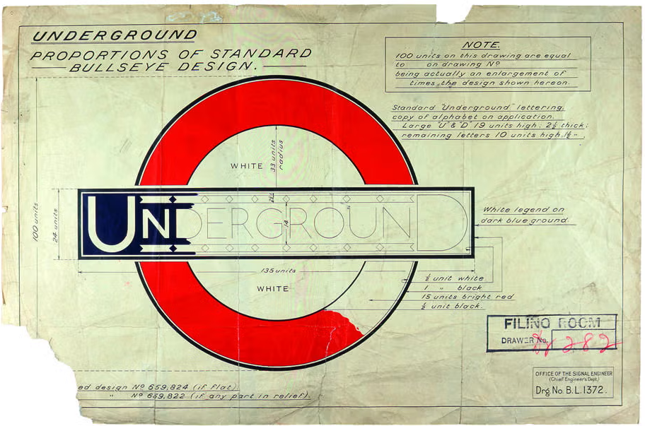
The London Tube Font, also known as the London Underground Font, is a symbol of the city, with one of the most memorable aspects of the city’s identity, as it is instantly associated with its world-renowned Underground system. It is not only a typeface, but it has created a cultural and civic image of the capital. Created in 1916 by Edward Johnston, it was an unusual typeface in its time, and Johnston Sans officially established the future of British type design.
Johnston created a distinctive and readable typeface in the name of modernity, clarity, and elegance, as Frank Pick (then Commercial Manager of the Underground Electric Railways Company of London (UERL)) commissioned him. What it produced is a geometric, but humanist, sans-serif typeface that transfers perfectly between functionality and artistic simplicity.
It is also a way of life; it not only represents order, clarity, and history but also drives millions along their intricate maze of tunnels and platforms under the city every day.
Features of The London Tube Font
Understanding what makes the London Tube font so unique requires a closer look at its defining features:
1. Humanist Structure
Unlike purely geometric fonts, Johnston has a warm and human feel. Its shapes are informed by calligraphy, giving it a friendly but formal tone.
2. Perfect Circles and Contrasts
The uppercase ‘O’ is a near-perfect circle, while the stroke thickness subtly varies, mimicking hand lettering.
3. Diamond-Shaped Dot on the ‘i’
One of the most iconic features, the lozenge-shaped dot, was a deliberate stylistic choice by Johnston. It softens the modern sans-serif form with an artisan touch.
4. High x-Height
The font has a tall x-height, enhancing legibility—especially useful for signage seen from a distance or at speed.
5. Minimalist Yet Expressive
Even though it is quite simple, Johnston also incorporates expressive idiosyncrasies, including curved terminals as well as letterforms. These features prevent a sense of sterility that is encountered in later sans-serif typefaces like Helvetica.
London Tube Font Free Download
You can download it by clicking the link given below.
Applications of The London Tube Font
The Johnston font family is versatile, in spite of being made with the specific purpose of use in the London Underground. It is part of the total brand system of Transport for London (TfL) today.
1. Signage and Wayfinding
From the iconic roundel signs to directional arrows, Johnston Sans ensures clarity and uniformity across all platforms.
2. Maps and Printed Materials
The map of the London underground is called Johnston map and was designed by a renowned designer called Harry Beck. It must be readable by the travelers as they navigate through it.
3. Digital Interfaces
TfL apps, websites, and digital displays use Johnston100, offering a seamless platform experience. Its high readability makes it perfect for mobile and web interfaces.
4. Advertising and Branding
Posters, marketing campaigns, and station art all use Johnston to maintain consistency in tone and identity.
5. Cultural and Commercial Use
The typeface is also used in TfL merchandise, from T-shirts and mugs to posters and books, symbolizing London’s heritage.
Alternatives to The London Tube Font
To capture a similar aesthetic in your projects, several fonts echo Johnston’s design while offering more flexibility or broader licensing options.
1. Gill Sans
3. Johnston-ITC
4. Public-Sans
5. FF-Meta
Why Johnston Still Matters Today
Promoting the London Tube font was much more than justifying its existence. It is a show of how design and public infrastructure can co-exist in the same arrangement of a well-defined vision.
In a world where it seems we are all surrounded by digital screens, the fact that Johnston remains relevant indicates that some designs are timeless. It is not just an object of the London past, it is a developing identity system that is able to change and at the same time not lose its soul.
Johnston font is a representation of straightforwardness without being chilly, a simplistic but non-boring one, a traditional type of font in a contemporary universe.
Conclusion
London Tube font is not only a typeface but a typographic institution. Its original design was created 100 years ago, and since then, its visual appearance has influenced innumerable typefaces, branding systems, and other graphics of public information. Edward Johnston’s work is a masterpiece on the art of intentional design and is a reminder that typography is not solely an aesthetic approach but a utilitarian identity and experience tool.
