Metropolis 1920 Font: Introduction
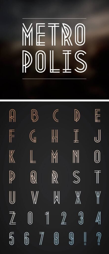
Metropolis 1920 is a more decorative vintage-style font inspired by the art deco 1920s. Designed by Croatian-Australian designer Josip Kelava, the typeface took its name after the 1927 silent film Metropolis directed by Fritz Lang, which became a classic of the early period of science fiction films and modernism.
It is not a font with general purpose. Rather, Metropolis 1920 is a display typeface intended to be used in headlines, in posters, logos and branding where style over substance matters as much as possible. Its clean geometry and angles as well as smooth lines feel more cinema or architecture-like, such as the letters in the marquee of a Jazz Age theater or an aged journey advertisement of the French Riviera.
Key Features Of Metropolis 1920 Font
Metropolis 1920 isn’t your everyday typeface. Its unique structure and design details set it apart. Here’s what makes it special:
1. Geometric Precision
Metropolis 1920 draws a great deal on the sharp geometry, straight line and angular forms. Letters such as A,M and W are highly symmetric and those such as E and F balance on few strokes reflecting the streamlines modernist ideas of the Art Deco era.
2. Decorative and Bold
This font nor was designed to be read in bulk. It is ornamental and demanding the attention making it ideal to be used as display, large headers, old-fashioned signage and poster art.
3. Uppercase Only
It’s an all-caps typeface, a common trait among Art Deco-inspired fonts. The lack of lowercase characters enhances its formal, poster-like aesthetic.
4. Period Authenticity
Unlike modern sans-serifs, Metropolis 1920 pays tribute to its historical roots through its period-accurate curves and lines. The letters evoke movie titles, vintage advertisements, and the facade lettering on art deco buildings.
5. Limited Character Set
Due to its niche appeal, Metropolis 1920 has a limited glyph set—primarily uppercase letters, numbers, and basic punctuation. It isn’t suited for multilingual typesetting but excels in stylistic impact.
Metropolis 1920 Font Free Download
You can download it via the link given below.
Applications Of Metropolis 1920 Font
Because of its strong personality, Metropolis 1920 works best in design projects with central style, luxury, or retro themes. Here are some standout use cases:
1. Branding and Logos
Feel like creating an elegant or nostalgic mood? Metropolis 1920 is an ideal vintage-related logo, so it can be used by any brand that relates to the fashion world, jazz, jazz clubs, speakeasies, or other luxury goods.
2. Posters and Event Promotions
With its cinema style, it would do great as posters of events, particularly involving film festivals, theater merchandise, and retro parties.
3. Packaging Design
Metropolis 1920 looks splendid on product packaging, particularly of products with either a vintage or luxurious flair to them–consider perfumes, liquors, or specialty chocolates.
4. Digital Graphics and Social Media
Make good use of it when it is not overdone; it provides glamour to Instagram photos, Pinterest pins, and YouTube thumbnails, i.e., the accounts that have a niche, artsy style.
5. Editorial and Titles
For magazine covers, blog headers, and printed media, there is a need for a bold and catching title font.
How To Use The Metropolis 1920 Effectively
Although this font is appealing to the eye, it should be applied with finesse so as not to dominate your design. Here are a few best practices:
- Use it sparingly: Avoid long paragraphs. Reserve it for titles, headers, and short phrases.
- Pair it with neutral fonts: For body text, combine with simple sans-serifs like Lato, Montserrat, or Open Sans.
- Mind the spacing: Adjust kerning and tracking as needed. The uppercase-only style may need manual tweaks for balance.
- Stick to vintage or themed palettes: Gold, black, ivory, and emerald green enhance its Roaring Twenties vibe.
Alternatives To The Metropolis 1920 Font
If you love the vintage feel of Metropolis 1920 but want variations or additional features, these fonts offer similar vibes:
1. Cormier
Inspired by the same Art Deco period, Cormier offers multiple weights and a similar geometric style with slightly more flexibility.
2. Deco Neue
A refined take on Art Deco fonts with both upper and lowercase characters. Ideal for those needing more versatility.
3. Bifur
Initially designed in 1929 by A.M. Cassandre, this experimental font screams 1920s authenticity.
4. Raleway Dots
Raleway Dots offers geometric flair with a dotted twist for a lighter, more playful deco-inspired style.
5. Gatsy
Another nod to the Art Deco movement, Gatsy works beautifully in luxury branding, echoing The Great Gatsby’s design elements.
Conclusion
Metropolis 1920 does not only beautify the font, but it is the lens into the substantial world of design, culture and cinema history. Its jagged lines and traditional design are perfect to fit in projects demanding elegance and drama. Though not a font in all contexts, it can be applied to one and another design and transform them into a memorable one.
It is novel, historically attractive, and is also daringly in design to become a reliable darling of vintage-styled designers, and even in the capacity of being widely applicable in print and online, it will probably bring more enthusiasts as the years pass.