Font choice plays a vital role in the nameplate design. With the variety of fonts available but we are selecting the right one to ensure you that our nameplate fonts are easily readable. If you’re looking to design a nameplate for an office desk, a product, the right font can give you a good impression.
Why Font Choice Matters for Nameplates
Selecting the right font for a nameplate is important because it affects the overall functionality. A font that’s too elaborate is difficult to read but a plain font lacks personality. The font should depict the purpose and setting of the nameplate and ensure it communicates the intended message clearly and stylishly.
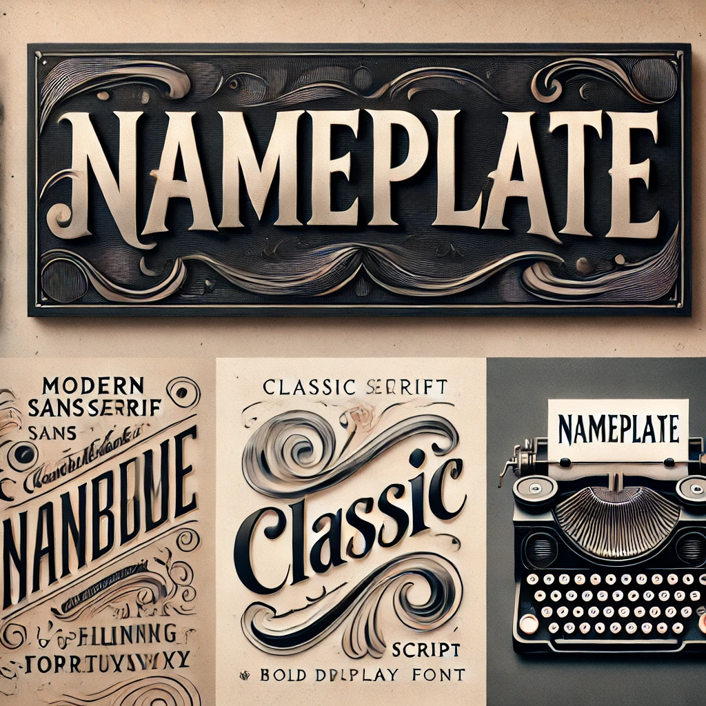
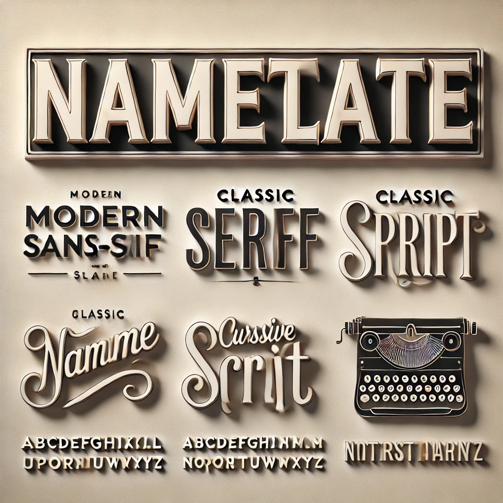
Top 5 Fonts for Nameplates
Choosing the right font for a nameplate can make a good impression on the overall look. If you’re looking for a nameplate font for your office door, mailbox, or even a name badge then selecting the right font is key.
In this post, we’ll be sharing our top 5 favorite fonts for nameplates to help you make the best choice for your personal or professional space. So let’s discuss and explore some stylish and eye-catching font options that are sure to impress!
-
Serif Fonts for Classic Elegance
Serif fonts like Times New Roman or Garamond add a touch of elegance. These fonts are perfect for traditional settings where an endless and classic look is desired.
-
Sans-serif Fonts for Modern Appeal
Fonts like Helvetica and Arial are sans-serif options that look clean and contemporary. This font is ideal for modern offices or tech environments.
-
Script Fonts for Personal Touch
Script fonts such as Brush Script or Lucida Calligraphy give a personalized feel. Suitable for nameplates that wish to convey elegance and a personal touch.
-
Decorative Fonts for Unique Designs
Decorative fonts, including Lobster or Curlz MT, bring an artistic flair. Best for creative applications where a distinct and eye-catching design is needed.
-
Monospaced Fonts for Minimalist Aesthetic
Monospaced fonts like Courier or Consolas offer a clean, minimalist look. Great for nameplates in a tech or industrial environment where functionality is key.
How to Choose the Right Font for Your Nameplate
To select the appropriate font for your nameplate, consider factors such as the purpose of the nameplate, the target audience, and the environment in which it will be displayed. Test different fonts by printing samples to evaluate readability and appeal.
Conclusion
Selecting the right nameplate fonts involves balancing elegance with legibility. By understanding the characteristics of different fonts and how they fit various settings you can design a nameplate that stands out and serves its purpose effectively.