The Nintendo font is a signature element of the company’s branding, capturing its playful and creative essence. Established in 1889, Nintendo is renowned for iconic franchises like Super Mario and The Legend of Zelda. The font used in the Nintendo name conveys a carefree and approachable attitude, aligning with the fun and imaginative spirit of its games.
This unique typeface reflects Nintendo’s rich legacy and has become a defining characteristic of the gaming industry, cementing its place as a cornerstone of Nintendo’s visual identity for generations.
What is the Nintendo Font?
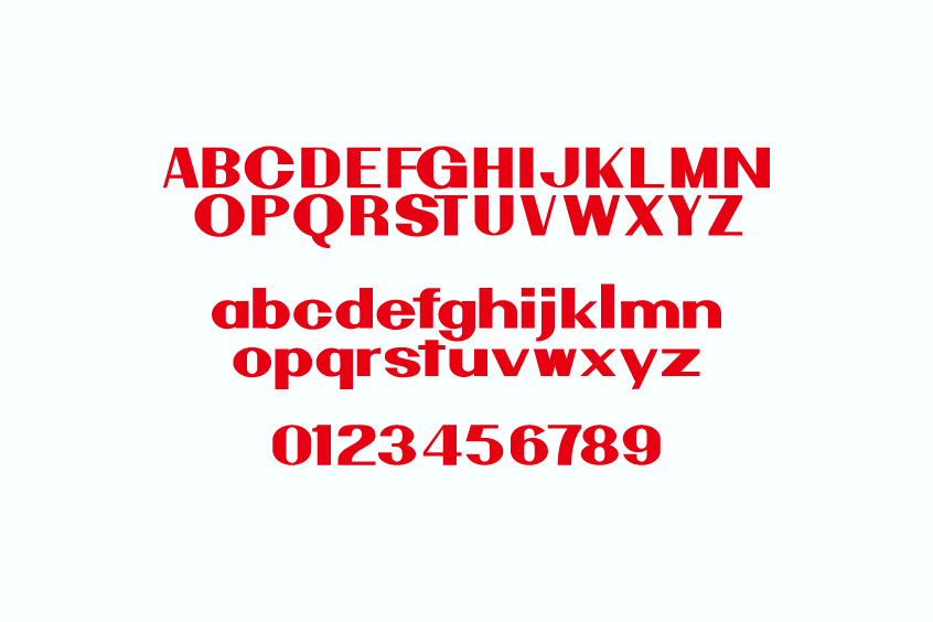
The Nintendo font is a typeface characterised by a rounded and bold design that conveys the playful yet inviting nature of the company. Also, even though Nintendo has not issued a standard font for public access, there are a few unofficial fonts that reflect the corporate style closely. Fonts such as “Pretendo” or “Nintendo NES” have been developed to adapt the Nintendo style and are frequently utilised by fans during design activities.
This font has also been designed in a very thick, sans-serif with rounded edges which are the same features found in the logo which makes them apt for use in graphics meant to evoke memories of the old Nintendo graphics.
Key Features of the Nintendo Font
The Super Nintendo font has several key features that enhance its brand appeal:
- Bold and Rounded Style: The font is relatable, powerful, perfect in readability, even for smaller sizes, and has thick rounded letters that can easily be loved by everyone.
- Sans-Serif Structure: The simple, modern, and easily readable sans-serif typeface can be used in both electronic and printed materials.
- Minimalist Aesthetic: Corresponding with Nintendo’s principle of minimalism, the font ensures that attention is directed to the gameplay while strengthening customer awareness of the brand through its simplicity.
- Color Flexibility: Traditionally seen in red or gray, the font adapts well to different color schemes, adding timeless appeal across Nintendo’s product line.
Uses of the Nintendo Font:

- Official Branding: Appears in Nintendo’s logos, consoles, game packaging, and online content, providing a nostalgic and consistent brand identity.
- Merchandise: Used on Nintendo-themed merchandise like clothing, posters, and collectibles, enhancing brand recognition.
- Fan Art & Community Projects: Replicated in fan creations, social media posts, and gaming community content to celebrate Nintendo’s cultural impact.
- Themed Events: Adds authenticity to Nintendo-themed events, from decorations to promotional materials celebrating gaming history.
- Personal Projects: Fonts like “Pretendo” and “Nintendo NES” are popular for personal use in nostalgic projects such as posters or invitations.
- Gaming Content Creation: Commonly featured in fan-made YouTube channels, streaming graphics, and thumbnails, capturing Nintendo’s iconic style.
Nintendo font Free Download:
For a free download of a Nintendo-inspired font for personal projects, you can find on sites like dafont.
Conclusion:
The Nintendo logo font is known for its clean bold letters and playful elements which encapsulate the innovative and family-friendly design traits of Nintendo. This captivating appeal makes it perfect for both the new and nostalgic audiences and showers the brand with its everlasting impact within the gaming industry and overall entertainment.
As Nintendo continues to expand its reach, the distinctive charm of its typography ensures the font’s place as a cherished element of its visual identity for years to come.
