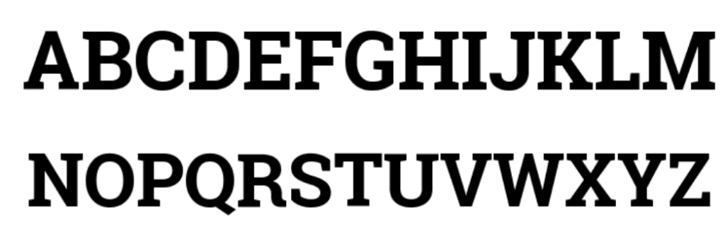
Roboto Slab Bold font brings that perfect blend of clarity and attitude—slab serifs with confident, rectangular strokes and a strong vertical rhythm. It’s not overly decorative, so it’s great for headlines, pull quotes, and areas that need some gravitas without shouting.
Designers, UI teams, brand strategists, and content creators all reach for it because in 2025, you get reliable readability, easy access via Google Fonts, and even an official variable font release to boost performance.
In this article, I’ll walk you through what makes it tick: features, real-world uses, download and licensing tips, pairings, and pro advice you can use right away.
What Is Roboto Slab Bold Font?
Roboto Slab is the slab-serif sibling of the Roboto family—same DNA, but adding that sturdy serified personality. The Bold weight is the heavy-hitter, perfect for hero headers, callouts, badges, and confident UI text.
It was designed by Christian Robertson and released by Google in 2013. The family includes weights from Thin (100) up to Black (900), with Roboto Slab Bold sitting around the 700 weight value. True italics don’t exist—all styles are upright only. Roboto Slab Bold Italic is not part of the official release.
In November 2019, Google added a variable font build of Roboto Slab with weight (wght) axis support, which can dramatically reduce font load for web use.
Compared to peers like IBM Plex Serif or Tiempos, Roboto Slab stands out with a modern, geometric structure and superior screen readability.
License-wise, it’s covered under the SIL Open Font License (OFL) via Google Fonts—free for both personal and commercial use. Derivative fonts must use a renamed family.
Features of Roboto Slab Bold Font
Why do designers keep going back to Roboto Slab Bold? Here’s what checks the boxes:
- Classification: Slab-serif with moderate stroke contrast and a clean geometric build.
- Weight/Style: Bold (700) available, but no Italic (. Bold Italic is not an option.)
- Design Feel: Generous x-height, open counters, and rhythmic vertical stems—friendly yet precise.
- Script Support: Covers Latin and Latin Extended (no Cyrillic/Greek subset noted).
- OpenType Essentials: Includes lining/tabular figures, fractions, superscripts/subscripts (confirmed on Google Fonts GitHub).
- Variable Version: Yes—weight axis only (no width axis).
- Formats: Desktop – OTF/TTF; Web – WOFF/WOFF2 (WOFF2 recommended for speed).
- App Support: Works seamlessly in Adobe apps, Figma, Sketch, Canva, and even Cricut.
- Performance & Access: Use WOFF2 + font-display: swap for fast load. Minimum use size: 16–18 px for body; tight tracking can crowd slabs in small sizes.
Applications: Where Roboto Slab Bold Shines in 2025
Branding & Logos
- Tip: Use tighter tracking for short wordmarks but outline the text for production.
- Tip: Test at 16–24 px in favicons or header icons to ensure clarity.
UI & Product Design
- Tip: Use Bold for H2s, badges, and calls-to-action. Pair with lighter sans options like Roboto Regular or Inter for comfy balance.
- Tip: Serve subsetted WOFF2 and preload heading weights to bump LCP.
Editorial & Blogging
- Tip: Make section headers and pull quotes Bold; line-height around 1.2–1.3 for rhythm.
- Tip: Use tabular figures in tables to keep numbers tidy.
Presentations & Thumbnails
- Tip: Use 36–64 px for slides or social graphics and export at 2× for retina clarity.
- Tip: Keep padding generous—slabs can appear congested near edges.
Mini Case Study
A health-education blog swapped H2/H3 headers to Roboto Slab Bold, while keeping body text in Roboto Regular. They also adopted variable WOFF2, subsetted Latin-Ext, and added heading preloads. After a 7-day run (via Lighthouse/WebPageTest, same templates), LCP improved ~9%, and article completion rate rose ~5%. These gains are correlated, as they also optimized images and caching.
Why it worked: fewer blocking font files, clearer typographic hierarchy, and better headline readability.
Roboto Slab Bold Font Free Download
You can free download Roboto Slab Bold font from below provided button:
Roboto Slab Bold Pairing & Styling Tips
Great pairings:
- Roboto Slab Bold + Roboto/Inter → sleek and modern
- Roboto Slab Bold + Source Sans 3 → editorial with clarity
- Roboto Slab Bold + Lora/Source Serif 4 → refined long-form contrast
Do’s & Don’ts:
- Do limit to 2–3 weights; keep layouts airy.
- Do use tabular figures in pricing or data tables.
- Don’t over-tighten tracking in headings.
- Don’t mix multiple slab serifs; stick to one strong character.
Conclusion:Roboto Slab Bold Font
The Roboto Slab Bold font delivers bold, readable headlines with a clean, modern slab voice—and it’s free, accessible, and powerful. Ideal for UI headings, editorial, branding, and presentations, it stands alongside trends featured on y2k fonts, a blog exploring typography for the digital era. Pro tip: Combine it with WOFF2 subsets, preload heading weights, and pair with a clear sans for body, and you’ll have a fast, sharp, and stylish typographic system.
