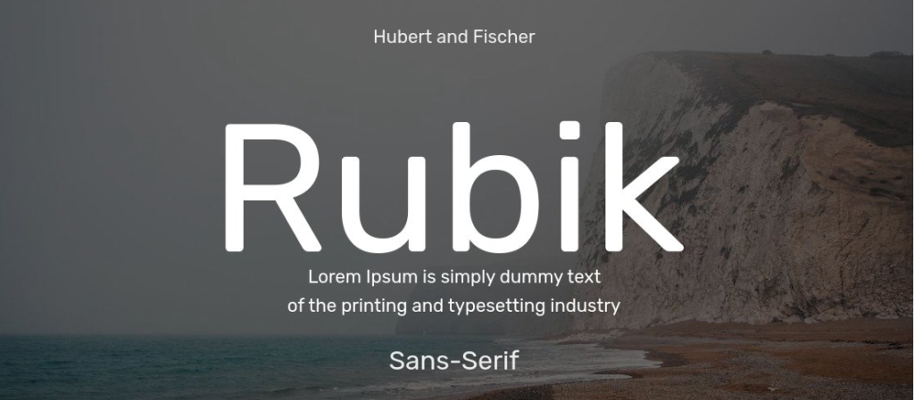
The Rubik font family is a friendly geometric sans-serif with slightly rounded corners that feels modern, warm, and accessible. It’s designed to be highly readable on digital screens while retaining enough personality for branding and editorial use.
In 2025, Rubik has become a favorite across industries — from tech startups and nonprofits to UI teams, blogs, and mobile apps — because it balances utility and character. As a variable font, it adapts to responsive environments, supports broad language coverage (Latin, Hebrew, Cyrillic), and delivers reliable web performance and accessibility scores.
In this guide, we’ll explore Rubik’s origins, features, applications, download/licensing details, pairings, and a mini case study to help you make the most of it in your projects.
What Is the Rubik Font Family?
The Rubik font family is a geometric sans-serif with a humanist twist, making it more approachable than strictly geometric peers. It works equally well for UI headings, body text, logos, and editorial design.
- Design & Foundry Origins
Rubik was originally designed in 2015 by Hubert & Fischer, with additional design contributions from Meir Sadan (Hebrew support) and expanded by Cyreal (Sorkin Type foundry) for broader language coverage [Google Fonts]. - Family Extensions
- Rubik Mono One: A bold, monospaced variant.
- Rubik Micro: A micro-size optimized cut for captions/UI (listed separately).
These are considered related but distinct families in Google Fonts.
- Rubik Mono One: A bold, monospaced variant.
- Weights & Styles
Rubik is available in 9 weights (300–900), each with matching italics, plus a variable version with a weight axis (weight range 300–900). - Licensing
Licensed under the SIL Open Font License (OFL) via Google Fonts, which allows free personal and commercial use (with attribution and derivative-naming rules). - Position vs Peers
Compared to Inter or Source Sans 3, Rubik adds warmth with rounded corners. Against Montserrat, Rubik feels more balanced for UI readability.
Key Features of the Rubik Font Family
Designers love Rubik because it blends legibility, friendliness, and web performance. Here’s a breakdown:
- Weights & Styles: Light → Black + italics.
- Variable Font: Yes, with weight axis (300–900).
- Design Traits: Slightly rounded corners, open apertures, tall x-height, consistent rhythm.
- Language Support: Latin, Latin-Ext, Cyrillic, Hebrew.
- OpenType Features: Lining/tabular figures, fractions, superscripts/subscripts.
- Formats: OTF/TTF for desktop; WOFF/WOFF2 for web.
- Web Performance: Ships in WOFF2 by default; supports subsetting and font-display:swap.
- Accessibility: Works best at 16–18px+ body size, line-height 1.45–1.6.
Applications of Rubik in 2025
Rubik shines in environments where clarity and friendliness are equally important.
Branding & Logos
- Use Medium/Bold for wordmarks.
- Adjust tracking for small-size applications.
- Pair with Merriweather or Lora for brand/editorial warmth.
UI & Product Design
- Serve subsetted WOFF2; preload heading weights.
- Body size: 16–18px, line-height 1.45–1.6.
- Variable font reduces file weight while enabling dark/light mode fine-tuning.
Editorial & Blogs
- Regular for body, Bold for H2s.
- Enable tabular figures for pricing/tables.
- Keep line length around 60–80 characters.
Nonprofits & Education
- Stick to Regular/Medium for high readability.
- Ensure WCAG AA/AAA color contrast.
- Italics for quotes/testimonials sparingly.
Social & Thumbnails
- Use Black/Bold for short, attention-grabbing text.
- Always export at 2× resolution for crisp mobile.
- Maintain padding to avoid cropping text.
Mini Case Study
A health-information portal switched from Montserrat to Rubik Variable in 2024. They subsetted glyphs, served WOFF2, and preloaded heading weights.
- Results (measured via Lighthouse & WebPageTest over 7 days):
- Largest Contentful Paint (LCP) improved by ~10%.
- Article completion rates rose by ~6% MoM.
- Largest Contentful Paint (LCP) improved by ~10%.
While other optimizations ran in parallel, the team cited Rubik’s performance and readability improvements as a major contributor.
Rubik Font Family Free Download
The safest place to get Rubik Font:
Rubik Font Pairing & Styling Tips
- Pairings
- Rubik + Merriweather → Balanced editorial system
- Rubik + Inter → Clean modern UI
- Rubik + Playfair Display → Elegant upscale headlines
- Rubik + Merriweather → Balanced editorial system
- Do’s
- Limit to 2–3 weights.
- Enable tabular figures for pricing/tables.
- Limit to 2–3 weights.
- Don’ts
- Don’t cram multiple geometric sans companions.
- Don’t over-tighten tracking in body copy.
- Don’t cram multiple geometric sans companions.
Conclusion:Rubik Font Family
The Rubik Font Family blends approachable geometry, performance-ready files, and an open license—making it ideal for branding, UI, and editorial projects in 2025.
At y2k fonts, we recommend Rubik for creators who want a safe, free, and stylish solution that adapts across industries. Whether you’re building a product, publication, or nonprofit platform, this typeface balances clarity with modern design.
👉 Pro tip: Download it from Google Fonts, test it in your type scale, subset for performance, and pair it thoughtfully for maximum clarity.
