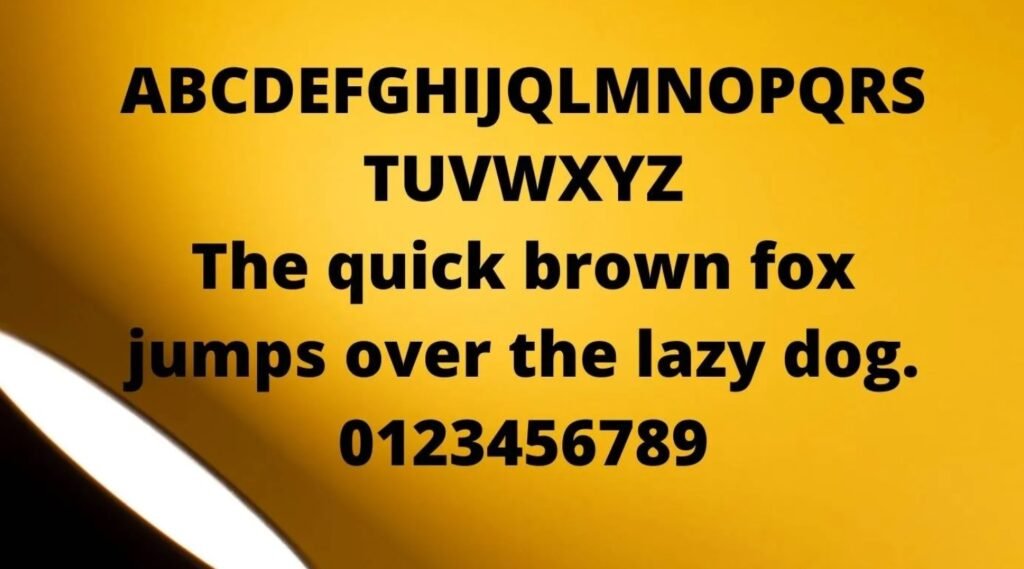
The Snapchat font plays a crucial role in defining the app’s visual identity. While Snapchat, launched in 2011, is widely recognized for its innovative messaging, stories, and creative filters, the selected snapchat text font enhances the user experience by ensuring a clean, minimalistic, and user-friendly interface.
This simplicity not only makes the app visually appealing but also facilitates easy navigation across different devices, contributing to its widespread popularity, particularly among younger audiences worldwide.
What is the Snapchat Font?
Snapchat applies multiple typefaces to its logo in order to keep a consistent and rich visual identity.
- Avenir Next: This contemporary sans-serif font is the core element of Snapchat’s logo. Avenir Next is acclaimed for its smooth curves, rounded corners, and symmetry, which express the brand’s fresh and dynamic character. The font bestows the Snapchat logo with a sleek and modern look as compared to the app’s creative side.
- Helvetica Neue LT Std Roman: In Snapchat, both the application and the website are built with the very readable and adaptive Helvetica Neue font style. This typeface permits uninterrupted use, so we can easily search, receive notifications, and message without any distraction from the fonts.Helvetica Neue’s simplicity and elegance contribute to a minimalist design that emphasizes functionality and ease of use.
The fonts present within Snapchat also build upon their sophisticated, legible, and up-to-date quality of their brand identity which therefore increases their uniqueness.
Features of the Snapchat Font

- Modern Aesthetic: Avenir Next and Helvetica Neue are both known for their contemporary design, aligning with Snapchat’s minimalist and user-friendly interface.
- High Legibility: Both fonts are optimized for readability on various screen sizes, ensuring clear communication across devices.
- Brand Consistency: The combination of these fonts provides a cohesive look across Snapchat’s logo, app, and website, reinforcing brand recognition.
Applications of Snapchat Fonts
- Logo and Branding: The Avenir Next font is an essential part of Snapchat’s visual branding, appearing in its logo and promotional materials.
- User Interface: Helvetica Neue is used throughout the app for navigation, messages, and notifications, ensuring a smooth and intuitive user experience.
- Social Media Content: Creators often use Snapchat-like fonts to replicate the app’s style in posts, stories, and graphics on other platforms.
Snapchat Font Download
You can download this font for free and use it in your personal and non-commercial projects. Simply click the download button below to get the font installed on your device quickly and easily.
Conclusion: Snapchat Font
Snapchat’s font style choices, Avenir Next and Helvetica Neue, the crucial elements of Snapchat’s visual design, the app is able to draw attention to its modern, clean, and harmonious user experience.
It doesn’t matter if you are a designer working on a social media project, the fonts you choose can lead you to the Snapchat style you want. They can create very different styles, so designers can use them to have highly engaging and visually convincing content.
