Termina Font: Introduction
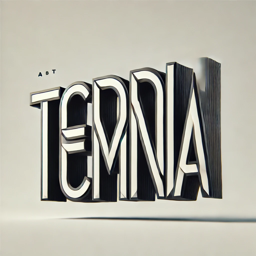
Typography is essential in design because it influences how information is consumed and how feelings are conveyed. Termina font is unique in its bold, modern, and geometric appearance compared to most fonts currently available. Whether used in branding, editorial design, or digital media, Termina offers a striking presence that commands attention while maintaining clarity and readability to the user.
Designed by Mattox Shuler and published by Fort Foundry, Termina is a sans-serif typeface with muscular geometric proportions. Its sharp angles, even letter spacing, and versatile weights make it a typographer’s and a graphic designer’s go-to for a contemporary yet authoritative feel. The typeface is widely praised for its power to project strength, innovation, and professionalism, and it is most suitable for use in technology, sports, and advertising.
Features of Termina Font
- Geometric and Bold Structure
Termina is known for its geometric foundation, which gives it a structured and uniform appearance. Unlike traditional sans-serif fonts, Termina’s letterforms are carefully crafted with a modernist approach, making them sleek, clean, and highly legible.
- Multiple Weights for Versatility
One of Termina’s biggest strengths is its wide range of weights, which includes:
- Thin
- Extra Light
- Light
- Regular
- Medium
- Semi-Bold
- Bold
- Extra Bold
- Black
This variety allows designers to create a clear hierarchy in typography, making Termina a flexible choice for both headings and body text.
- Wide Letterforms for Impact
Compared to other sans-serif typefaces, Termina features wider letterforms, giving it a strong and stable visual presence. This aspect makes it ideal for bold headlines, posters, and branding materials where readability and impact are key.
- Minimalist and Contemporary Appeal
Designed for modern branding and digital use, Termina embodies a sleek, futuristic look. It maintains a minimalist aesthetic without unnecessary flourishes, making it perfect for designers aiming for a clean and sophisticated composition.
- Strong Legibility in Both Print and Digital Media
Whether on billboards, mobile screens, or product packaging, Termina ensures clear readability due to its precise letter spacing and well-proportioned glyphs.
Termina Font Free Download
You can download this font by clicking the link below:
Applications of Termina Font
- Branding and Logo Design
Termina’s bold yet refined design makes it a go-to choice for companies looking to establish a strong and professional brand identity. Its wide letterforms and geometric precision work well for tech brands, startups, and sports-related businesses.
- Editorial and Magazine Layouts
For modern magazine covers, advertisements, and editorial spreads, Termina delivers a contemporary aesthetic. It pairs well with serif fonts for contrast or can be used alone for a striking, minimalist layout.
- Web and App Design
In UI/UX design, typography needs to be both functional and visually appealing. Termina’s sharp clarity and various weights make it an excellent choice for website headers, buttons, and mobile apps, ensuring readability across different screen sizes.
- Advertising and Marketing Campaigns
From billboards to social media graphics, Termina excels in advertising materials that require attention-grabbing typography. Its strong presence makes messages stand out while maintaining a modern and professional look.
- Product Packaging
For brands that want a clean and impactful packaging design, Termina offers a stylish yet industrial feel, perfect for technology, fitness, and minimalist product packaging.
Best Alternatives to Termina Font
If you’re looking for fonts similar to Termina but with slight variations, here are some excellent alternatives:
- Montserrat
A geometric sans-serif with a slightly softer look, Montserrat is a versatile alternative that maintains a modern appeal while offering a bit more warmth in its design.
- Gotham
Gotham is a widely popular sans-serif that shares Termina’s boldness and geometric proportions but with a slightly more neutral tone. Ideal for branding and editorial work.
- Avenir Next
Avenir Next provides a clean and contemporary design with excellent legibility for those seeking a more refined alternative.
- Bebas Neue
While Bebas Neue is more condensed, it shares Termina’s bold and impactful qualities, making it a great alternative for headlines and posters.
- Proxima Nova
With balanced proportions and a modern touch, Proxima Nova serves as a softer yet still geometric option for digital and print applications.
Final Thoughts
Termina font is a powerful and highly versatile typeface that blends modern aesthetics with geometric precision. Its bold, wide letterforms and multiple weights make it a perfect choice for branding, digital design, editorial layouts, and advertising.
For designers who seek a strong, structured, and contemporary font, Termina offers an excellent balance of clarity, impact, and adaptability. Whether you’re creating a tech startup logo, a sleek magazine layout, or a high-impact advertisement, Termina provides the flexibility and visual strength needed to make a lasting impression.
If you’re looking for alternatives, fonts like Montserrat, Gotham, and Avenir Next offer similar qualities while adding their own unique touch.
As typography continues to shape the way we communicate, choosing the right font is essential. Termina stands as a testament to modern design, simplicity, and boldness, making it an indispensable tool for today’s graphic designers.