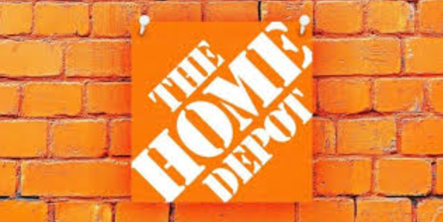
The Home Depot font in the logo is one of the most recognizable logos in the home improvement industry. The language formed by the graphic design with its stylized letters in the logo has features of relativity and power, which express a simple attitude toward DIY home improvement jobs. Have you ever investigated which font The Home Depot employs?
Overview of the Home Depot Font
Four entrepreneurs, Bernard Marcus, Arthur Blank, Ron Brill, and Pat Farrah, established The Home Depot in 1978. Home Depot initially positioned itself as a single destination for residents working on domestic house projects. The Home Depot uses the font Stencil D designed by Gerry Powell for its logo presentation. The strong uppercase typeface presents itself as a rugged industrial design, which perfectly corresponds to The Home Depot brand image of practical, durable solutions. The corporate lettering imitates stencil markings found on crates and building materials, thereby connecting the brand to its association with home improvement and hardware.
Why Choose a Stencil D Font?
The selection of the Stencil D font for the logo likely occurred because of its suitability for construction and warehouse businesses. Customers can easily judge this store as tough and reliable through the font style, which confirms its position as the preferred destination for builders and home craftsmen.
Features of the Home Depot Font
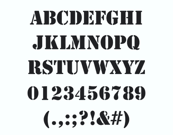
The Stencil D font has several distinctive characteristics that make it stand out:
- Bold and Blocky: The font features thick, capital letters that command attention.
- Gaps and Cuts: As with most stencil fonts, it has intentional breaks in the letters, simulating the look of spray-painted stencils.
- Industrial Aesthetic: The rugged design is reminiscent of military and construction signage.
- All Caps Usage: The Home Depot logo exclusively uses uppercase letters, adding to the font’s authoritative presence.
Applications of the Home Depot Font
Store Signage
The Home Depot font appears strongly in all signage that the company displays throughout its stores. The font serves for Home Depot’s logo presentation and remains active throughout directional signs and promotional banners inside the stores. The strong aesthetic design of the text enables people to easily read it, whether they stand far away.
Packaging and Labels
The Home Depot utilizes this font throughout its packaging and labeling of its company products. The feature of the brand identity remains consistent across every product line range. The contemporary lettering style, together with its assertive design, enables Home Depot products to stand out on displays, which simplifies their identification by customers.
Digital Media
The digital age heavily relies on the Home Depot font to represent the company successfully on its online platforms. The Home Depot website, alongside its mobile apps as well as social media outlets, utilizes this particular typeface. The font has a powerful yet straightforward design which creates visibility across all digital displays ranging from mobile phones to desktop displays.
Advertising and Promotional Materials
Advertising and promotional materials of Home Depot heavily rely on their distinctive corporate font for branding purposes. Home Depot establishes brand recognition through their marketing advertisements which utilize this specific font across different platforms including billboards and TV commercials as well as social media platforms. The distinctive modern design makes this text stand out to attract both customers and new customers.
Read more: Steven Universe Font:Free Download
Alternatives to the Home Depot Font
If you want to use a font similar to Home Depot’s Stencil D, there are several alternatives:
- Stencil Std – One of the closest matches, with a similar industrial and rugged look.
- Stencil Army WW I Font – A widely available font that shares the same military and warehouse-inspired design.
- DIN Stencil – A cleaner, more modern take on stencil typography.
- Rustico – A stencil font with a slightly more rustic and handmade feel.
- Impact – While not a stencil font, a modified version with added breaks can replicate the Home Depot look.
Conclusion
The Home Depot font serves as a strong visual symbol of the company, reflecting its core principles, long-standing journey, and commitment to maintaining the highest standards. Home Depot’s brand identity comes to life through its bold, clean font design, which provides versatile uses in all its marketing materials. Throughout its corporate identity, the Home Depot font appears on store signs and product labels, and websites, which makes it an essential element of the brand representation.