The North Face Font: Introduction
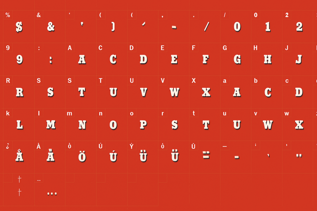
The North Face Font is Helvetica Bold, a classical example of a timeless modern typeface with its clean lines, modern design, and great readability. The selection of font is exactly what the brand is all about, representing something simple, strong, and reliable, which The North Face has had decades of experience embodying.
The North Face was established in 1966 by Douglas and Susie Tompkins as a symbol of adventure around the world. The brand wanted to keep pace with the daring identity and so selected the Helvetica Bold typeface that aligns with the brand ethos of commitment, trust, and exploration.
Features of The North Face Font
- Sans-Serif Simplicity
The sans-serif typeface Helvetica functions without decorative extensions which mark the letter ends. The lack of decorative strokes in Helvetica produces a contemporary design which facilitates quick reading especially when used in brand applications and out-of-home displays.
- Bold Weight for Impact
Helvetica Bold allows The North Face to create text that delivers maximum visibility as well as impact and memorability. The thickness of these letters creates prominent visuals no matter what medium they appear in either digital displays or printed clothes.
- Geometric and Balanced Design
The neutrality of Helvetica together with its balanced design proportions has made it well-known in the industry. The company can use Helvetica for various branding contents because it offers flexible adaptability to brand their products in labels and advertisements.
- High Legibility
The clean layout of Helvetica and its precise letter spacing makes the typeface highly readable which a brand needs for instant reputation recognition.
The North Face Font Free Download
You can download this font for free from right here for your personal use only.
Applications of The North Face Font
- Brand Logo
The North Face’s logo features Helvetica Bold in all capital letters, reinforcing a strong, confident brand identity.
- Product Labeling and Tags
Helvetica Bold is used on product labels, tags, and packaging, maintaining a consistent brand experience.
- Advertising and Marketing
From billboards to digital ads, The North Face relies on Helvetica’s clarity and authority to deliver its brand message effectively.
- Website and Digital Presence
The North Face website uses Helvetica (or close alternatives) for a clean, modern, and professional appearance, ensuring easy readability across devices.
- Outdoor and Retail Signage
Retail stores and promotional banners prominently use Helvetica to maintain a cohesive and recognizable brand image.
Read more: Scandia Font: Free Download
Alternatives to The North Face Font
- Arial Bold: A common alternative to Helvetica, Arial is slightly more rounded but retains the clean and modern aesthetic.
- Univers Bold: Designed by Adrian Frutiger, Univers shares Helvetica’s simplicity but has narrower proportions.
- Akzidenz-Grotesk: A predecessor to Helvetica, Akzidenz-Grotesk has a more industrial and raw feel.
- Roboto Bold: Google’s Roboto offers a more contemporary digital-friendly alternative to Helvetica.
- Proxima Nova: A modern typeface that combines elements of Helvetica and Futura, often used in digital branding.
Conclusion
The North Face Font is a major contributor to the excellent and trustworthy brand. This typeface has long associations with durability and professionalism, and its lines, clarity, and timelessness make its message exactly what an outdoor lifestyle brand aims to communicate. Its worldwide fame not only solidifies The North Face as the leader in the clothing business sector but also reflects the importance of typography in enhancing consumer confidence and brand vision.