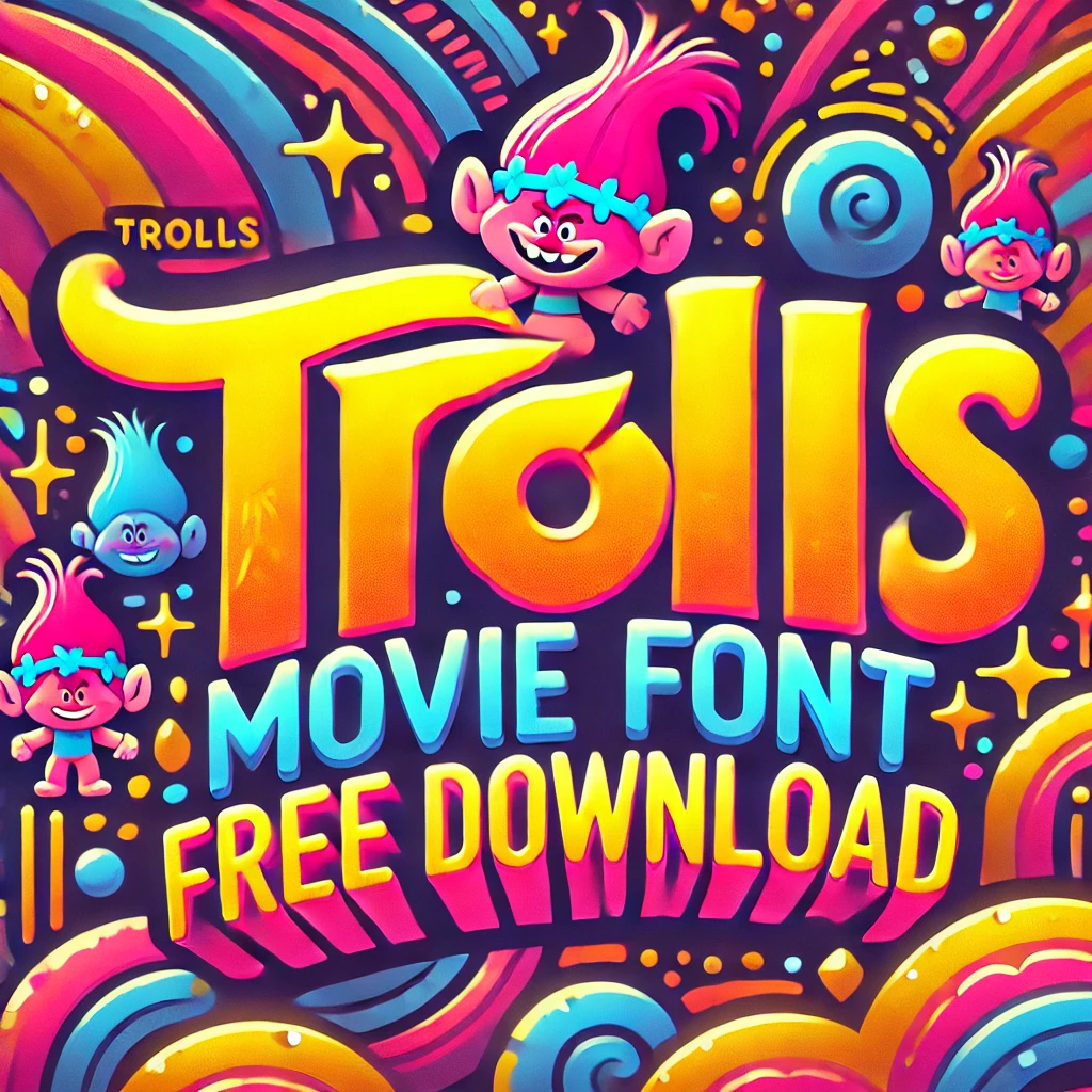
Trolls Font is most famously used in the 2016 animation film of the same title, Trolls, based on the original Troll dolls made by Thomas Dam. The movie is based on two trolls as they seek to rescue their village from the Bergens, who consume trolls in an effort to be happy. Famous across the globe with its colorful characters, catchy music, and colorful appearance, the Trolls franchise applies playful typography in its logo and advertising to display the light-hearted and joyful mood of the movie.
Features of the Trolls Font
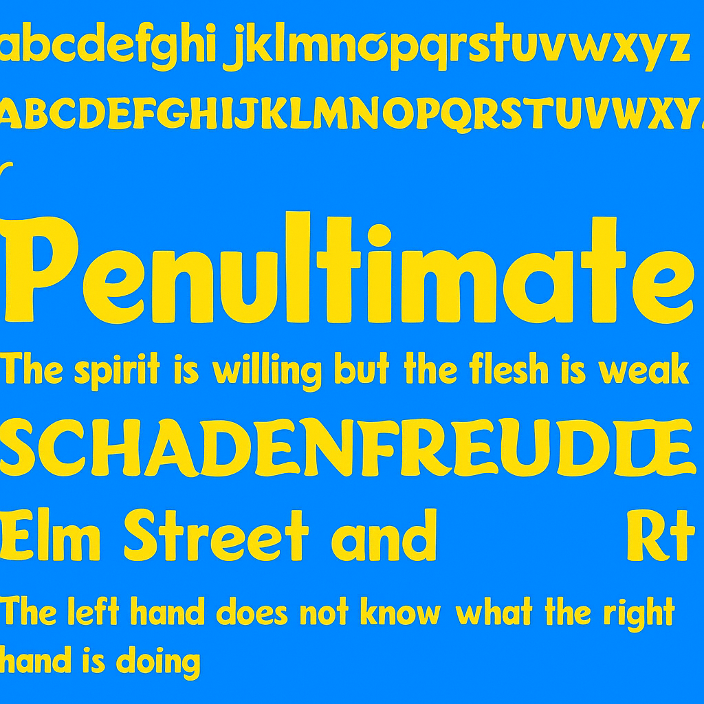
1. Bold and Rounded Letterforms
The letters are thick, rounded, and slightly irregular, giving them a friendly and approachable feel.
2. Playful and Whimsical Shapes
The font’s asymmetrical shapes and dynamic lines reflect the liveliness and spontaneity of the Trolls world.
3. Textured Elements
A unique aspect of the font is the texture often added to the letters, especially in the logo, where the “T” appears fuzzy, mimicking the Trolls’ signature hair.
4. Bright and Cheerful Colors
While not inherent to the font, the Troll typography is typically paired with vibrant gradients and bold colour combinations that amplify its fun and joyful vibe.
Trolls Movie Font Free Download
You can download the Trolls movie font for free by clicking the link below.
Children’s Media – Ideal for cartoons, children’s books, apps, or educational materials for children.
Movie Posters & Promotions – Great for entertainment branding, especially for animated movies, music festivals, character-based branding, and more.
Party Invitations & Decorations – Gives a festive, fun touch to birthday cards, posters, banners and celebration resources.
Toys & Merchandise – Ideal for product packaging, toy labels, apparel prints, and collectible items.
Digital Content – Great for social media posts, YouTube thumbnails, or playful website headers.
Best Practices for Pairing Trolls Font with Other Fonts
Pairing fonts can be tricky. However, when done right, it can elevate your design. Here are some best practices for pairing the Trolls font with other typography:
• Contrast is Key: Choose fonts that contrast in style. For example, a bold, playful font like Trolls pairs well with a minimalistic font.
• Limit Your Choices: Stick to two or three fonts in your design. Too many fonts can create visual chaos.
• Hierarchy Matters: Use size and weight to create a visual hierarchy. The Trolls font can be more significant for headings, while a simpler font can be smaller for body text.
• Test Readability: Always check if your text is easy to read. If the playful font makes it difficult, it may not be the right choice.
We can create visually appealing designs and effectively communicate our message by considering these practices.
Trolls Font is the perfect reflection of the playfully fun essence of the Trolls films, bringing joy and energy in its natural form. With a fun and simple design it is perfect for adding character and remembrance to your projects. Whether you’re designing children’s media, branding, or digital designs, the Trolls Font offers endless possibilities to add a sprinkle of color, fun, and happiness.