First impressions are crucial, as any branding expert will attest. If the content on a webpage isn’t clear and engaging, most users will exit quickly. Your creative team puts in the effort to communicate your brand message in a captivating and accessible manner.
Now, they’re relying on you to make wise typography and design choices for improved readability and brand engagement.
Continue Reading to Discover:
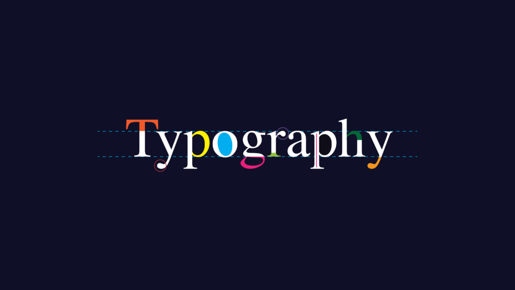
What is Typography?
Typography in design encompasses crafting or choosing a collection of typefaces and fonts to convey written content. This artistic endeavor can evoke powerful emotions by utilizing visually striking letters and arranging type to reflect your brand’s personality. Skillfully executed typography can improve communication clarity, ensuring easy legibility and readability.
Why is Typography Important?
Typography plays a pivotal role in crafting high-quality websites, apps, emails, ebooks, and various other mediums. Effective typography can:
- Capture Users’ Attention: Utilize typefaces and typographic elements that immediately draw users in, even before they start reading.
- Establish Visual Hierarchy: Create a clear visual hierarchy with consistent type sizes, weights, serif or sans-serif fonts, font pairings, and typeface combinations to guide users and enhance readability.
- Enhance Brand Recognition: Consistent use of typography aids in brand identification, as users associate your brand with specific typeface and font styles used in your content.
- Support Content Objectives: Consistent letter spacing, line lengths, capitalization, and other typographic elements improve legibility, while fonts used as design elements amplify the tone and meaning of your content.
5 Most Popular Kinds of Typefaces
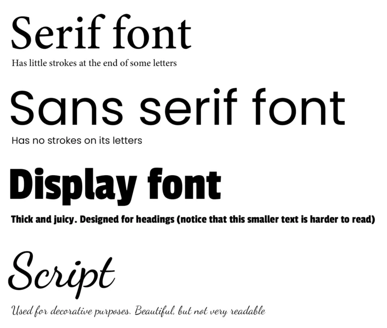
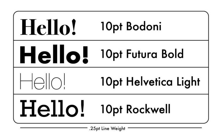
In contemporary design, there are typically five main categories of typefaces: serif, sans serif, script, monospace, and display. Each category encompasses a range of fonts, each with its own unique style. For instance, Helvetica is a typeface, while Helvetica Light and Helvetica Regular are individual fonts.
Serif fonts: These formal and traditional typefaces feature small lines or strokes at the ends of letterforms. They are favored by established brands like The New York Times, Sony, and J.P. Morgan.
Sans serif fonts: With clean lines and no decorative flourishes, these modern typefaces are popular among youthful brands and tech startups such as Target, Airbnb, and Doordash. Common examples are Helvetica, Arial, and Calibri.
Script fonts: These flowing, cursive typefaces range from elegant calligraphy to playful handwriting styles. While not suitable for body text, script typefaces work well for quotes, signatures, and short headers.
Monospace fonts: Featuring fixed-width letters and spacing reminiscent of typewriters, these retro typefaces are commonly used in source code for better legibility. They also appear in various web designs and graphics. Examples include Courier, Bergen Mono, and Source Code Pro.
Display fonts: Also called decorative, these eye-catching typefaces are perfect for logos, banners, and headings, adding flair and originality to designs.
Key Elements of Typography
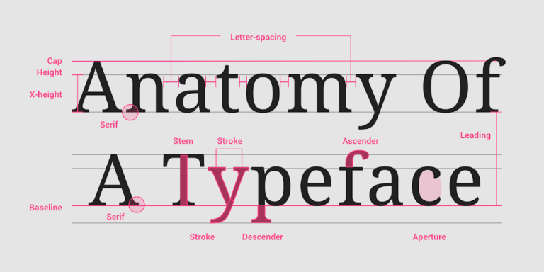
Adjusting typographic elements allows you to refine the appearance, legibility, and tone of a word, line of text, or product.
Alignment:
Achieve balance and guide users down a page by aligning design elements such as logos, images, headers, and body text. Consistently space each element and use margins and padding uniformly. Choose between left-, right-, full-, or center-justified text based on your project requirements. For instance, center-justify a heading or short quote, but left-justify long-form copy.
Color:
Choose a color palette that reflects your brand and effectively communicates your message. Adjust text opacity and use complementary colors with good contrast for readability and accessibility.
A color wheel generator helps you create a well-balanced palette. Ensure your colors meet ideal contrast ratios—refer to the Web Content Accessibility Guidelines for guidance. Bolder, brighter colors are suitable for headings and subheadings, while neutral colors are ideal for large blocks of text.
Hierarchy:
Establishing a hierarchy in your typography helps prioritize and highlight key information for easy scanning and comprehension.
To establish a clear visual hierarchy, ensure that headings are larger than subheadings, and subheadings are larger than body text. For example, website body text is typically 16px, with H1 headers at 48px. You can strengthen this hierarchy by using whitespace, text alignment, color variations, and different typefaces.
Kerning:
Adjust the spacing between individual letters to ensure consistent spacing. Proper kerning enhances the visual appeal and legibility of your text.
Leading:
Leading, also known as line height, is the space between the baseline of one line of text and the baseline of the line directly above it.
Tracking:
Improve readability with tracking (also known as character spacing), which adjusts the overall spacing between letters in a word or line of text. Increase tracking to expand the space between letters, and decrease tracking to bring them closer together. Words or phrases displayed in all capital letters may be easier to read with increased tracking.
How to Pick the Right Typeface?
Selecting a typeface involves several key steps:
- Assess your project scope, requirements, and objectives. Ask your team essential content questions: How will content be delivered (via app, website, email, or print collateral)? Who is our audience, and what are their preferences? What typefaces and fonts are used by our competitors? Keep in mind that some typefaces are more suitable for headers than menu text, while others offer extensive font families with international scripts, glyphs, and special characters.
- Develop a visual tone by creating a mood board based on user and competitive research. You can start with FigJam’s mood board template. Pro tip: Analyzing similar solutions can help identify valuable patterns and standards.
- Explore typeface options on your computer or websites like Google Fonts. Look for a typeface that reflects the message you want to convey with your product or brand. For instance, if your brand’s tone is serious rather than playful, choose a straightforward typeface with minimal embellishments.
Which Figma design example strikes you as more professional? If you picked the module on the left, you’re on the right track.
This module uses Roboto, a clean, legible sans serif typeface. The module on the right features Almendra, a calligraphy-based typeface often seen in children’s books.
- Opt for typefaces that align with your brand identity and attract attention to support your project objectives. Consider factors such as letter construction (e.g., x-heights, cap heights, counters, ascenders, and descenders), scalability, legibility, personality, and embellishments.These elements together shape the look and feel of a typeface.
- Experiment with your chosen typefaces using real and relevant content. This is the most effective way to determine whether a typeface resonates with your users.
Test the typeface at different sizes to guarantee readability for both large and small text.
- Evaluate how your brand colors complement the chosen typeface. Begin by placing black text on a white background and white text on a black background. Then, apply your primary brand color to the text and observe how the typeface interacts with both light and dark backgrounds.
Reverse the colors to assess the legibility of white and black text against a background in your primary brand color.
Weight and Style:
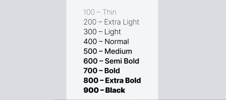
In a typeface like Montserrat by Julieta Ulanovsky and studio, there are various styles and weights available, including regular, bold, italic, thin, black, and more, each represented by a font. A font is a digital file that installs a specific set of type with a particular weight and style. A typeface with multiple weights comprises a font family.
Weight indicates the thickness of a letter’s stroke. Typefaces can vary in weights from hairline to ultra-black, with many fonts in between, although some typefaces may offer only one weight. These weights are typically associated with a numerical value, which aids in programming or collaboration with developers. Weights generally correspond to a number on a scale of 100 to 900, with intervals of 100: Regular 400, Medium 500, Semi-Bold 600, Bold 700, and so on.
Font style refers to adjustments made to the characters or case, such as italics and all caps respectively. Some typefaces do not offer style options, and occasionally, only a Regular weight is available.
Letter case, also known as “case,” denotes the difference between lowercase and uppercase letters. Most typeface sets include both cases, while fonts like Bangers consist only of uppercase letters. Typefaces featuring only uppercase or lowercase letters are less common.
Size:
Determining the appropriate type size and making adjustments can be a challenging task, particularly considering the various mediums in which the text will appear, such as paper, mobile phones, or billboards. Moreover, the size can vary depending on the viewer’s device or the responsiveness of the design.
It’s crucial to establish hierarchy in your typography choices, using size as one of the elements to emphasize certain aspects.
In web development, it’s essential to define key sizes, including headings, subheadings, body text, menu items, and footer text. While many designers typically start with the heading size, also known as H1, it might be more beneficial to begin with the body text size, as this is how front-end developers may implement it. When a developer works with ems, a unit of measurement based on scaling, the body text size is usually set at 1em, with all other text sizes being multiples or fractions of it.
For example, a typical body text size for websites is 16px. The H1 size may then be set at 3em, equivalent to three times the body text size, making it 48px in this case.
As web pages must adapt to various screen sizes, your designs may need to adjust font sizes based on the user’s device. The developer can enable the body text size to adjust with the browser dimensions of your customer, and all other text will scale accordingly.
Conclusion: Typography in Design
In conclusion, typography is a vital aspect of design that influences the readability, accessibility, and visual appeal of text-based content. By paying attention to details such as typefaces, font styles, sizes, spacing, alignment, and justification, designers can create visually engaging and user-friendly designs.
Understanding the nuances of typography allows designers to make informed decisions that enhance the overall user experience. From selecting appropriate typefaces and adjusting font sizes to ensuring consistent alignment and spacing, every aspect plays a crucial role in communicating the intended message effectively.
Moreover, the evolution of typography—from traditional serif and sans-serif fonts to modern display and script typefaces—reflects changing design trends and preferences over time. By staying updated on typography trends and best practices, designers can create designs that are not only visually appealing but also functional and impactful.
Ultimately, the art of typography lies in balancing creativity with practicality, ensuring that the text is both aesthetically pleasing and easy to read. By following the principles outlined above and experimenting with different typographic elements, designers can create compelling designs that captivate audiences and convey their message with clarity and style.