With the creation of hit franchises such as Mario, Zelda, and Pokemon, Nintendo has established itself as an industry leader audiovisual entertainment. In addition to their games, Nintendo’s branding, particularly its logo, has had a major impact the company’s merchandising image.
Designers, gamers, and branding experts frequently ponder: What font does Nintendo use? In this article, we will look at the typeface used in the Nintendo logo and discuss the Alternatives to the Nintendo Font.
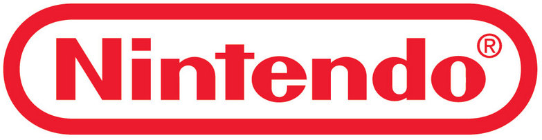
What Font Does Nintendo Use?
Nintendo’s most recent logo features a typeface that differs from those purchased commercially; it was crafted with the brand in mind. Although this typeface cannot be accessed by the general public, designers and enthusiasts have created substitute versions that adequately resemble the original.
The most notable substitute is Pretendo, a fan-sponsored typeface emulating the style of the official Nintendo logo.
As with the logo evolution, there are various usages of the logo in the 80s and 90s, and it is not designed with one specific font in mind. With that said, it has been many years since the design of the logo has remained the same, which is great for brand recognition.
Alternatives to the Nintendo Font
If Pretendo isn’t quite right, here are some great alternatives:
- VAGRounded – A friendly, rounded sans-serif option
- Helvetica Rounded – Clean and professional with soft edges
- Noto Sans Rounded – Free from Google Fonts, modern and accessible
- Mario Font – Perfect for a more playful, game-specific style
These fonts maintain the cheerful, approachable tone of Nintendo branding.
Conclusion: What Font Does Nintendo Use?
Nintendo’s most recent logo features a typeface that differs from those purchased commercially; it was crafted with the brand in mind. Although this typeface cannot be accessed by the general public, designers and enthusiasts have created substitute versions that adequately resemble the original.
The most notable substitute is Pretendo, a fan-sponsored typeface emulating the style of the official Nintendo logo.