Heavy Heap Font: Introduction
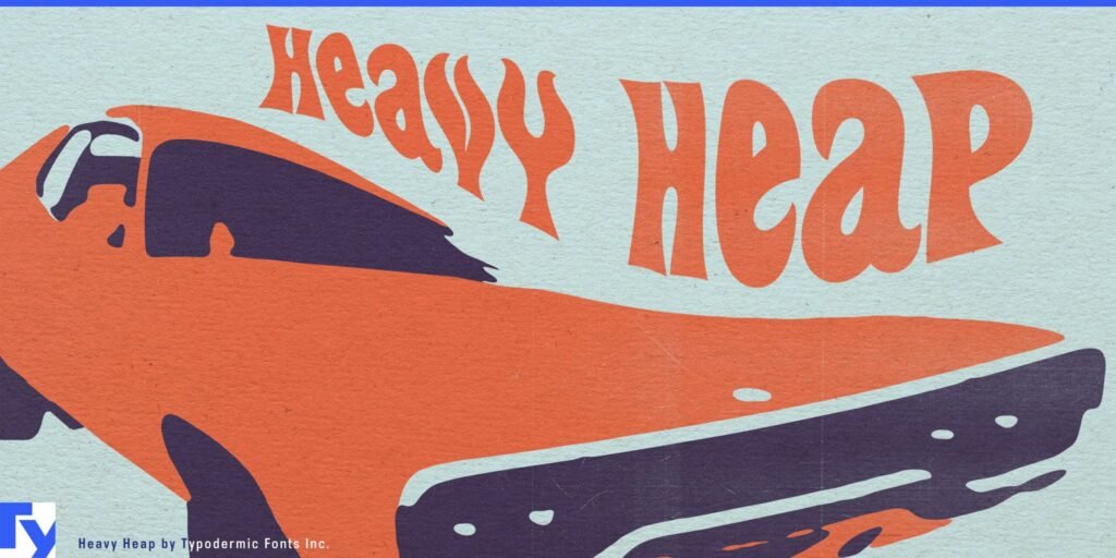
Heavy Heap has been designed by Ray Larabie from Typodermic Fonts, and its letters seem worn out, thanks to stencil prints. Because of its grunge-like ruggedness and the use of cutout stencils, the typeface is both striking and full of an industrial feel. Due to its rough edges and signs of wear, it suggests themes of dilapidation, disobedience, and the usefulness of machines.
Posters, music album covers, urban billboards, and digital work all work well with Heavy Heap, which is designed to stand out.
History and Evolution of Heavy Heap Font
Heavy Heap debuted in the 2000s from Typodermic Fonts at a time when grunge and distressed fonts were trendy. At this time, designers started to add smudges, scratches, and signs of decay to their creative designs in opposition to the pure techniques of modernist typography.
Heavy Heap was built to showcase the real feeling of early graffiti, rust on machinery and weathered military paint. Shaping the font took photographer Thor Larabie’s real pictures of paper plus some computer-based vector tools to make every character look old and natural.
Today, Heavy Heap remains a go-to font for projects needing a touch of rebellion, history, or urban texture.
Key Features of Heavy Heap Font
Heavy Heap isn’t just another display font—it’s a calculated balance between grit and structure. Here’s what sets it apart:
- Stencil-Inspired Design
Each character features stencil breaks, commonly found in industrial labeling and military packaging. These gaps not only enhance the utilitarian feel but also make the font suitable for spray-paint or graffiti-themed visuals.
- Distressed Texture
The font includes organic, grungy erosion, as if the characters were scraped, scratched, or decayed over time. This gives Heavy Heap a handcrafted feel despite being vector-based.
- Uppercase Emphasis
Heavy Heap is designed as a display uppercase font, offering bold capital letters with visual heft. Some versions include limited lowercase or small caps, but the impact lies in the uppercase glyphs.
- Industrial and Urban Personality
Heavy Heap projects urban grit, military efficiency, and underground rebellion. It feels mechanical yet anarchic—perfect for titles and branding that need to scream rather than whisper.
- Extensive Language Support
True to Larabie’s standards, Heavy Heap supports multiple Latin-based alphabets, making it accessible for multilingual designs.
Heavy Heap Font Free Download
You can download this font by clicking the link below.
Applications Of Heavy Heap Font
Because of its rough-edged aesthetic, Heavy Heap excels in situations where visual drama is needed. It’s not for subtle elegance—it’s for making a bold statement.
- Music and Band Graphics
Rock, metal, punk, and industrial bands can use Heavy Heap in album art, gig posters, merchandise, or logos. The font echoes themes of rebellion, distortion, and raw emotion.
- Video Game Design
Heavy Heap fits seamlessly into game interfaces, loading screens, or promotional assets—especially for war games, post-apocalyptic genres, or survival horror.
- Film and TV Titles
For movie posters or title cards, especially in action, horror, thriller, or military genres, Heavy Heap delivers a gritty cinematic vibe.
- Industrial Branding
Products or services related to construction, engineering, hardware tools, or tactical gear can use Heavy Heap to evoke durability and strength.
- Event Flyers and Street Posters
Its stencil and grunge combo make it perfect for urban art shows, underground music events, or any design meant for lamp posts and alley walls.
How to Use Heavy Heap Effectively
To make the most of Heavy Heap in your design work, consider these practical tips:
- Limit usage to headers and short phrases. Due to its complex texture, Heavy Heap loses clarity in body text or small sizes.
- Use high contrast backgrounds. The distressed elements require sufficient contrast to remain legible and impactful.
- Pair with clean sans-serifs. Fonts like Lato, Roboto, or Bebas Neue create contrast and balance when paired with Heavy Heap.
- Avoid excessive effects. The font already has visual texture; adding drop shadows or bevels may make the design feel too cluttered.
Alternatives to Heavy Heap Font
If you love the rugged style of Heavy Heap but want alternatives for variety or licensing reasons, here are some excellent substitutes:
- Capture It by Magique Fonts
A popular stencil grunge font with sharper angles and high-impact letters. It’s a bit cleaner than Heavy Heap but still very aggressive.
- Stencil Std by Adobe
A more traditional stencil font, great for projects that need military-style lettering without the grunge.
- Gunplay by Typodermic Fonts
Another Larabie creation, Gunplay leans more toward display utility than grunge, but still has industrial flavor.
- CF Bad Weather by CloutierFontes
Offers weathered and stormy letterforms—perfect for horror or dystopian aesthetics.
- Headliner No. 45
Designed to look like it’s printed from a broken press, this font mimics newspaper-style distress.
Conclusion
Heavy Heap isn’t just a font—it’s a design statement. It says: “I’m not polished. I’m powerful.” Designed by Ray Larabie, a master of expressive type, Heavy Heap delivers a unique blend of grunge, stencil, and industrial charisma.
From edgy band posters to video game UIs and underground art flyers, this font has proven its value in niche but high-impact roles. Its open licensing and artistic strength make it a versatile choice for designers who need texture and attitude.