Quicksand Font: Introduction
We use typography today to help us form an impression of brands, work our way around websites, and view and read different information. When designers need a typeface that is clear, modern, and friendly, they often turn to Quicksand. The design of this font is modern, which helps it fit well into almost any printing or electronic solution. No matter if you build a slick mobile app or develop a company’s logo, Quicksand could be the moderate influence behind your graphic ideas.
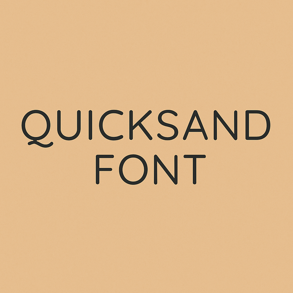
Overview of Quicksand Font
Quicksand is shaped by its rounded terminals and simple, straight lines in geometric patterns. Developed for display, it features equal parts style and readability so that it looks good in all types of text. Because of its clean outlines and open letters, the font is easily distinguished from many sans-serif types.
- Designer: Andrew Paglinawan
- First Released: 2008
- Revised: 2016 with contributions by Thomas Jockin for Google Fonts
- Style: Geometric sans-serif
- Available Weights: Light, Regular, Medium, SemiBold, Bold, and their italic variants
- License: Open-source (SIL Open Font License)
History and Development Of Quicksand Font
Quicksand became available in 2008, thanks to the work of Filipino designer Andrew Paglinawan. He tried out designing with geometric shapes to make the font. I wanted to make a font that appears current, simple to read and legible across all sizes.
In 2016, Google Fonts began using Quicksand and sponsored Thomas Jockin in his update of the typeface. The changes to the font helped it work well for headlines as well as body text. Thanks to this, the font’s kerning, visibility and display across all devices improved.
Key Features of Quicksand Font
- Geometric Construction Quicksand has a modern and smooth image thanks to its geometric design. Using simple shapes helps a layout appear structured and also makes it easy on the eyes.
- Rounded Terminals Because of its softly rounded features, the font is very friendly and appealing, something unusual for a geometric sans-serif typeface.
- Multiple Weights and Styles Because Quicksand has weights from Light to Bold and italic versions, it is easy to distinguish between different parts of a design.
- Optimized for Display and Text When initially designed, Quicksand was set up for display, but it has now expanded to support paragraph text on screens. This design allows people to read the information without any problems.
- Open-Source Licensing Because of the SIL Open Font License, Quicksand is open to everybody for free use at home or in the workplace. Thanks to open licensing, many have adapted the technology.
Quicksand Font Free Download
You can download this font by clicking the link below.
Practical Applications of Quicksand Font
Quicksand is a favorite among designers for its versatility and visual appeal. Here are some common use cases:
- Branding and Logos: The font’s unique blend of structure and friendliness makes it ideal for startups and lifestyle brands aiming for a modern, approachable image.
- Web and App Interfaces: Thanks to its clarity and legibility on screens, Quicksand is often used in navigation menus, buttons, and headlines in web and mobile applications.
- Infographics and Data Visualizations: The clean geometry helps maintain readability even in data-dense visual content.
- Marketing and Advertising: Quicksand’s distinct style grabs attention in social media graphics, brochures, and digital ads.
- Educational and Children’s Content: Its soft, rounded edges make it a friendly choice for materials aimed at younger audiences.
Alternatives to Quicksand Font
While Quicksand is a standout font, it’s always helpful to consider alternatives for different design contexts:
- Montserrat Montserrat is another geometric sans-serif font with a more formal and urban vibe. It’s ideal for corporate branding and editorial design.
- Raleway Raleway offers a more elegant and high-contrast aesthetic. It works well for headings and large text in fashion and luxury branding.
- Poppins Known for its versatility and rounded geometry, Poppins is a strong alternative that shares Quicksand’s friendliness but with a slightly bolder presence.
- Nunito Nunito and its extended version, Nunito Sans, offer similar rounded terminals and clean structure, making them suitable substitutes for user interfaces and casual branding.
- Lato With a more humanist design, Lato offers excellent legibility and neutrality, ideal for professional and academic content.
Conclusion
Quicksand font is modern, approachable and can be used in many different ways. Combining mathematics with soft lines allows Art Deco to adapt easily to current design styles. Quicksand adds clarity and a warm feeling to branding, designs, educational content and advertisements alike.
Quicksand works well for both expert graphic designers and for entrepreneurs who need a fresh approach for their new website. Because Font Awesome is accessible for everyone, thanks to open-source licensing, professional typography is now more open to all.