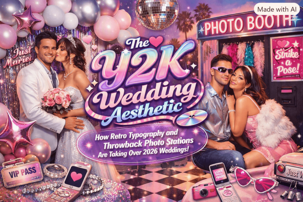
Every few years, a decade’s leftover visual language finds its way back into an industry that has nothing to do with where it came from. Right now, it’s happening to weddings. Bubble letters, chrome gradients, and lowercase sans-serifs that once lived on flip phones and CD sleeves are showing up on save-the-dates, welcome signs, and seating charts, and the typography is doing most of the work.
The Retail Signal
The clearest evidence that this isn’t a niche aesthetic experiment is on Zazzle’s own storefront, where a dedicated Y2K invitation and stationery category now runs into the hundreds of listings, filed under labels like retro, gradient, funky, and Memphis. When a mass-market print-on-demand platform builds out an entire category around a look, it’s a reasonably reliable sign that enough couples are searching for exactly those words to justify the shelf space.
Typography as the Whole Design
Higher up the stationery market, the same instinct shows up with more restraint. Paperless Post’s creative director, Cat Chi, built a design called “Ampersand Outline” around towering, dramatically scaled type set against a black-and-white palette, drawing inspiration from city skylines rather than florals or foil. It’s a useful example of what separates this wave from a costume-party throwback: nobody is asking for literal Y2K clip art. What survives the translation is the confidence of the lettering, oversized, a little blunt, unwilling to share space with much else on the page.
The Date as a Graphic Object
Stationery studio Empire Now has been getting attention for treating the wedding date itself as the entire design: a suite simply printed with “28 06 27” stretched across the top of the card in an oversized numeral treatment, with almost nothing else competing for attention. Paperlust, one of the larger stationery marketplaces tracking these shifts for its own trend reporting, paired that example alongside another studio’s approach, Linear’s save-the-date, which sets a handwritten signature-style name against a clean sans-serif body. Paperlust’s own description called the combination “nostalgic and contemporary,” which is about as precise a summary of the Y2K wedding look as you’re likely to find.
Bringing Back the Physical Object
Typography is only half of it. The other half is what happens on the actual wedding day, and there the nostalgia gets even more literal. Disposable camera stations and Polaroid corners have become a standard line item on “throwback guest experience” checklists, sitting alongside arcade corners and jukebox song-request boards. The appeal is straightforward: after a decade of guests defaulting to a phone camera and a shared hashtag, a physical print that exists in exactly one copy has become the novelty again, not the inconvenience.
The Same Instinct, Somewhere Else Entirely
What makes this trend worth watching isn’t that it’s happening in one design market, it’s that the same instinct is turning up independently in places with no shared stationery supplier, no shared Pinterest board, and no obvious reason to be aligned. Stas Muzikov, an event photographer in Israel who runs bemazal.com, has been fielding a similar shift in what clients ask for at the end of an event, just built around a slightly different physical object. Instead of a disposable camera table, his studio has leaned into wooden photo-block stations and printed magnets, tangible keepsakes guests can hold before they’ve even left the venue. “People got tired of a photo that only exists on someone else’s phone,” he says. “They want something they can put their hand on that same night.” It’s a different material solution to a nearly identical craving, arrived at without any coordination, which is usually the strongest evidence that a trend is real rather than manufactured by one clever marketing team.
Why This Matters for Anyone Designing Around It
For designers, the useful takeaway isn’t “add a chrome gradient.” It’s that this particular nostalgia wave rewards restraint far more than the era it’s borrowing from ever did. The invitations getting attention right now aren’t the busiest ones, they’re the ones that trust one bold typographic choice to carry an entire suite, then let a genuinely physical keepsake do the sentimental work that used to belong to filters and captions. Y2K’s real comeback, at least in this corner of the design world, is less about looking backward and more about giving people something they can actually hold.