Accessible fonts are crucial for ensuring that content is comprehensible and inclusive for all users, regardless of their visual abilities. In today’s digital landscape, accessibility is paramount. As technology evolves, so do the considerations for making digital content accessible to all users, regardless of their abilities. One crucial aspect of accessibility is the choice of fonts.
Fonts play a pivotal role in determining readability, legibility, and overall user experience.
In 2024, with advancements in technology and design, it’s essential to explore the best fonts for web accessibility that meet the latest standards and cater to diverse user needs.
What are Accessible Fonts?
Accessible fonts refer to typefaces that are specifically designed to enhance readability and legibility for all users, including those with visual impairments or reading difficulties. These fonts prioritize clarity, simplicity, and contrast to ensure optimal accessibility in digital and print media. When it comes to web accessibility, choosing the best fonts for websites is crucial for ensuring an inclusive user experience.
Fonts like Arial, Verdana, and Open Sans are among the most accessible fonts, known for their clear letterforms, generous spacing, and versatility across various screen sizes and resolutions. By prioritizing accessibility typography and selecting the best font for accessibility, designers can create web content that is easy to read and understand for all users, regardless of their abilities.
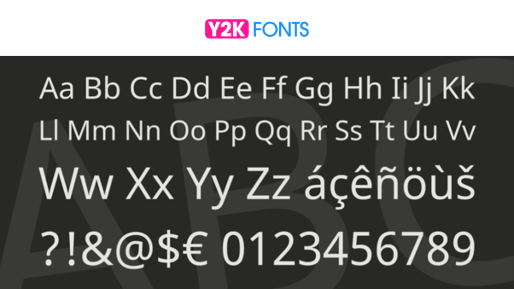
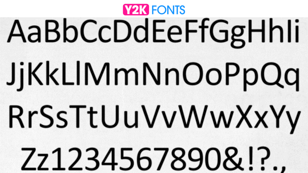
20 Best Accessible Fonts
In this article, we’ll explore the top 20 fonts for accessibility in 2024, empowering designers to create more inclusive digital experiences.
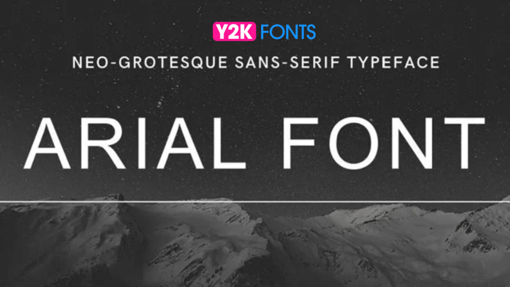
Arial font is a widely recognized sans-serif font renowned for its clarity and readability. With its simple, uniform strokes, it not only ensures easy comprehension for users with varying visual abilities but also enhances accessibility. This makes it an excellent choice for digital content, where legibility is paramount.
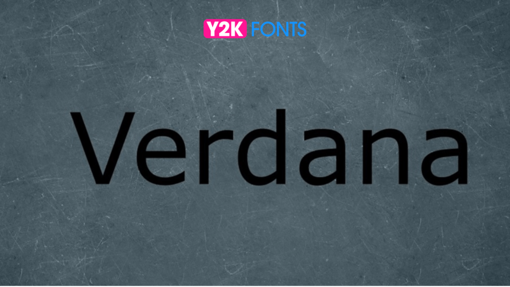
Developed specifically for on-screen readability, Verdana font stands out with its generous letter spacing and distinct letterforms. Its large x-height and open counters not only enhance legibility but also prioritize accessibility, ensuring that users with varying visual abilities can easily comprehend content. This makes Verdana a valuable asset for web design and user interfaces, where clear communication is essential for a seamless user experience.
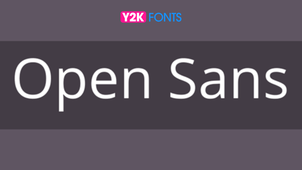
Open Sans is a versatile sans-serif font that prioritizes optimal legibility across various devices and resolutions. Its neutral appearance and balanced proportions not only enhance readability but also promote accessibility, ensuring that content is easily comprehensible for all users, including those with visual impairments. This font’s adaptability makes it an invaluable choice for a wide range of applications, from websites to mobile apps, where clear communication and inclusive design are paramount.
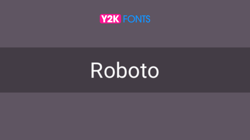
Developed by Google, Roboto is a meticulously crafted font that blends geometric shapes with open letterforms to prioritize readability, especially for users with visual impairments. Its consistent stroke width and clear distinction between characters ensure effortless reading, even on high-resolution screens, contributing to an inclusive user experience across various devices. This accessibility-focused approach makes Roboto a standout choice for digital content, where legibility is crucial for effective communication and user engagement.
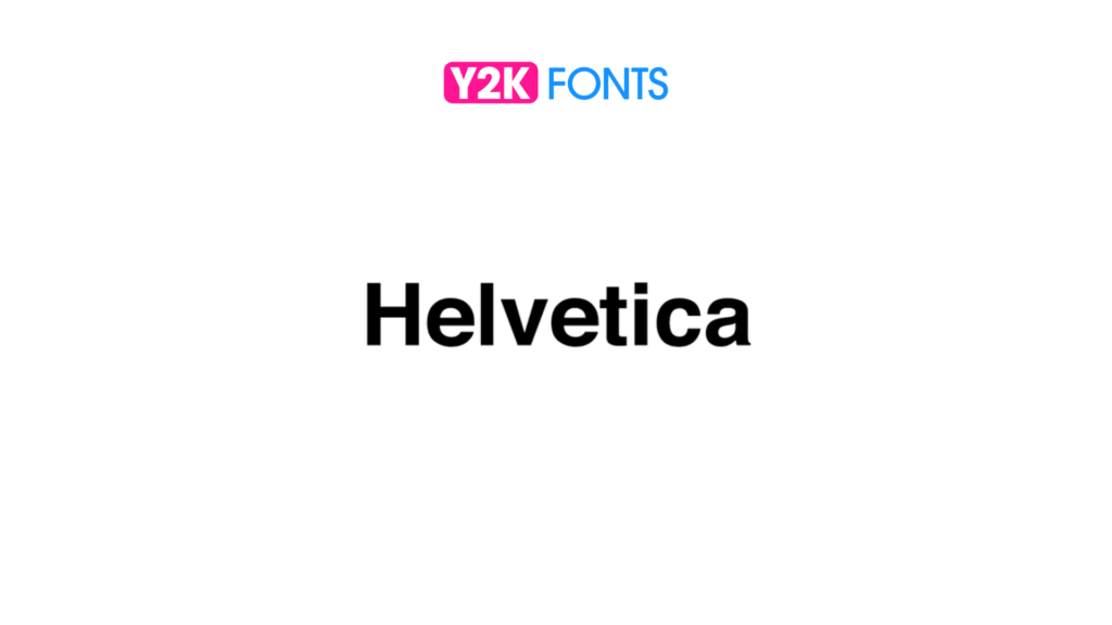
Helvetica, a timeless classic font, is celebrated for its clean, modern design and exceptional legibility, making it an excellent choice for users with varying visual abilities. Its neutral appearance and balanced proportions not only enhance readability but also promote accessibility, ensuring clear communication across both digital and print media. This versatility makes Helvetica indispensable for a wide range of applications, where its reliability and clarity contribute to an optimal user experience and effective communication.
Widely utilized in Microsoft Office applications, Calibri font boasts a contemporary design characterized by rounded letterforms and ample spacing. Notably, its clear and legible characters cater to users with varying visual abilities, ensuring effortless readability in long-form content and presentations. This accessibility-focused approach underscores Calibri’s suitability for diverse audiences, making it an indispensable tool for effective communication and content creation across various platforms.
Another notable Microsoft font, Segoe UI stands out for its exceptional readability and adaptability across various platforms. Its clean, crisp letterforms and well-balanced proportions contribute to optimal legibility, prioritizing inclusivity and accessibility for users of all visual abilities. This focus on accessibility enhances the overall user experience in digital interfaces, ensuring that content is easily comprehensible and engaging for all audiences. As a result, Segoe UI emerges as a valuable asset for designers and content creators seeking to deliver clear and effective communication across diverse digital platforms.
Developed by Google, Noto Sans font is renowned for its extensive language support, catering to multilingual content with ease. Its consistent stroke width and clear letterforms prioritize accessibility, ensuring readability across a diverse range of languages, scripts, and writing systems. This commitment to inclusivity makes Noto Sans an invaluable resource for designers and content creators seeking to reach global audiences and communicate effectively across different cultures and linguistic backgrounds. Additionally, its versatility and readability enhance user experience, fostering engagement and comprehension across various platforms and devices.
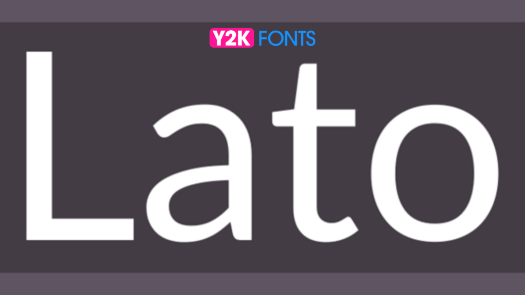
Lato boasts a humanist sans-serif design characterized by rounded letterforms and generous spacing, imparting a welcoming and approachable aesthetic. Notably, its tall x-height and spacious counters prioritize accessibility, enhancing legibility across a wide range of content types, from body text to headlines. This focus on accessibility ensures that all users, regardless of visual abilities, can easily engage with and comprehend the text. Furthermore, Lato’s versatility and readability contribute to a seamless user experience, making it an excellent choice for designers and content creators seeking to deliver clear and engaging communication across various platforms and devices.
Crafted specifically for user interfaces, Droid Sans prioritizes clarity and legibility, particularly in smaller sizes. With its straightforward, unembellished letterforms and uniform stroke width, this font guarantees readability on digital screens, thereby optimizing accessibility for users across various devices. By enhancing user experience in mobile apps and websites, Droid Sans font plays a pivotal role in facilitating seamless interaction and comprehension, ensuring that all users can navigate and engage with digital content effortlessly.
PT Sans, a versatile sans-serif font, offers a harmonious balance of readability and personality with its clear, open letterforms and moderate stroke contrast. This accessibility-focused design ensures optimal legibility across various content types, making it equally suitable for body text and display purposes. By prioritizing clarity and versatility, PT Sans enhances user experience across digital and print media, empowering designers and content creators to effectively communicate their message with impact and clarity.
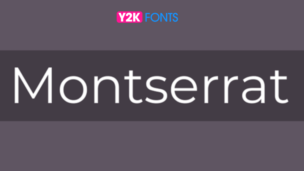
Montserrat, hailed as one of the best accessibility fonts, is a geometric sans-serif font renowned for its clean, modern aesthetic that seamlessly transcends both digital and print design. Its distinct letterforms and generous spacing prioritize optimal legibility, ensuring that content remains easily accessible and comprehensible to all users. This accessibility-focused approach makes Montserrat an ideal choice for headlines and branding materials, where clear communication and visual impact are paramount. By combining versatility with readability, Montserrat enhances the overall user experience, enabling designers and content creators to effectively convey their message with clarity and style.
Developed by Adobe, Source Sans Pro stands out as an accessibility font, meticulously crafted for optimal readability across diverse devices and resolutions. With its clear, legible characters and consistent letterforms, this font ensures effortless comprehension, enhancing accessibility for all users. Its versatility makes it a valuable asset for a wide range of applications, spanning from web design to print media. By prioritizing inclusivity and legibility, Source Sans Pro elevates the user experience across various platforms, empowering designers and content creators to deliver content with clarity and impact.
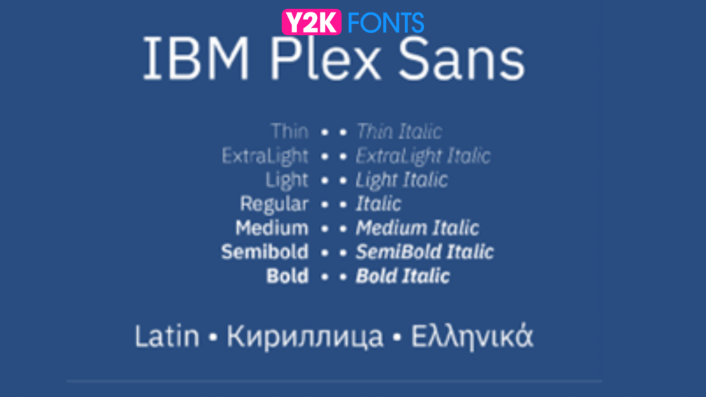
IBM Plex Sans, recognized as an accessibility font, achieves a harmonious balance between form and function. Its clear, legible characters and modern design aesthetic prioritize readability for users of all abilities. Moreover, its versatility and comprehensive character support ensure suitability for global audiences and diverse content types. By emphasizing inclusivity and usability, IBM Plex Sans enhances the accessibility and user experience across various platforms, enabling effective communication and engagement for all.
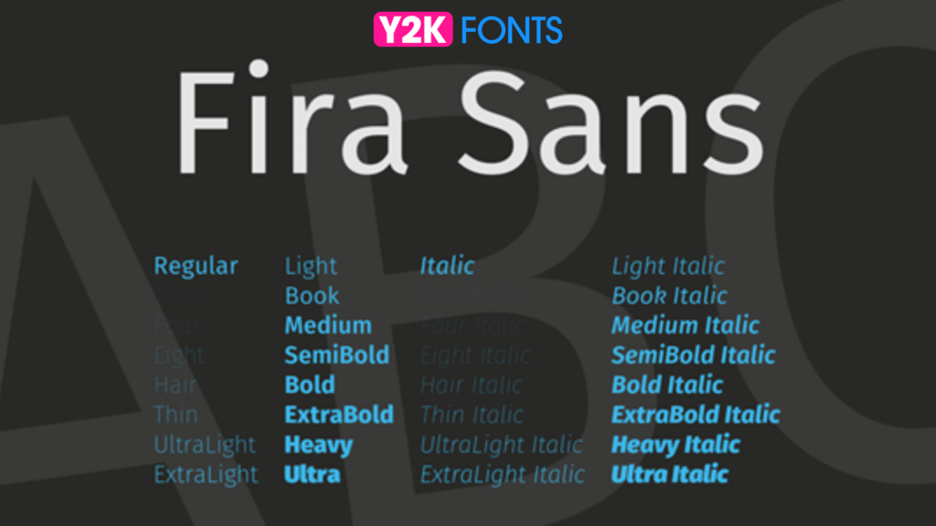
Fira Sans, renowned as an accessibility font, boasts a tall x-height and ample spacing, guaranteeing exceptional legibility, even at small sizes. Its clean, modern design and uniform letterforms make it an optimal selection for digital content, promoting readability across diverse devices and platforms. By prioritizing accessibility and legibility, Fira Sans enhances the user experience, enabling seamless communication and engagement across a wide range of digital mediums.
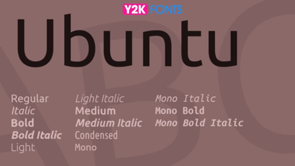
Inspired by the Ubuntu operating system, Ubuntu font stands out as an accessibility font with its friendly and approachable design, characterized by rounded letterforms and open spacing. Its clear and legible characters ensure optimal readability, making it a versatile choice for various applications, including user interfaces and branding materials. By prioritizing accessibility and user experience, Ubuntu font empowers designers and content creators to effectively communicate their message with clarity and warmth across different platforms and mediums.
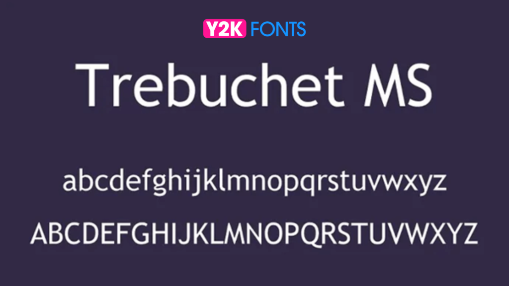
Trebuchet MS, recognized as an accessibility font, is celebrated for its distinctive letterforms and exceptional legibility, rendering it an adaptable option for digital content. With its well-balanced proportions and moderate stroke contrast, this font prioritizes readability, thereby enriching the user experience across diverse contexts. By emphasizing accessibility, Trebuchet MS enhances the clarity and comprehensibility of content, ensuring seamless communication and engagement for all users across different platforms and mediums.
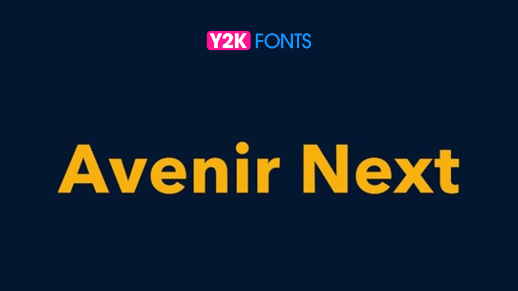
Avenir Next, revered as an accessibility font, seamlessly blends classic proportions with contemporary design elements to deliver exceptional readability. With its clear, well-defined characters and balanced spacing, this font excels in both body text and headlines, guaranteeing optimal legibility across all applications. By prioritizing accessibility, Avenir Next enhances the clarity and comprehensibility of content, facilitating seamless communication and engagement for users of all abilities across various platforms and mediums.
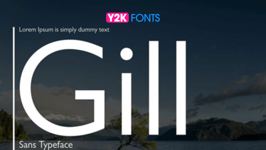
With its humanist sans-serif design, Gill Sans is revered as an accessibility font, imbuing warmth and personality while upholding excellent legibility. Notably, its clear, open letterforms and moderate stroke contrast prioritize readability across diverse devices and resolutions. By emphasizing accessibility, Gill Sans enhances the user experience, ensuring seamless communication and engagement across various platforms and devices. This font’s blend of warmth, personality, and readability makes it a versatile choice for a wide range of applications, from body text to headlines, enriching content and fostering inclusivity for all users.
Franklin Gothic, revered as an accessibility font, stands as a robust and versatile font family with a storied history dating back to the early 20th century. Renowned for its clear, well-defined characters and balanced proportions, this font family ensures optimal legibility across diverse applications, from print to digital design. By prioritizing accessibility, Franklin Gothic enhances the clarity and comprehensibility of content, enabling seamless communication and engagement for users of all abilities. Its rich history and adaptability make it a timeless choice for designers and content creators seeking to convey their message with clarity and impact across various platforms and mediums.
In conclusion, the selection of fonts plays a pivotal role in ensuring web accessibility and inclusivity for all users. The 20 best fonts for accessibility in 2024, including popular choices like Arial, Verdana, and Open Sans, prioritize clarity, simplicity, and contrast. These fonts are specifically designed to enhance readability across different devices and screen sizes, catering to individuals with visual impairments or reading difficulties.
By utilizing the best fonts for web access, designers can create digital content that is easy to navigate and understand, thereby fostering inclusivity and improving the overall user experience on the web.