Aileron Font is one of the best options among modern designers, thanks to its clean, geometric design and outstanding versatility. The design of it is also fundamental in forming the perspective and attention of the reader to the content, and it is not only a typeface but a means of effective communication. Following the modernist design theory, Aileron has managed to gain popularity and is often favored by professionals who desire a businesslike appearance with a touch of modernity.
Overview of Aileron Font
Aileron Font, designed by Sora Sagano is a contemporary sans-serif typeface that is based on the 1900s classic types of Helvetica and Univers. It is a favorite of designers and branding professionals as it was released as a free and open typeface. Aileron is ideal with its geometric letterforms to improve readability and provide clean and contemporary appearance in both digital and print-based applications.
Features of Aileron Font
Aileron is distinguished by several notable characteristics that contribute to its widespread appeal:
- Geometric Sans-Serif Style
Aileron depends on modernist principles to present a geometric structure while combining simplicity with elegance. You can understand this font easily due to its well-balanced shape along with its refined curved lines.
- Extensive Font Weight Range
Aileron offers a comprehensive range of weights, including:
- Thin
- Light
- Regular
- Semibold
- Bold
- Black
This variety allows designers to use Aileron for diverse applications, from body text to bold headlines, without needing to switch fonts.
- High Legibility
The carefully crafted letterforms provide excellent readability at various sizes. Whether used in large display formats or small body text, Aileron maintains its clarity and effectiveness.
- Smooth Curves and Elegant Proportions
Aileron distinguishes itself from industrial-style sans-serif type designs because it includes softened elements and refined characteristics, which create a friendly appearance without compromising professional reputation.
- Free for Personal and Commercial Use
One main benefit of Aileron is its totally free cost for all personal and commercial project implementations. People find Aileron attractive for its free status, which contrasts favorably with premium choices such as Helvetica and Proxima Nova.
Read more: Omori Font Free Download
Applications of Aileron Font
Thanks to its versatility, Aileron is suitable for a broad range of design projects. Here are some of the most common uses:
- Branding and Logo Design
The sleek professional design features of Aileron position it as an outstanding choice for building brand identity along with logos. A strong brand presence requires a design that displays modernity and trust along with sophistication and Aileron achieves this.
- Web and UI/UX Design
Aileron finds its main application in web development alongside user interface work because of its easy legibility and simple formatting. Aileron presents excellent visibility across background sizes which makes it appropriate for displaying titles and navigation menus as well as UI features on diverse screen platforms.
- Print and Editorial Design
Aileron functions exceptionally well with its modern design to deliver high-quality results for magazines and corporate documents and brochures. Aileron works effectively at various size ranges which gives printed materials a refined appearance.
- Marketing Materials
Flyers, posters, business cards, and advertisements benefit from Aileron’s versatility. Its broad weight selection allows for clear visual hierarchy, ensuring essential information stands out.
- Presentations and Infographics
Professional presenters who need to enhance clarity and engagement find a clean sophisticated design solution in Aileron. This theme functions well with systematic layouts thereby improving the visual presentation of data visuals and informational graphics.
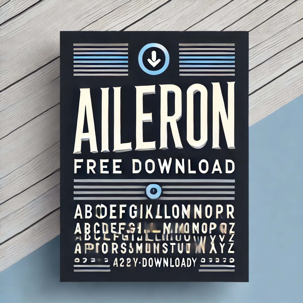
Aileron Font Free Download
You can download this font by clicking the link below:
Alternatives to Aileron Font
Best Practices for Using Aileron Font
To maximize the effectiveness of Aileron Font in your design projects, consider these best practices:
- Pair It with a Complementary Font
Aileron pairs well with serif fonts like Garamond, Merriweather, or Playfair Display for a sophisticated contrast. For a clean, minimalistic design, pairing it with another sans-serif font like Open Sans or Roboto works well.
- Use Different Weights for Hierarchy
Take advantage of Aileron’s multiple weights to create a clear hierarchy in your designs. Use bold weights for headlines and lighter weights for body text to enhance readability and visual appeal.
- Ensure Adequate Spacing
Adjusting letter-spacing (tracking) and line-height (leading) ensures optimal legibility. Aileron’s natural balance makes it flexible for various spacing adjustments depending on the project.
- Consider Contrast and Background Colors
When using Aileron in digital or print designs, ensure sufficient contrast between text and background to enhance legibility. Light text on dark backgrounds or vice versa often works best.
Conclusion
The Aileron Font offers modern, multitudinous functional features within typography. The geometric structure, coupled with its clear readability features, together with multiple weight options, makes Aileron perfect for commercial design projects. The unique combination of creative elements and professional effectiveness in Aileron provides optimal design solutions for branding projects or websites, as well as print campaigns.