Game of Squid Font: Introduction
The Game of Squid Font stands out as one of the most notable recent typefaces because it is inspired by the title design of the Netflix series Squid Game. The precise geometric approach and its minimalist design have led the Game of Squid font to become a popular choice across many creative sectors.
The following blog investigates the origins of the Game of Squid Font, its distinctive design features, industry applications, and alternate font options for designers with matching aesthetic needs.
Overview of the Game of Squid Font
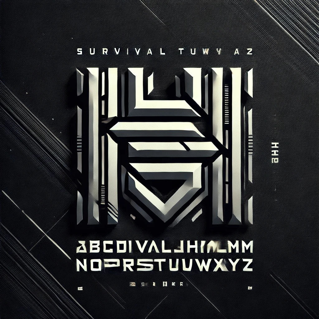
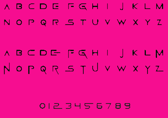
The text design for Squid Game perfectly complements the show’s concept while expressing both uniqueness and instant recognizability. This layout features structured letterforms that create a science-fiction atmosphere, ideal for contemporary and technical design projects.
The design of this font was derived from Korean Hangul characters by combining distinctive shapes that model important Squid Game symbols including the circle (○), triangle (△) and square (□). Different game ranks in Squid Game are symbolized by this font, which generates a combination of mystery and dystopian mood during gameplay.
Regrettably, the TV show Squid Game employed a unique customized font, but various designers created comparable versions of this font named “Squid Game Font” or “Game of Squid Font,” which became publicly available.
Features of the Game of Squid Font
- Minimalist and Geometric Design: The font consists of simple, geometric letterforms with clean edges. This modern and futuristic approach makes it ideal for digital and branding projects.
- Korean Hangul Inspiration: Some letters resemble Korean Hangul characters, reflecting the series’ cultural origins and adding a unique aesthetic appeal.
- Bold and High-Contrast Style: The font is typically used in bold weight, ensuring high readability while maintaining a sleek and edgy look.
- Symbolic Elements: The use of circular, triangular, and square shapes within the font design directly ties into the mystery and structure of the Squid Game universe.
- Versatile and Eye-Catching: While primarily used for branding, the font is well-suited for various design applications, including posters, digital media, advertising, and merchandise.
Game of Squid Font Free Download
You can download this font by clicking the link below:
Applications of the Game of Squid
Designers utilize this Squid Game font beyond its TV series portrayal because it has emerged as their preferred design choice. The font expresses both fun and threatening elements which enables designers to apply it across diverse applications. This text finds its way into numerous applications due to its unique characteristics which I will address now.
- Title Sequences and Branding: A bold, dramatic design in the font proves suitable for creating titles and logos and establishing brand identities. This design works exceptionally well in establishing projects that need to build tension with an intriguing quality.
- Promotional Materials: Posters alongside social media graphics continue to benefit greatly from the Squid Game font which promotes powerful promotional graphical content creation. The strategic style elements of this font maintain its visibility regardless of the visual competition in the design space.
- Merchandise Design: The Squid Game font serves as an essential element in establishing Squid Game-inspired merchandise products such as T-shirts along with mugs and posters. People who are fans of the show regularly choose this design as a popular and iconic collectible item.
- Event Graphics: Themed celebrations and escape rooms alike benefit from the use of Event Graphics that incorporate the Squid Game font to create an authentic atmosphere in each experience. The mysterious yet enjoyable visual language of this font precisely suits entertainment projects derived from the show.
- Digital Media and Gaming: The Squid Game font works exceptionally well in digital media applications including websites apps and video games due to its bold geometric appearance. The font works especially well when designing content that needs to create suspense with competitive elements.
- Art and Illustration: Creators including artists and illustrators use the Squid Game font as their artistic element for their projects. The distinct appearance of this design creates extra value when applied to visual stories.
Read more: Gambarino Font: Free Download
Alternatives to the Game of Squid Font
If you’re looking for fonts similar to the Game of Squid Font, consider the following alternatives:
A font with similar geometric and minimalist features, commonly used in modern design.
A sleek, sans-serif typeface that exudes elegance and simplicity.
A bold, clean font with a strong visual impact, often used in branding and advertisements.
A widely recognized geometric sans-serif font known for its modern and timeless appeal.
Conclusion
The Game of Squid Font represents more than typography because it embodies contemporary, understated visuals and motion picture artistry. This unique geometric typeface with cultural value and attractive design elements works perfectly for multiple creative uses.
Designers across all fields including graphics and content development and branding will discover an exclusive style in their work through use of this typeface. The Game of Squid Font serves as an outstanding option to implement futuristic mystique in your designs.