If you’ve ever felt like choosing font pairs is an unsolvable puzzle, you’re in luck. Selecting the right font combinations is a crucial part of creating stunning designs, and it doesn’t have to be a no-win situation — it’s quite the opposite.
In this post, we’ll walk you through the basics of font pairings and give you a treasure trove of examples for any design need.
Font Pairings at a Glance
Apart from the multitude of examples we’re about to present, make sure to check out our other fantastic font-related article, “How to Use Font Pairings Like a Pro,” which delves into the finer points google font combinations. But before we get into the design inspiration, here are a few essential “What You Should Knows.”
Fonts versus typeface
Before mastering font pairings for websites, it’s crucial to understand the distinction between fonts and typefaces. Typeface combinations refers to the specific lettering design. For instance, Google Docs defaults to the Arial typeface, while Microsoft Word uses Calibri.
Within these typeface styles, you can adjust the font characteristics such as italic, bold, underline, etc., in Arial or Calibri, for example, in 12-point size. In essence, the font attributes are customizable within the typeface style.
Contrasting font pairs
Understanding the difference between font and typeface is essential when selecting contrasting font pairs. Just like contrasting colors, there’s a place for contrasting fonts in design. You can create contrast not just with typefaces but also with fonts, incorporating different styles, sizes, widths, spacing, and other characteristics.
Here are a few examples of contrasting font combinations.
Vidaloka + Roboto (Serif and Sans Serif typefaces)
- Oswald + Raleway (Sans Serif typefaces)
- Playfair Display + Cormorant (Serif typefaces)
As shown, contrasting fonts can exist within the same typeface family. So, whether you’re creating menus, birthday party invites, or planning a professional event, using contrasting fonts can diversify the design and generate intrigue.
However, just like you probably wouldn’t put cinnamon and dill together, certain fonts don’t mix. Matching fonts can be a bit of trial and error, but there are ways to guarantee a stronger match. For instance, while contrasting font pairs do exist within the same family, serif and sans serif pairings also balance each other out. Using web font pairings within the same category can create a refined visual.
And remember this: More fonts typically don’t make for a better design. Two fonts and you’re golden, three fonts and you’re still in the safe zone. Incorporate four or more fonts into your design, though, and things might start looking chaotic.
Now that you’ve got the basics down, let’s explore PicMonkey’s text tools.
In PicMonkey’s text tool, you have access to six main font types, or font families:
- Serif: Fonts in this category have either a footer or minor flourish, perfect for a distinguished look.
- Sans Serif: Sans = without, so no footer or flourish. These fonts provide a sleek and contemporary appearance.
- Handwriting: Designed to mimic one’s handwriting, each variation is distinctly different.
- Script: Elegant or special occasions come to mind with script fonts, perfect for wedding or shower invitations.
- Display: Bold and attention-grabbing, meant for grabbing attention.
- Monospaced: A nod to the typewriter days, these fonts create an old-school or classic feel.
Now, onto the font pairing examples…
30 Best Font Combinations
Selecting the perfect font pairings can greatly improve your website’s visual charm and readability.
Let’s delve into each of the 30 best font combinations and explore their characteristics and applications:
Font Pairings For Events
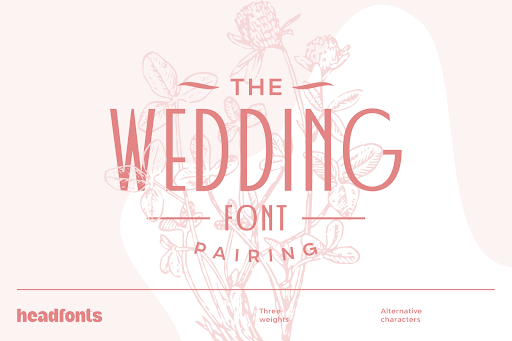
1. Wedding Program
This wedding font combination program is a perfect example of the saying “opposites attract.” Dolce Vita serves as a classy headline font, and when combined with Montserrat (sans serif), it creates a contemporary and elegant final appearance.
2. Graduation invitation
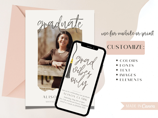
A crucial aspect of effective font pairing is readability, and this example excels in that regard. Didonesque, a prominent serif font, exudes boldness and authority. Paired with Didact Gothic, a tall and slim sans serif, it achieves a harmonious balance in appearance.
3. Certificate
Oswald and Lato Light complement each other seamlessly. When used together, they produce a sleek appearance, maintaining clarity even when the Lato Light font is resized.

4. Baby Announcement
Announcements provide a great chance to play with modern font combinations. Bombshell Pro, a striking script font, complements Gordita (a sans serif) beautifully, ensuring a well-organized design.
For added creativity, try experimenting with textures in the editor to achieve unique styles. In this design, Bombshell Pro is enhanced with a glitter texture for extra flair.

5. Wedding announcement
In this scenario, we have another opportunity for creative font combinations. Lato and Ultra System Script come together to create a modern style with a touch of personality, especially with the script ampersand.

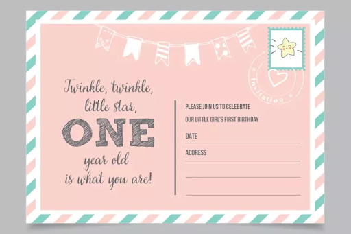
6. Birthday Invitation
Phenomena is a striking and attention-grabbing font selection. Combining its bold personality with a more subdued option like Heebo Light adds quick distinction and ensures easy readability.
Font Pairings for Business
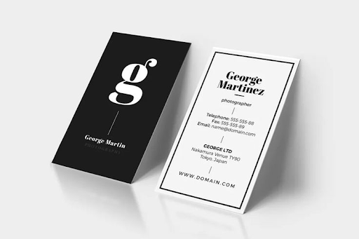
7. Business Card
Business cards aim to achieve the perfect balance between captivating and professional. Antonio and Lato Light, both simple sans serif fonts, offer versatility. By adjusting their sizing and density, you can effortlessly create contrast and make your design stand out.
8. Resume
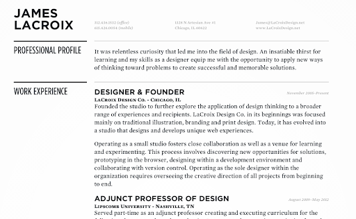
Choosing the right fonts for your resume is crucial. You need great fonts pairings that are visually appealing yet maintain consistency throughout the page. One great combination is Rozha and Montserrat.
Rozha, a serif font, makes a bold statement for your name, while Montserrat is clean and easy to read for the rest of the text. This pairing ensures a professional and visually pleasing resume.
9. Presentation
When creating professional presentations, choose elegant font pairings that are authoritative and easy to read. Adamina and Work Sans are excellent choices for this purpose. These modern fonts not only ensure readability but also combine to create a distinctive and polished look in your design.
10. Real Estate Flyer
No, we’re not bending the rules here. You can pair the same font… just ensure they have slight contrast. In this example, Montserrat Bold is paired with Montserrat Regular. Since they’re technically the same font, it’s a perfect match, and the bold style adds differentiation while maintaining an elegant appearance.

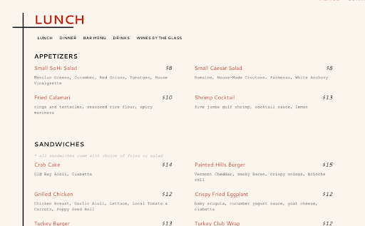
11. Menu
Menus offer a great opportunity for creative and visually appealing font combinations. Shrikhand paired with Chivo Light is an example of a bold display font meeting a simple serif, resulting in a clear and attractive menu.
12. Email
Absolutely, font pairings can enhance your email designs! This is especially important for marketing emails aimed at boosting engagement. Combine attractive fonts with visually appealing graphics. Didonesque, an elegant serif font in all caps with wide spacing, adds a modern touch. Montserrat Regular ensures readability and keeps readers engaged.
You can also experiment with cursive and script font combinations, or pair script fonts with serifs to create a memorable email signature design that makes a lasting impression.

Font Pairings for Social Media
13. Instagram Question post
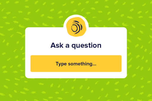
Social media thrives on engagement, and creating eye-catching content is key to keeping followers interested. Incorporating font pairs in your designs can help achieve this goal. For instance, Bird and Thorn combined with Raleway creates a friendly and playful font duo. Bird and Thorn is particularly useful for guiding story viewers on where to fill in their own information.
14. Instagram post
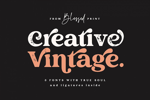
Choosing the right font pairs can elevate your social media content, improving both engagement and readability. Considering that most users view posts and stories on their phones, it’s important to select fonts that stand out when paired together. Didonesque Medium and Gordita achieve this perfectly.
15. Facebook quote story
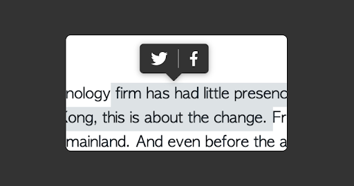
Facebook quote stories and posts are widely shared on social media. Vollkorn and Arimo offer a contemporary appearance while striking a balance between serif and sans serif fonts.
16. Instagram fashion story
If you want an artsy script font pairing, Northwell + Chivo is ideal for you. Experiment with font colors to create a vibrant and eye-catching appearance.

17. Instagram quote post
Chango provides a visually striking impact. Utilize it in a quote post, then combine it with Lato Light for a subtle hashtag.

18. Facebook post
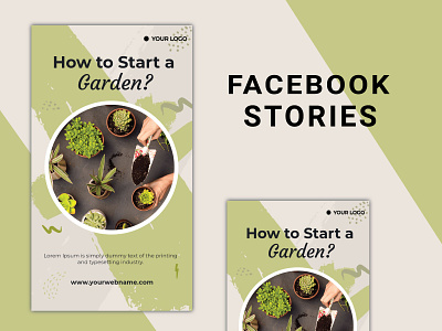
If you’re looking for a cursive font combination, try Nickainley + Futura Medium. Nickainley offers a modern take on cursive headlines, adding a unique touch. Its lively personality pairs perfectly with the simple and effective Futura Medium, which is great for conveying important information.
Font Pairings for Marketing
19. Pinterest pin
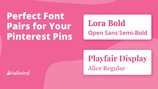
It’s beneficial to use large headlines on Pinterest. Pairing serif and sans serif fonts often creates a balanced design, making Prata and Montserrat Medium a perfect match.
20. Facebook ad
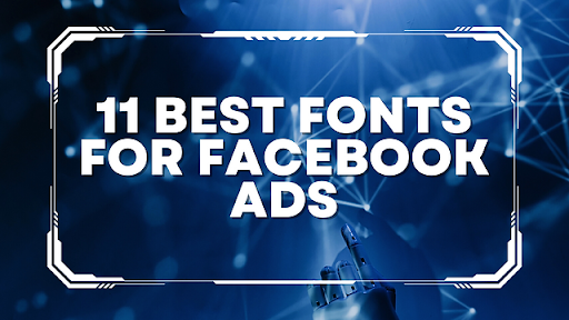
When creating a Facebook ad, it’s crucial to catch attention and stop scrolling. Press Start is an exceptional display font, perfect for tech-oriented ads. Combine it with Lato, a contemporary sans serif font, for clear and detailed ad copy.
21. Instagram carousel ad
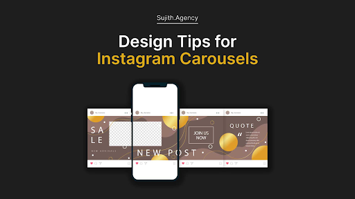
Bodoni is a commanding serif font with wide letter spacing, making it an excellent option for social media ads. Montserrat complements it perfectly for a polished finish.
22. Postcard
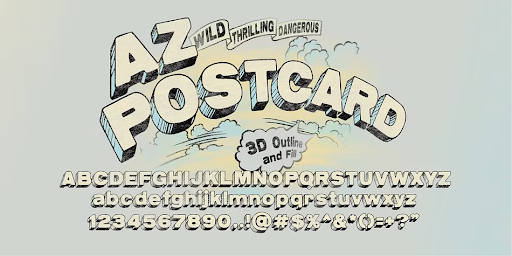
When including postcards in your marketing materials, combine two versions of the same font for better readability. For instance, you can use Cormorant Medium and Cormorant Medium Italic together.
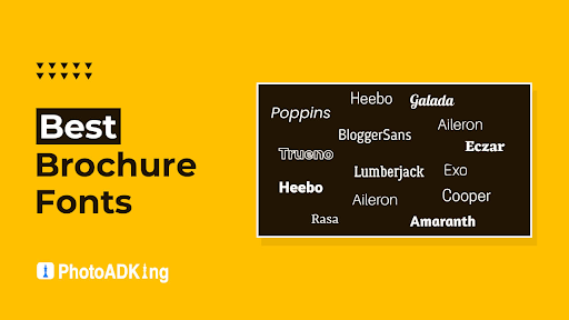
23. Brochure
Just like a postcard, your printable brochure should ensure easy readability, whether it’s in print or digital format. Use Hammersmith One, a serif font, paired with Montserrat to maintain clean and clear copy across your brochure.
24. YouTube Thumbnail
YouTube is a platform full of excitement and bold visuals. Black Jack and League Spartan fonts are both vibrant and attention-grabbing, especially when used with different colors.
Pairing a script font like Black Jack with a sans serif like League Spartan creates a balanced yet impactful look, perfect for making your content stand out.

Font Pairings for Organization
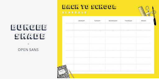
25. Class schedule
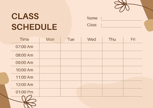
Here’s a creative twist for your school schedule: try pairing Bungee Shade with Open Sans. Bungee Shade adds a touch of fun to your design, while Open Sans ensures everything remains neat and easy to read.
26. Personal schedule
Why settle for a dull yellow legal pad or a plain notebook for your personal schedule? Add some personality to your pages that reflect who you are! Try pairing Silver South Serif with Silverline Script, using the script font sparingly. See how it adds just the right amount of contrast to the design with just one word.
27. Calendar
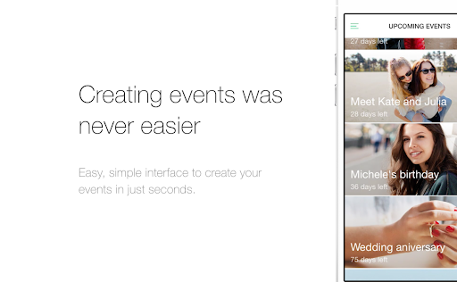
Personalize your calendar by combining Amoret Script and Quicksand. Opting for a script font for your main headline text adds a personal touch to the calendar. Quicksand, with its thin and rounded style, ensures a clean appearance on the page and enhances readability.
28. Content planner
When organizing content, use a bold sans serif font like Shapiro Heavy to mark your planning sections. Then, maintain consistency with the distinct Shapiro Bantam for a cohesive look.
29. Lesson plan
Expressing personality is crucial when using organizational tools. It’s all about looking good, feeling good, and achieving great things. Here, Dukas adds flair, while Glacial Indifference ensures that the body text remains clear.

30. To-do list
Similar to customizing a calendar, your daily, weekly, or monthly to-do list can benefit from a personal and friendly touch. Pairing Sebastian Bobby with Roboto achieves this, adding a familiar vibe while maintaining a modern design.
