Josefin Slab Font is not merely letters on a screen, but rather a silent yet forceful communicator that constructs perception, evokes feeling, and creates brand identity. Of the numerous typefaces pleasing designers and typographers, Josefin Slab is remarkable for its refreshing combination of vintage sophistication and geometric futurism. Google Font Josefin Slab has been widely used for its versatility in anything from editorial designs to contemporary web interfaces.
Overview of Josefin Slab Font
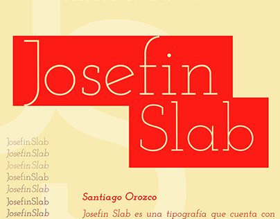
Josefin Slab or geometric slab serif font was produced by Santiago Orozco. Its minimalist roots and inspiration from Scandinavian design were born out into an offshoot (sister font) of Josefin Sans. Available under the SIL Open Font License, commercial as well as personal use is free of cost, making it one of the most popular among website and print designers.
Key Attributes:
- Font type: Slab serif
- Designer: Santiago Orozco
- Release: 2010 (Google Fonts)
- License: SIL Open Font License
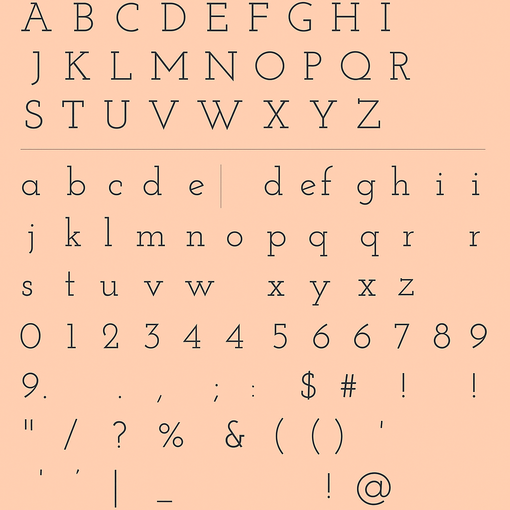
- Styles: 6 weights (from Thin to Bold) with corresponding italics
Key Features of Josefin Slab Font
Josefin Slab combines art deco influences, geometric structure, and classical slab-serif details to create a highly recognizable and functional typeface. Let’s dive into its standout characteristics:
1. Geometric Precision
Each letterform in Josefin Slab follows a consistent geometric grid. This adds a sense of order and balance, making it especially suitable for clean and modern layouts.
2. Slab Serifs
Unlike traditional serifs, slab serifs are thick and block-like, offering a bolder and more impactful aesthetic. Josefin Slab uses this style with elegance—its serifs are pronounced yet not overwhelming.
3. Tall x-Height
Characterized by a tall x-height, the font increases legibility, in particular, for small type. It also helps create its modern look of openness.
4. Thin Hairlines
Though Josefin Slab boasts of exuberant slab serifs, its lighter weights also carry the most delicate of hairlines, which gives extra contrast and refinement.
5. Vintage Appeal
The design has a retro feel to it, like 1930s advertising and editorial work, which gives character to current arrangements.
6. Multiple Weights and Italics
Josefin Slab comes in six weights—Thin, Light, Regular, Medium, Semi-Bold, and Bold—each with a matching italic. This range supports typographic hierarchy and design versatility.
Josefin Slab Font Free Download
You may acquire the font using the link below without limitations for both personal and commercial needs.
Applications of Josefin Slab Font
One of Josefin Slab’s greatest strengths is its adaptability. Here are some contexts where it truly shines:
1. Editorial and Print Design
Josefin Slab is a favourite in the magazines, books, newspapers. Its retro-modern flair serves perfectly well for titles, bylines, and pull quotes.
2. Branding and Logos
For brands looking to exude a blend of classic and contemporary, Josefin Slab can serve as a primary typeface. Its distinct slab serifs offer a strong visual presence.
3. Websites and UI Design
Josefin Slab fits in perfectly in website headings and in navigation menus as well, as long as the body text includes sans-serif text. The availability of its integration into Google Fonts therefore makes it possible to implement it using only a few lines of code.
4. Posters and Advertisements
Josefin Slab’s bold weights and stylish curves provide visual authority when making an impact. It’s often used in event posters, fashion lookbooks, and restaurant menus.
5. Pairing Typography
Josefin Slab fits very well next to Josefin Sans, but works well with other fonts such as Open Sans, Lato, or Raleway, particularly in minimalist design.
Alternatives to Josefin Slab Font
Final Thoughts
Josefin Slab is not only a font, but it’s a declaration. A delicately harmoniated mix of vintage geometry and modern aesthetics, it’s a flexible typeface that communicates with style, self-assurance, and clarity. Whether in a magazine layout, or in your brand identity or in a responsive website, with Josefin Slab you will get sophistication and flexibility to make your message stick out.