Typography is one of the most essential elements of design, shaping how we perceive and interact with visual content. Fonts, as the building blocks of typography, play a critical role in conveying mood, tone, and personality.
Whether you’re designing for print, web, or branding, understanding how to use fonts effectively can elevate your work to new heights.
In this article, we’ll explore the different types of fonts, their applications, and practical tips for creating stunning designs.
The Basics of Fonts: Types and Characteristics
Serif Fonts: Timeless and Classic
Serif fonts are the oldest typefaces in design history. They are characterized by small strokes or “feet” at the ends of letters. These fonts exude sophistication and are often used in formal or traditional designs.
Popular Uses:
- Books and newspapers for readability.
- Logos for brands that want to convey trust and heritage (e.g., Vogue).
Examples:
- Times New Roman
- Baskerville
- Georgia
Sans Serif Fonts: Modern and Minimal
Sans serif fonts lack the decorative strokes of serif fonts, giving them a clean and contemporary look. They are highly versatile and ideal for digital screens due to their crisp readability.
Popular Uses:
- Websites for a sleek, modern feel.
- Branding for tech companies or startups.
Examples:
- Helvetica
- Montserrat
- Arial
Script Fonts: Elegant and Decorative
Script fonts mimic handwriting or calligraphy, adding a touch of elegance and creativity to designs. These are perfect for projects that require a personal or luxurious feel.
Popular Uses:
- Wedding invitations.
- High-end product packaging.
Examples:
- Pacifico
- Great Vibes
- Lobster
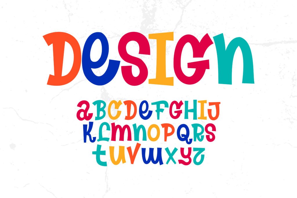
Decorative Fonts: Bold and Unique
Decorative fonts are dramatic and attention-grabbing. They often combine artistic elements, making them suitable for creative projects that require a strong visual impact.
Popular Uses:
- Posters and advertisements.
- Event branding or themed designs.
Examples:
- Bangers
- Comic Sans (used sparingly)
- Plante
How to Use Fonts Effectively in Design
Establishing Visual Hierarchy
Fonts play a crucial role in guiding the viewer’s attention. Using different font sizes, weights, and styles can create a clear visual hierarchy.
Tips:
- Use bold fonts for headlines to grab attention.
- Pair contrasting fonts (e.g., serif for headings and sans serif for body text) to create balance.
- Apply consistent spacing to improve readability.
Pairing Fonts Strategically
Combining multiple fonts can add depth to your design. However, it’s essential to ensure harmony between the typefaces.
Best Practices:
- Pair serif with sans serif fonts for contrast.
- Limit font combinations to two or three to avoid clutter.
- Choose fonts with similar proportions or x-heights for consistency.
Styling Text for Impact
Font styling—such as color, size, and alignment—can transform basic text into an engaging design element.
Techniques:
- Use vibrant colors to evoke emotion or highlight key information.
- Experiment with text effects like shadows or gradients for added depth.
- Align text consistently to maintain a clean layout.
Practical Applications of Font Choices
Branding with Fonts
Fonts are an integral part of brand identity. The right typeface can communicate your brand’s personality and values effectively.
Examples:
- Luxury Brands: Use serif or script fonts for elegance (e.g., Dior).
- Tech Startups: Opt for sans serif fonts to convey innovation (e.g., Google).
A Sensory Connection
Typography is not just about visuals—it can evoke sensory experiences too. Just as aromatics enhance essential oil through subtle layers, well-chosen fonts enrich design by adding depth and personality. For instance, a script font might evoke the smooth flow of a fragrance bottle’s label, while bold sans serif fonts mirror the precision of modern packaging designs.
Enhancing User Experience in Web Design
Fonts significantly impact user experience on digital platforms. Legible typography ensures that users can easily consume content without strain.
Tips:
- Choose web-safe fonts like Arial or Roboto.
- Maintain proper line spacing and font sizes for readability on all devices.
- Incorporate white space around text elements to reduce visual clutter.
Precision in Design
Customizing font choices is akin to selecting made to measure blinds—both require precision and attention to detail. Just as blinds are tailored to fit specific windows perfectly, typography must be carefully adjusted to suit each project’s unique requirements. This ensures that every element aligns seamlessly with the overall design vision.
Conclusion
Fonts are much more than letters on a page—they are powerful tools that shape how audiences perceive your message.
By understanding the characteristics of different font types and applying them thoughtfully, you can create designs that are not only visually appealing but also emotionally resonant.
Whether you’re crafting a brand identity or designing a website interface, remember that typography is your silent partner in storytelling.
Embrace its potential, experiment with combinations, and let your designs speak volumes!