
DIN font represents a definitive example of clear precision combined with versatility among all typefaces that have proved their longevity. People notice DIN appearance across road signs and corporate branding as well as digital interfaces and this functional design has become a standard in modern visual communication.
Overview of DIN Font
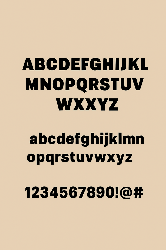
The DIN font family, under DIN, stands for Deutsches Institut für Normung (German Institute for Standardization) possesses a sans-serif typographic design through its structured geometric font. DIN provides a straightforward functional design that functions well in industrial as well as technical situations that require easy text readability.
The DIN font started as a design for engineering projects and signage markers but its basic structure now gives designers opportunities in contemporary branding and digital media applications.
DIN Font Family
- DIN Regular Font
- DIN Bold Font
- DIN Light Font
- DIN Medium Font
- DIN Regular Alternate Font
- DIN Condensed Bold Font
- DIN Medium Alternate Font
- DIN Condensed Font
- DIN Condensed VF Font
- DIN Pro Font
- DIN Font
- DIN Black Font
Features of DIN Font
What makes DIN font stand out among countless sans-serif typefaces? Let’s break down its defining features:
- Geometric Simplicity
The builders of DIN font use straight lines together with circles and uniform curves in its design. Because of its geometric structure DIN fonts maintain a clear organized look that allows people to read them without difficulty regardless of size.
- High Legibility
Originally designed for road signage and technical documents, DIN prioritizes clarity and visibility, even at great distances or under adverse conditions.
- Minimal Contrast
DIN features low stroke contrast, meaning the thickness of the lines remains mostly uniform throughout each character. This contributes to its mechanical and modern aesthetic.
- Wide Range of Weights and Styles
The FF DIN family’s extensive range includes Light through Black weights as well as italics, condensed and rounded versions which ensures its usability in functional as well as creative projects.
- Neutral and Versatile
DIN stays neutral in design language that enables it to integrate well with different environments while avoiding any design takeover. DIN holds popularity in official branding because of its subtle appearance.
DIN Font Free Download
You can download this font for free by clicking the link below:
Applications of DIN Font
The DIN font’s unique blend of clarity, neutrality, and versatility has cemented its place across multiple industries. Here’s where you’re most likely to encounter it:
- Signage and Wayfinding Systems
DIN’s origins in public signage are still relevant today. From road signs across Germany and Europe to airport wayfinding systems, its clear lines and legibility under varying lighting and distances make it ideal.
- Corporate Branding
Major brands leverage DIN for its modern, professional appeal. Companies such as BMW, Bosch, and Deutsche Bahn have incorporated DIN into their brand identities to convey reliability and precision.
- Editorial and Print Design
Magazines, books, and newspapers use DIN fonts for headings, captions, and sometimes body text, particularly when a clean, modern aesthetic is desired.
- Digital Interfaces
DIN is widely used in web design, mobile apps, and UI/UX design thanks to its readability and neutral style. It ensures user interfaces remain intuitive and accessible.
- Governmental and Technical Documents
True to its standardized roots, DIN fonts appear in technical manuals, blueprints, and official documents where precision and legibility are essential.
Popular Variants of DIN Font
While DIN 1451 is the original, several high-quality variants and expansions have emerged:
- DIN 1451
This is the original, functional font used primarily for technical and governmental applications, still mandated in many European countries for road signage.
- FF DIN
The font designer Albert-Jan Pool developed the more refined version of DIN font known as FF DIN. The font offers diverse weights along with types that work well for technical documentations and creative projects.
- DIN Next
Created by Linotype, DIN Next expands on DIN 1451, adding more stylistic variety, including rounded versions, supporting a broader range of languages and OpenType features.
Read more: Vans Font Free Download
Alternatives to DIN Font
While DIN remains iconic, several alternatives offer similar qualities with slight variations:
Conclusion
The DIN Font is a prime example of functional design that has become timeless. First created for standardization, it has since become relied upon by different industries, from engineering and corporate identity to government applications. Its versatile simplicity and enduring appeal continue to keep it relevant in contemporary design, as a first choice for signage, identities, digital interfaces, and editorial layouts.