
Patagonia Font: Introduction
Patagonia font is one of the minor elements of the brand identity that is very strong. Patagonia combines both environmental responsibility and outdoor adventure effortlessly, and is known as a premium hiking clothes brand that cares about its environment. The font applied in all its advertising resources is one that is light and simple in its design and that resembles the values of the brand i.e. minimalist, authentic, and purposeful. Although it does not scream, the Patagonia font supports the identity of the company by bringing consistency and trust, which is a necessary component of the brand image.
Patagonia Font Logo Font
The Patagonia logo uses Belwe Bold as its foundation, which German typographer Georg Belwe initially created in 1907. Belwe Bold provides an ideal solution for outdoor brands due to its strength and elegance, which result from its slightly condensed letters with sharp serifs and vintage appeal.
The customized Belwe Bold variation used by the company keeps the original font recognizable, so it establishes a brand personality that combines sophistication with ruggedness.
History of Patagonia Typeface
In 1973, the company entered the outdoor apparel industry, and by 1973, Patagonia had founded its niche in the industry because of its focus on quality production, environmental practices in the production of functional apparel. The branding approaches embraced by the company since its creation were quite simple as they emphasized nature and environmental friendly attitudes rather than commercial advertising strategies.
The company chose Belwe Bold to serve as the main font because it supports their corporate principles. Belwe Bold’s strong structure creates a traditional effect that represents craftsmanship and durability, just like Patagonia’s core values.
The Patagonia brand unites its typical lettering style with a symbolic artwork depiction of Monte Fitz Roy from the Southern Patagonian Ice Field. The combined imagery of the logo forms a clear visual story emphasizing exploration together with nature preservation goals.
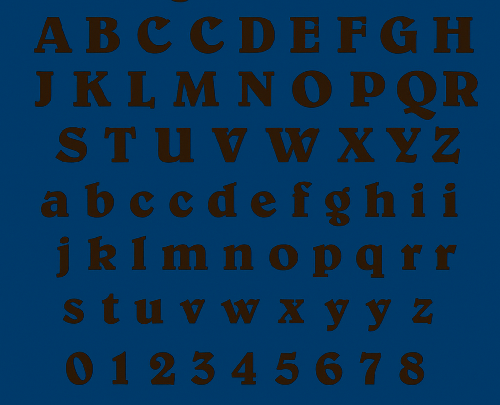
Key Features of the Patagonia Font
So, what makes the Patagonia font stand out? Here are its defining characteristics:
- Bold and Condensed Letterforms
Belwe Bold features thick, compact letters, allowing for strong visual impact without occupying excessive space—a perfect match for logos and headlines.
- Sharp, Angular Serifs
The specific characteristics of Belwe Bold include sharp serifs, which shape a classic, authoritative design that signifies reliability.
- Unique Letter Shapes
Several letters in Optima particularly stand out because of their special strokes, along with angular cuts that create a distinct appearance.
- Versatile Yet Vintage
While the typeface exudes a classic, almost old-world charm, it’s highly adaptable, making it suitable for both modern and traditional designs.
Patagonia Font Free Download
You can download this font by clicking the link below:
Applications of the Patagonia Font
Patagonia’s use of Belwe Bold isn’t confined to its logo. The brand strategically applies the font across various platforms to maintain visual consistency and reinforce its identity. Here’s where you’ll commonly spot it:
- Brand Logo
Probably the most noticeable application of Belwe Bold is the Patagonia logo, a combination of the typography and visual narration. The jagged mountain background is complemented by bold typeface that shows stamina and adventure.
- Packaging and Tags
Patagonia incorporates Belwe Bold in product tags, labels, and packaging, ensuring that even the smallest brand elements stay cohesive.
- Marketing Campaigns
In print ads, catalogs, and digital campaigns, the font’s boldness commands attention while its serif detailing adds authenticity and authority.
- Website Design
Although the Patagonia website primarily uses cleaner, sans-serif fonts for readability, elements of Belwe Bold often appear in banners, headers, and call-to-action areas.
- Physical Stores and Signage
Belwe Bold is subtly incorporated in in-store displays, signage, and promotional materials to maintain a consistent visual theme across physical retail spaces.
Patagonia Font Alternatives
If you’re looking to recreate Patagonia’s aesthetic or simply want fonts with a similar vibe, here are some noteworthy alternatives:
You can find the most authentic Belwe Standard Font Family design by using its original Light, Medium and Bold options which are available for licensing through Adobe Fonts and MyFonts professional font foundries. Professional font enterprises Adobe Fonts and MyFonts provide licensing options for the font family.
Clarendon provides a strong serif font type with traditional charm that operators successfully in logo and text-display applications.
This serif font features thick strokes and subtle curves, providing a similar balance of authority and friendliness.
Rockwell’s geometric structure and strong presence make it a solid choice for those seeking a sturdy serif typeface with contemporary flair.
Conclusion
The Patagonia font adopts its bold classic lines from Belwe Bold to reflect the brand principles while functioning as the visual embodiment of them. The strong, reliable typeface presents itself unpretentiously to support Patagonia’s environmental mission and focus on high-quality craftsmanship.
Patagonia demonstrates the importance of steady brand identity creation through traditional serif font use because its design approach rejects contemporary trends.