
Archivo Font is considered to be one of the most well-balanced fonts in terms of readability, usability, and aesthetics by designers. Designed to work both digitally and in print, it is a clean and versatile text solution that works well across a variety of design contexts. Due to its predictable behavior and modern, clean aesthetic, wrapped text has become a go-to solution for designers, developers, and branding experts in all kinds of creative projects across various media.
Overview of Archivo Font
The grotesque sans-serif Archivo serves as an accent font that maintains exceptional printing performance. The type foundry Omnibus-Type developed Archivo in Argentina. The ability of Archivo to perform well on multiple platforms is its greatest strength since it offers equal effectiveness between print publications and web interfaces, and mobile applications.
The structured design of Archivo presents consistent geometric shapes along with proportional elements throughout the system. Multiple weight options, along with design style variety, enable Archivo to serve as a multi-purpose design element between branding needs and editorial and user experience work.
History & Development of Archivo Font
Archivo Font is born out of a need for screen-friendly typography to complement standardized print materials. It’s designed by Omnibus-Type, in-house designers who are on a mission to release their amazing free, open-source typefaces.
Influenced by American grotesque typefaces from the end of the 19th century, Archivio was redesigned for contemporary use while maintaining an excellent digital legibility. Available for free under the Open Font License (OFL), the font is accessible and professional enough to be used and modified by designers around the world.
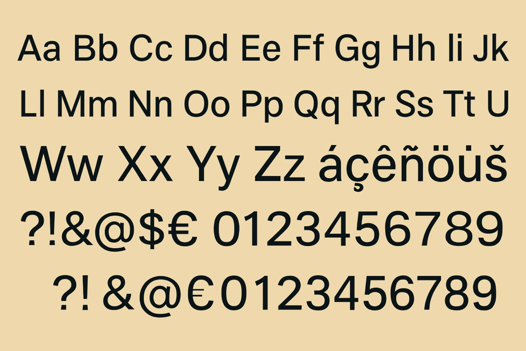
Key Features of Archivo Font
Archivo is packed with well-thought-out design elements that set it apart:
- Grotesque Sans-Serif Structure
Archivo follows the grotesque sans-serif tradition, characterized by:
- Uniform stroke width
- Minimal contrast between thick and thin lines
- Simple, geometric letterforms
This makes it highly legible, even at small sizes.
- Multiple Styles and Weights
The Archivo font family includes:
- Archivo Regular
- Archivo Italic
- Archivo Medium
- Archivo SemiBold
- Archivo Bold
It also features a Condensed variant (Archivo Narrow), which is perfect for tight layouts and space-saving designs.
- Excellent Multilingual Support
Archivo offers comprehensive support for Latin-based languages, accommodating international projects seamlessly.
- Optimized for Performance
Archivo is meticulously engineered for smooth rendering across web browsers, mobile devices, and printed formats. Its clear letterforms prevent pixelation or distortion even at lower resolutions.
Archivo Font Free Download
You can download this font for free by clicking the link below.
Applications of Archivo Font
Thanks to its clean aesthetics and versatility, Archivo font finds application across various industries and platforms:
- Web Design and User Interfaces
Archivo’s sharp clarity and readability make it an excellent choice for:
- Website headers
- Navigation menus
- Body text in web content
- Mobile app interfaces
The font loads quickly and scales well, providing a consistent experience across devices.
- Branding and Corporate Identity
Brands seeking a modern, professional, and approachable look often turn to Archivo. Its geometric balance ensures:
- Cohesive brand identity across media
- Scalability for logos, packaging, and promotional materials
- Neutral yet bold personality
- Editorial and Print Media
Due to its high legibility and clean lines, Archivo is frequently used in:
- Magazines
- Newspapers
- Books
- Brochures
The availability of multiple weights allows for creative hierarchy in editorial layouts.
- Advertising and Marketing
Marketers appreciate Archivo for its ability to grab attention without appearing overly decorative. It’s ideal for:
- Banners
- Posters
- Digital ads
- Social media graphics
- Government and Institutional Use
The font’s clarity, neutrality, and open-source licensing make it suitable for:
- Public service announcements
- Educational materials
- Official documents
Read more: Palm Angels Font
Popular Alternatives to Archivo Font
If you’re exploring other fonts with similar characteristics to Archivo, here are some excellent alternatives:
Conclusion
Archivo Font is a rare non-sans-serif typeface that feels both highly functional and modern. With clean lines, multiple styles, open source availability, and great platform adaptability, it provides designers, developers, marketers, and brands with a powerful tool to create professional yet unique design work. With its harmonious interplay between functionality and visual appeal, Archivo emerges as a trusted font for corporate websites, brand identity development, and marketing designs.