
Dr. Seuss Font: Introduction
Dr. Seuss font is equally as humorous and playful as the Dr. Seuss stories. It fits the bizarre stories and strange rhymes, and characters perfectly. This typeface adds another layer of magic to the stories and to the book itself, making them timeless and loved throughout the years.
This guide elaborately examines the Dr. Seuss font through investigating its beginning point along with specific design features and widespread implementation as well as substitute choices and additional points.
Overview Dr. Seuss Font
Typefaces resembling Dr. Seuss’s hand-drawn irregular written designs found throughout his renowned children’s books share the name “Dr. Seuss font.” The Dr. Seuss font does not represent any release from Theodor Seuss Geisel but provides a range of fan-developed versions inspired by his distinctive kid-friendly letterforms.
The arrangement of letters in the most widely adopted digital version of Dr. Seuss font comes from Grinched which ShyFonts created. Grinched duplicates the book lettering from How the Grinch Stole Christmas through its disordered style of jagged edges which brings authentic personality to text.
The History Behind Dr. Seuss and His Typography Style
As both creator of compelling tales and gifted picture drawer Dr. Seuss demonstrated his expertise. The author released more than 60 children’s books throughout his lifetime starting from 1904 as he united original drawing styles with transformative storytelling abilities. His books including Green Eggs and Ham alongside The Cat in the Hat along with One Fish Two Fish Red Fish Blue Fish received immediate popularity.
The typography found in his books serves as a key component despite people generally focusing on his rhyming verses together with his energetic characters. His creative stories achieve a playful and unpredictable tone because each of his illustrations and titles gets presented with offset irregular text. The handwritten text appearance establishes an important whimsical design element which brings both words and letters to a vivid animated state.
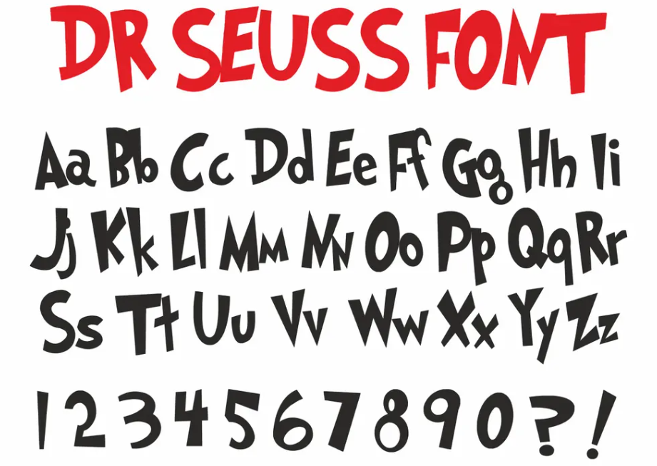
Features of Dr. Seuss Font
Fonts inspired by Dr. Seuss typically have the following defining characteristics:
- Playful Irregularity
The letters aren’t perfectly straight or uniform. Some lean to the side, vary in size, or appear slightly shaky, giving a carefree, informal look.
- Tall, Narrow Lettering
Many characters in the font are elongated and slim, contributing to the quirky, energetic style.
- Jagged Edges and Looseness
The edges of the letters often look hand-sketched, with wavy lines and uneven thickness, mimicking a doodled effect.
- All Uppercase or Mixed-Case Options
Depending on the specific font variation, some offer both uppercase and lowercase letters, though many lean toward uppercase to capture the bold, pronounced feel seen in Seuss books.
- Lighthearted, Childlike Personality
Above all, the font radiates fun, making it ideal for children’s content and informal projects.
Applications of the Dr. Seuss Font
Given its distinctive and cheerful vibe, the Dr. Seuss font finds applications across various creative fields:
- Educational Materials
Teachers frequently use Seuss-inspired fonts to design:
- Bulletin boards
- Classroom posters
- Reading challenge charts
- Learning worksheets
It engages students by evoking a familiar, fun environment.
- Children’s Party Invitations & Decorations
The font is a popular choice for:
- Birthday invitations
- Party banners
- Goodie bag labels
- Event signage
Its connection to childhood nostalgia makes it perfect for themed parties.
- Digital Design & Social Media
Graphic designers and bloggers use Dr. Seuss fonts for:
- Social media graphics (especially around Read Across America Day or Dr. Seuss Day)
- Website banners
- Pinterest visuals
- Merchandise designs (e.g., T-shirts, mugs)
- Book Covers and Storytelling Projects
Although not commonly used in official publications due to licensing concerns, independent authors and illustrators often use Seuss-inspired fonts for self-published children’s content.
Most Popular Dr. Seuss-Inspired Fonts
Here are the leading fonts that replicate the Seussian style:
Are There Official Dr. Seuss Fonts?
Dr. Seuss Enterprises have released no official font. The fonts used in the original books were hand-drawn by Seuss himself or by typesetters following his style. All available digital versions are unofficial recreations by third-party designers.
Alternatives to Dr. Seuss Fonts
If you’re looking for fonts that capture a similarly playful, child-friendly energy but aren’t exact replicas of Dr. Seuss’s style, here are a few options:
- Comic Sans MS
Though it often gets criticized, Comic Sans has a childlike, informal vibe and can be a friendly alternative for casual projects.
- KG Primary Penmanship
Designed to resemble children’s handwriting, this font is perfect for educational purposes without mimicking Seussian typography directly.
- Mister Froggie Font
With bubbly, exaggerated letters, Mister Froggie carries the fun, whimsical energy associated with Dr. Seuss fonts.
- Chalkboard Font
Popular in both Mac and Windows systems, Chalkboard provides a clean, approachable style that works well in kids’ designs.
Conclusion
The Dr. Seuss font does more than present typographical features because it serves as the key that unlocks imagination and creativity with its nostalgic elements. Users from educational, design, and family event planning fields can find that the whimsical handwritten letters deepen the joyful childhood spirit they seek.
The unofficial Seuss-inspired fonts, including Grinch and Doctor Soos, deliver an excellent opportunity to bring a charming personality into your projects.
Explore our Taylor Swift Fearless Font: Free Download