Copperplate Font: Introduction
The appearance of typefaces strongly influences human perception of brand identity, documentation, and artistic creations. From the vast family of traditional typewriter faces, the Copperplate Font is unique for integrating formal beauty with clear legibility. Copperplate stands out for professionals because its precise geometric shapes, along with distinct serifs, confer modern elegance.
This extensive guide dives into Copperplate font’s historical development and technical characteristics alongside its usage and substitutes in addition to proving why designers choose it as an enduring font for branding.
Overview of Copperplate Font
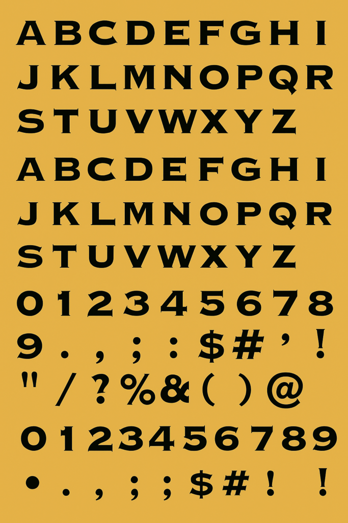
Copperplate Font presents itself as a serif typeface which carries small bracketed serifs combined with wide letterforms alongside an engraved appearance. The uppercase characters sometimes produce a slight flared effect while maintaining sharp edges which produce a professional yet welcoming essence.
The engraving-oriented Copperplate started as an official purpose but evolved into use across different documents such as wedding invitations and corporate branding and financial paperwork. The combination between elegance and strength presents this font with great versatility.
History of Copperplate Font
The Copperplate font originated in the 19th century yet the name today applies to several similar typefaces of its kind. Copperplate engraving represents the artistic origins behind the naming of typefaces which use this technique.
Frederic W. Goudy designed Copperplate Gothic as one of his most recognizable typographic works when he released it through American Type Founders (ATF) during 1901. This typeface disregards its gothic title because it deviates from the usual specifications of sans-serif gothic designs. Â The unique format of Copperplate combines thin wedge-serifs with its sans-serif design to create a powerful yet elegant visual effect.
The adoption of Copperplate spread across different sectors due to its trustworthy formal look since its initial release. People primarily use Copperplate for legal purposes and financial transactions as well as premium brand presentations together with official documents.
Features of Copperplate Font
Copperplate font’s appeal lies in its distinctive design elements. Let’s break down its key features:
- All-Caps Design
Copperplate Gothic was designed entirely in uppercase letters, giving it a stately and commanding presence. This makes it ideal for titles, headers, and logos.
- Small, Bracketed Serifs
The small and subtle serifs of Copperplate bear an engraving mark appearance. The brief triangular forms of these serifs create an engraved formal appearance that remains easy to read.
- Wide, Geometric Letterforms
Due to Copperplate font’s broad style and well-spaced arrangement it creates a professional look. The wide nature of Copperplate letters makes them easy to read even when they are reduced in size.
- Uniform Stroke Weight
Copperplate’s consistent line thickness ensures clarity and precision, crucial for printing, engraving, and digital mediums.
- Timeless, Classic Style
The combination of modern sans-serif elements with traditional serifs results in a font that feels both classic and contemporary.
Copperplate Font Free Download
You can download this font for free by clicking the link below.
Applications of Copperplate Font
Copperplate font’s versatility allows it to thrive across various industries and mediums. Here’s how and where designers use it:
- Business & Professional Branding
Copperplate’s formal aesthetic is ideal for:
- Law firms
- Financial institutions
- Consulting agencies
- Corporate stationery
Its strong, authoritative look conveys trust, stability, and professionalism.
- Wedding & Event Invitations
The elegant engraved feel of Copperplate lends itself beautifully to:
- Wedding invitations
- Event programs
- Certificates
- Formal place cards
Often paired with cursive fonts, it creates a sophisticated, classic appeal.
- Logos & Visual Identity
Luxury brands and high-end services frequently use Copperplate to craft logos that exude prestige and elegance.
Examples:
- High-end jewelers
- Upscale restaurants
- Fashion labels
- Print & Digital Headlines
Copperplate font excels in:
- Book covers
- Magazine mastheads
- Website headers
- Posters & flyers
Its readability and strong presence make headlines pop while maintaining a refined look.
- Signage & Engraving
True to its roots, Copperplate remains a go-to font for:
- Office plaques
- Memorial engravings
- Building signage
- Nameplates
Its clear, sharp letters are ideal for materials like metal, wood, and stone.
Popular Alternatives to Copperplate Font
While Copperplate font is highly distinctive, there are several alternatives that offer similar aesthetics but with slight variations in style and tone:
Often used in movie posters and official documents, Trajan Pro features an all-caps serif style reminiscent of Roman inscriptions. It offers a slightly more classical and less geometric feel than Copperplate.
Designed with the same engraved, formal touch, Engravers Gothic is sans-serif and shares Copperplate’s wide, commanding presence, perfect for signage and logos.
Inspired by Roman inscriptions, Cinzel blends elegance with modernity. It’s available in both uppercase and lowercase letters, offering more flexibility compared to Copperplate.
A more decorative serif font, Cormorant Garamond brings sophistication and is often paired with Copperplate-like typefaces for a harmonious blend.
With its clean, geometric forms and minimalistic serif touches, ITC Blair provides a slightly softer alternative to Copperplate while retaining a formal vibe.
Pros and Cons of Copperplate Font
Pros:
- Timeless elegance
- Excellent legibility
- Versatility across industries
- Professional, authoritative feel
- Perfect for print and engraving
Cons:
- Limited lowercase options (especially Copperplate Gothic)
- It may appear too formal or rigid in casual contexts
- Overuse can make designs feel outdated or stiff
Conclusion
Most fonts lose their relevance in less than a century but Copperplate font stands out by retaining its appeal for more than a century. Copperplate font is an exception. As a result Copperplate combines traditional artisan methods with contemporary readability which makes it applicable across different usage scenarios.
Copperplate provides law firms and wedding invitations as well as commemorative plaques with a distinctive powerful appearance which continues to resonate today. The combination of sophisticated elegance with powerful characteristics guarantees its ongoing use in documents as well as logos and digital platforms for long periods.